Elodia
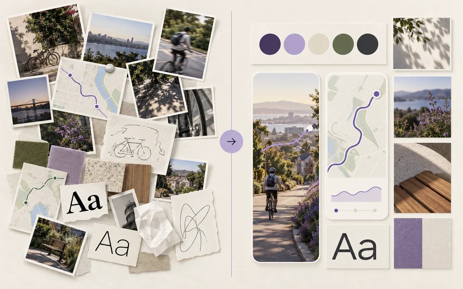
A useful mood board is a set of decisions, not a folder of attractive pictures. Start with the experience you want to create, collect a few relevant references, then keep only the images, colors, type and interaction cues that support that direction. The finished board should help another designer answer: “What belongs in this project, and what does not?”
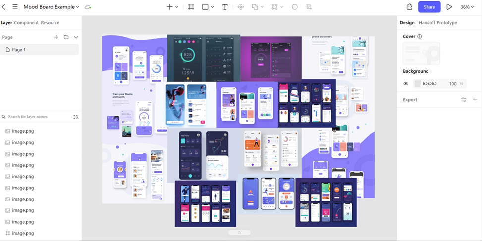
For this walkthrough, imagine a neighborhood cycling app that helps people discover calm routes. A shared visual brainstorming space lets the team gather possibilities first; the mood board then narrows them into a direction for the app. If you want to browse formats before building your own, see these mood board examples.
What is a Mood Board?
A mood board is a visual brief. It can include photos, color samples, typography, interface references, textures and short notes, but each item needs a purpose. For the cycling app, a park photo might suggest a calm tone, a route-map crop might suggest how to simplify navigation, and a type sample might suggest the voice of the product. The board is not yet a production-ready screen.
One board can explore several ideas; a final direction board should make a choice. Keep the references and the chosen rules distinct. Otherwise viewers may not know whether a striking image is an option under discussion or a decision the team has agreed to use.
Why Use a Mood Board?
It lets a team discuss tone before every screen is polished. “Friendly,” “energetic” and “calm” mean different things to different people; examples make those differences visible. A board is especially useful when a project has multiple contributors, when stakeholders need to compare directions, or when visual work is starting from an incomplete brief.
It also creates a test for later choices. If a route screen suddenly uses loud neon colors and dense data, compare that decision with the agreed board. The board does not override usability evidence or product requirements, but it helps distinguish an intentional change from visual drift.
How to Make a Mood Board in 10 Easy Steps
1. Set the Direction
Write one sentence for the user experience. For the cycling app: “Help a rider find a quieter route without making the map feel technical.” Add a few constraints, such as the audience, screen size and existing brand rules. This gives you a reason to accept or reject a reference.
2. Gather Existing Material
Start with the product brief, current palette, logo usage, interface screenshots and any research that already exists. Preserve those constraints rather than treating the board as a blank style exercise. Separate firm requirements from ideas that are still negotiable.
3. Gather Motivating Pictures
Collect a broad first pass: cycling routes, street signs, parks, maps and relevant app screens. Save the source or usage rights for images that might later appear in public work. At this stage the aim is range, not a polished grid.
4. Incorporate Motion and Sound
If motion is important, link or annotate the interaction rather than assuming a still image explains it. For example, a route preview might need a subtle transition to show where the rider is going. Sound may be irrelevant to this app; leave it out if it does not help a design decision. The board can reference media without promising that a design tool plays every format natively.
5. Select Your Fonts and Colors
Choose a small working set, then try it on a realistic screen. A muted green and warm neutral may support an outdoors theme, but map lines, buttons and text still need enough contrast. Type samples should show headings and a short body sentence, not just a decorative alphabet.
6. Organize Your Thoughts
Group references by job: atmosphere, map language, interface patterns, typography and color. Remove duplicates. A board with twenty similar forest photos is less useful than one photo that explains the mood and one screen that explains the information hierarchy.
7. Stay Open to New Ideas
Keep an “explore later” area outside the approved direction. New references can be added when research or testing raises a real question, but do not silently change the agreed board every time a fashionable image appears. Record what changed and why.
8. Explain Your Vision
Add a one-line reason next to each chosen cluster. “Simple route line so the map stays readable at a glance” is more actionable than “modern.” Clarify which pieces are inspiration and which are proposed rules; a reference from another product is not permission to copy its interface.
9. Collaborate with Your Team
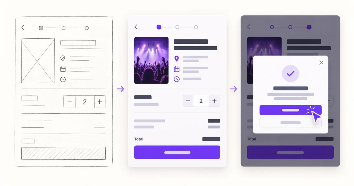
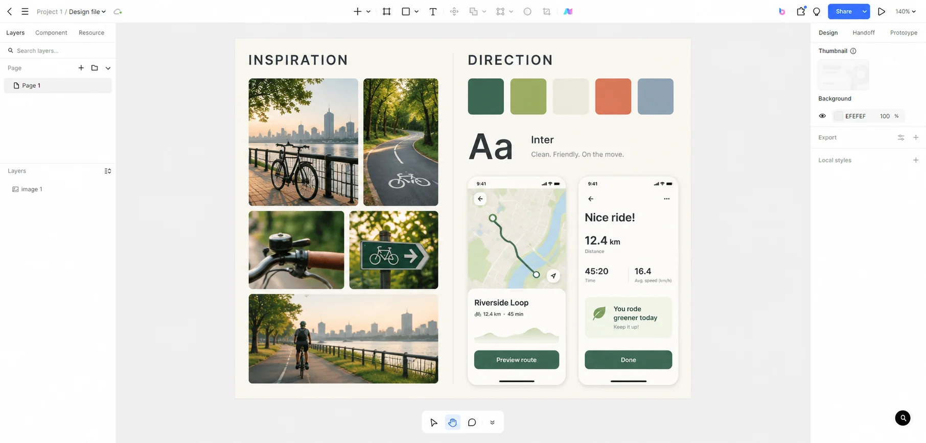
In Pixso, place the reference images, swatches and sample screens on one design-file canvas, then review them with the people responsible for content, interface and brand. The example below separates collected inspiration from the selected direction. It shows how a visual board can lead to two screen-level design choices without claiming that the software makes those choices automatically.
10. Seek Feedback
Ask targeted questions: “Which two references best express a calm route?”, “Which color pairing makes the route visible?”, “What feels inconsistent with the product?” Capture the answer alongside the board. A vague thumbs-up does not tell a designer what to carry into the next screen.
Final Thoughts
The board is ready when someone else can use it to design a first screen and explain the choices. For the cycling app, that means a clear route-line treatment, restrained colors, readable type and a deliberate tone. Turn those decisions into a small UI draft, then check them against the actual user task. If the screen fails to help riders choose a route, revise the direction rather than defending the collage.