Scott
A multi-step form should make a long request easier to finish, not turn one task into four chances to lose an answer. The user needs to know where they are, whether they may go back, what has been saved, and what remains before submission. Consider a fictional team requesting a new design project through four stages: project basics, requirements, optional details, and review. We will map the transitions in Pixso's prototyping workspace, then define the behavior a real service must implement.

Group stages by decisions, not by an arbitrary field count
Break the intake request where the person's job changes. In our example, “Project basics” identifies the work, “Requirements” describes the deliverable, “Optional details” collects material that may be skipped, and “Review” checks the request before it is sent. A stage with one tiny input followed by a stage with twenty unrelated questions does not feel simpler just because the progress indicator has four dots.
Tell people at the start what the request asks for and roughly how long it will take only if the estimate has a basis. Name the information they may need, such as a project owner and a design brief. Do not make someone register or upload a file before they can understand the task. The W3C's multi-page forms guidance recommends logical groups, repeated overall instructions, clear optional stages, and orientation throughout the form.
Write down the form contract before drawing screens: which fields are required, which stages are optional, when answers are saved, how long a draft persists, and whether another teammate can continue it. Those are service decisions. A design file can expose missing decisions, but a progress bar alone cannot make data persist.
Show position and next work without promising a false percentage
For a fixed four-stage flow, “Requirements — step 2 of 4” is more informative than an unlabeled bar. Show the current stage, completed stages, and the name of the next stage. If the optional stage can be skipped, a visual 75% bar may be misleading: the amount of work left changes with the user's choices. A labeled ordered list is often clearer than a precise-looking percentage.
Keep the stage names stable across the heading, progress indicator, and navigation. On the review screen, the completed steps should be reachable for correction. If the user changes a requirement that makes later questions irrelevant, explain what will be removed or re-evaluated instead of silently clearing it. The W3C guidance also describes making completed steps available for review while saving answers in the current step.
Progress is orientation, not a completion claim. Mark a stage complete only after its required answers pass the checks needed to move on. A stage with a draft answer that has not been validated can be shown as “in progress,” not as complete merely because the person visited it.
Preserve answers before back, skip, and resume
Use one consistent rule for a Back action: it returns to the previous stage with the person's entries intact. If moving forward saves the current stage, show the save status only after the service confirms it. “Saved” must not be decorative text while a request is still pending. If autosave is used, provide a visible way to understand whether the latest edit is saved, saving, or not saved.
Skipping an optional stage should preserve earlier answers and make the absence of optional information clear on review. Do not insert a blank required-looking section that causes a surprise error at submission. In our example, a brief can be supplied later, but the request still needs a project owner; those conditions should be explicit in both the form and its server validation.
When a person returns after a network interruption, distinguish a saved draft from an unsaved local edit. The UI should not imply that an offline change reached the server. The separate problem of an expired login session has its own recovery rules; this guide focuses on normal progress and correction inside a multi-stage form.
Validate the problem without resetting the person's work
At each stage, report errors near the relevant fields and describe what the person can do. “Enter a project owner” is actionable; “Something went wrong” is not. Do not wait until the final review to reveal an error that could have been explained on the first stage. At the same time, avoid interrupting typing with a warning before the user has had a fair chance to finish the field.
Suppose the team selects a delivery date earlier than the project start date. Keep both dates and explain the relationship that needs correction. After the person edits the date, retain the other valid answers. Client-side checks can provide quick feedback, but the server must validate the final submission too. The W3C's form validation tutorial explains that client-side checks can be bypassed and are not a substitute for server-side validation.
For an error on a different stage, the review screen should link to that stage and field, preserve everything else, and bring the person back to review afterward. A global error summary helps when several fields need attention. If the server rejects a value that passed an earlier client check, show the new reason and preserve the full draft; never respond by returning to an empty first step.
Make review, submission, and the resulting state distinct
The review stage should summarize the answers in the same words used during entry, with a clear Edit action for each section. Show omitted optional details as “Not provided” rather than implying they are required. If editing an earlier answer changes what the final request means, recalculate the summary before submission.
The Submit button starts a request; it is not itself proof of success. While the service processes it, prevent accidental duplicate submission and show a truthful pending state. On success, display a stable confirmation or request ID and a sensible next step. On an error, keep the completed form and say whether the request was received. A network timeout is ambiguous: before offering a blind retry, the service should check whether the request already exists.
Measure the experience by the ability to complete and correct the task, not by the number of screens. Useful tests include whether people can name the current stage, return to change one answer, skip the optional stage, recover from a validation error, and tell whether the final request was actually submitted.
Prototype the routes and accessible states in Pixso
Place the four stages side by side in a Pixso design file. Link Next, Back, Skip, and Edit paths, then add separate states for saving, save failure, field error, submission pending, success, and uncertain outcome. Keep the same project name and answers across artboards so reviewers can see whether state is preserved. A single polished happy-path screen cannot expose a lost draft.
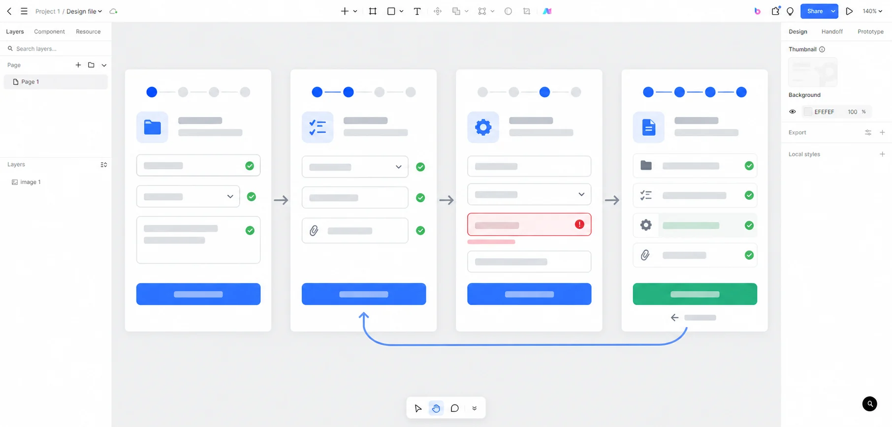
Ask a colleague to use the prototype without narration. Can they tell what has been saved? Can they return from review, fix the delivery date, and come back without re-entering the brief? Can they distinguish a failed save from a failed final submission? Adjust the copy and flow where they hesitate. Hand engineering the screens together with the actual persistence, validation, and request-status rules. Pixso supports the design and review of the interaction; the production service must implement and verify the data behavior. Open Pixso to map the form states.