Scott
AI can produce a polished interface concept in seconds, but a convincing screen is not automatically ready for engineering. Generated UI still needs decisions about hierarchy, reusable components, content, interaction states, accessibility, and evidence for every open issue. This AI design review checklist shows how to turn a fast concept into a design package that developers can implement and test. It deliberately stops at developer handoff: browser behavior, assistive-technology support, security, performance, and release acceptance must still be verified in the implemented product.
Part 1: Define the job before reviewing the pixels
The most useful review starts with a concrete task. Throughout this guide, imagine that an AI-generated UI has produced a subscription analytics dashboard for a software company. A billing manager must review monthly revenue, identify failed payments, and retry a payment when the account and permissions allow it. This example gives every design decision a testable purpose.
Before moving layers, write a one-page review brief. Record the user, the business outcome, the primary task, the information needed to complete it safely, the target viewport, and the important system states. An attractive chart is irrelevant if the billing manager cannot find the failed-payment queue or understand why a retry action is unavailable.
Pixso can keep this early reasoning close to the design work. A team can use built-in brainstorming, flowchart, and PRD tables in a Pixso Whiteboard file to organize requirements and edge cases. Once the brief is stable, Pixso AI can turn a natural-language prompt into an editable UI draft for rapid visual validation. A useful prompt names the user, task, data priority, platform, responsive targets, and required states instead of asking for a generic "modern dashboard."
| Review brief item | Subscription dashboard example | Pass condition |
|---|---|---|
| Primary user | Billing operations manager | The role and permission level are documented. |
| Primary task | Find failed payments and start an allowed retry | The task can be stated in one sentence and mapped to visible controls. |
| Decision data | Customer, amount, failure reason, retry eligibility, last attempt | Every field supports a decision or is removed. |
| Responsive targets | 1440 px desktop and 390 px mobile | Both widths have reviewed frames and written behavior rules. |
| Required states | Loading, empty, failed, retrying, permission-limited, success | Each relevant state has content and recovery guidance. |
| Release boundary | Design specification versus implemented behavior | The handoff names tests that engineering must complete later. |
Part 2: Audit hierarchy and layout with a real task
Apply the AI design review checklist by reducing the dashboard to blocks and asking whether their order supports the billing manager's task. The page purpose should be immediately legible, the failed-payment queue should be easy to locate, and the retry control should not compete with unrelated analytics. Multiple areas may correctly have equal visual weight when they are genuine peers, such as plans in a comparison view. The problem occurs when a screen has a clear main task but several unrelated regions fight for the same attention.
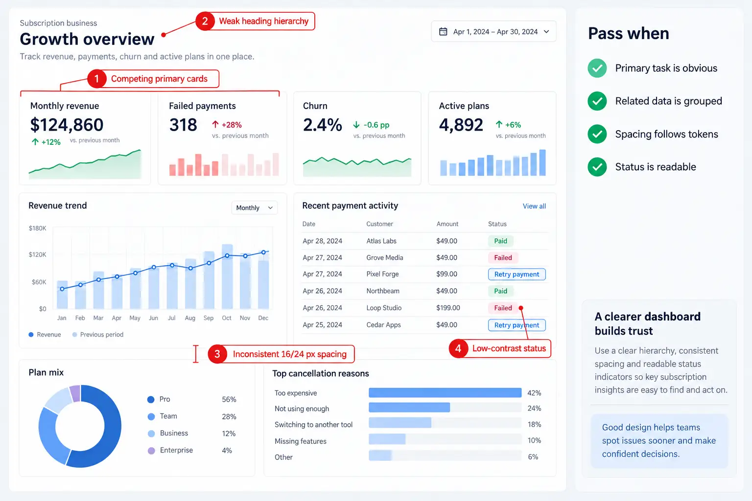
Run the check without relying on decorative color. Cover charts with neutral blocks, scan the heading order, and trace horizontal anchors. Then compare the desktop and mobile frames. Related information should remain grouped, repeated gaps should map to a small spacing scale, and the most important action should retain priority when columns stack.
Pixso AI can help clean selected content. AI Smart Layout can establish a clearer layout hierarchy with consistent spacing and alignment, while AI Smart Editing can modify editable elements from natural-language instructions. Use these features on suitable selected layers, then inspect the resulting nesting, wrapping, constraints, and order at every target width. Automation can improve structure, but it does not decide which business task deserves priority.
Layout pass criteria
- A reviewer can identify the page purpose and primary task in five seconds without an explanation.
- The failed-payment table and retry path are visually connected; unrelated analytics remain secondary.
- Margins, columns, and repeated gaps map to documented tokens rather than isolated values.
- The 390 px frame shows what stacks, wraps, truncates, hides, or scrolls; no essential action disappears.
- Any equal-weight regions are intentional peer choices, not accidental competition for attention.
Part 3: Turn meaningful patterns into maintainable components
AI-generated UI often draws controls that are almost identical but differ in padding, radius, label alignment, or feedback. UI quality assurance should identify those accidental variations before developers have to interpret them. However, repetition alone is not a reason to create a component. Componentize patterns that share the same function and semantics, need consistent behavior, or will be maintained together. A one-off illustration or a repeated decorative divider may not need the same treatment.
For the dashboard, review the primary button, email or account fields, payment-status badges, table rows, and retry action. Define meaningful variants for state and emphasis instead of copying frames. Loading belongs to the same primary action component if its size and purpose remain stable; "Payment failed" and "Retrying" can be variants of a status component if their meaning, icon rules, and announcement requirements are documented.
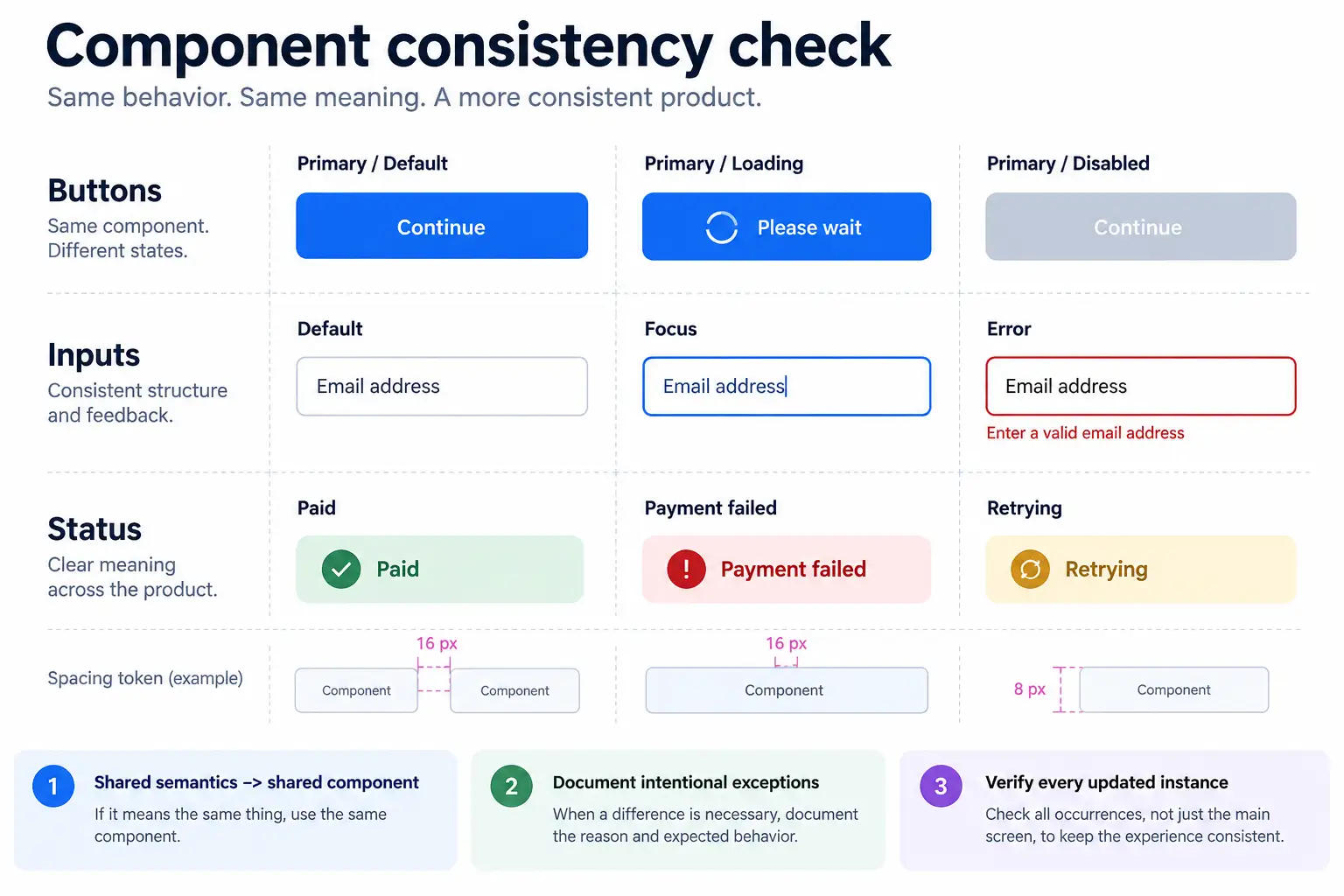
Pixso supports components, styles, variables, and design systems that teams can reuse across files. AI Smart Search can locate team or community assets with natural-language queries, reducing unnecessary redrawing. AI Smart Rename can replace meaningless layer names with business-oriented names. Review the affected layers and names before updating a shared library: an automated label may be readable yet still conflict with the team's component taxonomy.
Component pass criteria
- Patterns with the same purpose and semantics use the intended shared component or have a documented exception.
- Variants represent meaningful properties such as emphasis, size, status, or loading rather than duplicate frames.
- Controls accommodate realistic content expansion and the reviewed mobile width.
- Default, focus, pressed, loading, disabled, error, and success states are defined where the component needs them.
- After a component change, every affected instance is checked for layout, copy, and state regressions.
Part 4: Replace idealized content and validate assets
Placeholder copy makes AI-generated UI look complete while hiding difficult cases. Replace perfect one-line labels and uniform values with representative data: a long customer name, a missing failure reason, a localized currency, a retry that is not permitted, and a payment still processing. If the table works only with short English content, the design package is not ready for developer handoff.
Review action labels for outcomes. "Retry payment" is more specific than "Continue" in this dashboard. Error text should explain what happened, preserve useful context, and offer the next available step. Empty-state copy should distinguish a new account from a filtered result with zero matches.
Pixso AI Smart Text can translate, continue, polish, summarize, or rewrite canvas text, which is useful for exploring alternatives. A fluent suggestion still requires product-policy, terminology, tone, and localization review. AI Text-to-Image can create visual assets, while AI image editing can remove backgrounds or improve resolution. Every selected image must fit the product context, survive the intended crop, include an accessibility decision, and meet the project's licensing and usage-rights requirements. Decorative imagery should never displace billing data or recovery instructions.
Content and asset pass criteria
- Short, long, missing, localized, and repeated values have been tested in representative frames.
- Every action label predicts its result, and every error message offers a realistic next step.
- Images have documented source or generation records, usage rights, crop behavior, and alt-text treatment.
- Automated copy and imagery have a named human reviewer.
Part 5: Specify states, availability, and interaction intent
The AI design review checklist must cover what happens before, during, and after an action, because a static screen cannot explain those moments. Trace the retry-payment path through eligibility, activation, submitting, success, and failure. Keep the table geometry stable while a request is in progress, prevent accidental duplicate submission, and tell the user whether the payment is retrying or has completed. A green field or control state means that item passed its local check; it does not prove the entire operation succeeded. Form-level success needs its own confirmation.
Do not treat "disabled" and "unavailable" as competing categories. Unavailability is a situation; disabled, hidden, read-only, or visible with an explanation are possible presentations. Choose the presentation from the reason and the user's need to discover the action.
| Why an action is unavailable | Possible presentation | Required explanation |
|---|---|---|
| A prerequisite is incomplete | Keep it visible and disabled when the sequence should be discoverable. | Name the prerequisite next to the control or in reachable help. |
| The user lacks permission | Show disabled or read-only when awareness is useful; hide when the action is irrelevant or revealing it would be confusing or sensitive. | If shown, name the required role and how access is requested. |
| The service is temporarily unavailable | Disable during the outage and provide status or retry behavior. | Explain that the condition is temporary and what the user can do next. |
| The action does not apply in this context | Hide it or replace it with the relevant action. | Avoid explaining a feature the user cannot use here. |
Use Pixso Whiteboard flowcharts to map triggers, system responses, and recovery routes. In the design file, variants and annotated frames can express the intended focus order, overlay behavior, navigation, and feedback. Visual transitions and a presentation can communicate that intent, but they cannot prove browser focus management. After implementation, engineers must test the real tab sequence, focus visibility, focus trapping, and focus return with a keyboard and assistive technology. The W3C keyboard interface guidance is a useful implementation reference.
Part 6: Set an accessibility and UI quality assurance gate
Accessibility review at handoff is a specification check, not a certification. Inspect information structure, reading order, visible focus treatment, text scaling, target size, color contrast, status announcements, and error recovery. Color, motion, and imagery should support meaning rather than carry it alone. Pixso AI can generate a design checklist from a page type or description, but that output is only a starting point for team-specific UI quality assurance.
The design accessibility gate passes when every interactive element has an accessible-name requirement, the intended keyboard order is annotated, focus appearance is specified, text and controls meet the team's documented contrast and size targets, and loading, error, and success messages include an announcement requirement where needed. Any exception must have an owner, rationale, and follow-up test. Severity 1 and Severity 2 design issues must be resolved or formally accepted by the accountable product and engineering owners before handoff.
Implementation creates a second gate. It verifies semantic HTML, actual keyboard operation, focus movement, screen-reader output, zoom and reflow, browser behavior, and dynamic announcements. A clean design review cannot substitute for those tests. This separation makes the completion standard honest: the design can be handoff-ready while the product is not yet release-ready.
Evidence required at the design gate
- Annotated reading and focus order for the dashboard's main route and retry flow.
- Recorded contrast values or token references for text, status badges, focus indicators, and controls.
- Copy for loading, permission, failure, retry, and success feedback, including announcement intent.
- Issue records with severity, owner, resolution, and acceptance evidence.
- An implementation test list for behaviors that the design file cannot prove.
Part 7: Run a traceable review in Pixso
Review in focused passes: product intent, hierarchy, design system, interaction states, content, accessibility, and implementation risk. This keeps a discussion about visual polish from hiding a broken task. Pixso supports real-time collaborative editing and contextual comments, so reviewers can keep a frame, the identified issue, and the decision together.
Use a consistent severity scale. Severity 1 (Blocker) prevents the primary task or creates serious access or data-loss risk. Severity 2 (Major) creates substantial task friction or inconsistency with no easy workaround. Severity 3 (Minor) has limited impact and a practical workaround. Teams may add lower priorities, but the top levels should remain tied to user impact rather than reviewer preference.
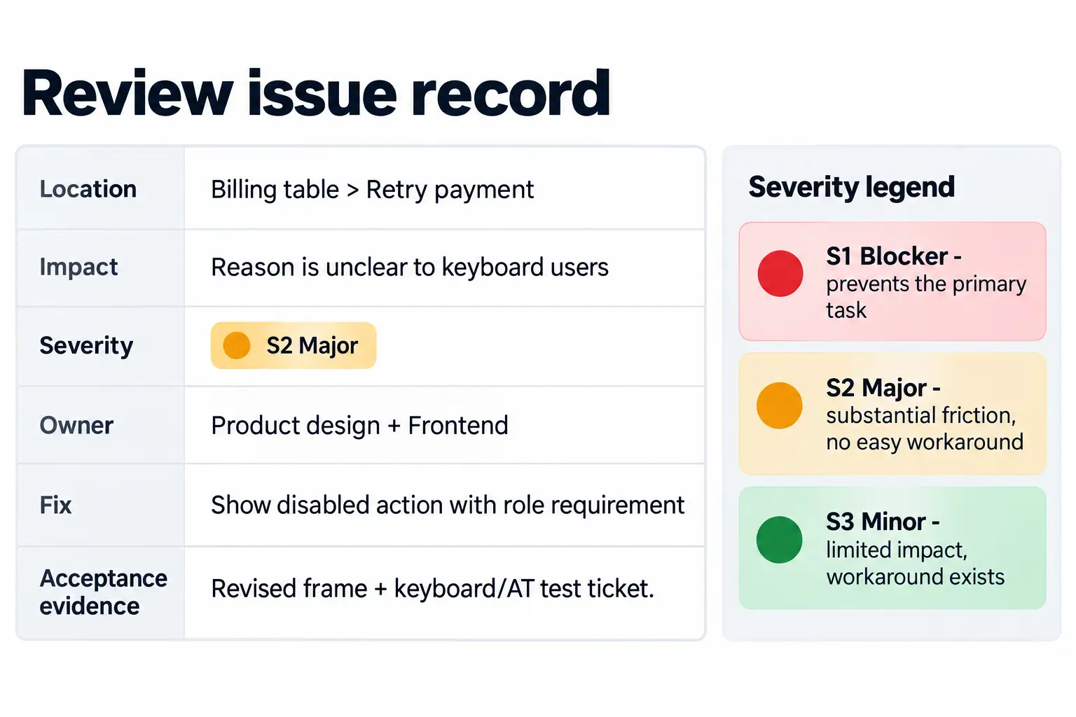
For the dashboard example, a complete issue record reads: Location - Billing table > Retry payment action. Impact - keyboard users cannot discover why the action is unavailable. Severity - S2 Major. Owner - product designer and frontend engineer. Resolution - keep the action visible when discovery is useful and add the role requirement. Acceptance evidence - revised frame plus a linked implementation ticket for keyboard and assistive-technology testing.
Pixso's Prototype Presentation module can be used to preview a prepared presentation and collect contextual review comments. It also supports offline presentation for prepared reviews in weak or unavailable network conditions. This module is for presentation and feedback; the overseas version does not provide prototype-file creation or editing. A presentation can demonstrate the intended sequence, but it does not validate live networking, browser focus, ARIA, or application state.
Review pass criteria
- Every S1 and S2 issue has a resolution or a documented acceptance by accountable owners.
- Every unresolved S3 issue has an owner and target milestone.
- Each resolution links to a revised frame, component, specification, or implementation test ticket.
- Comments that are preferences rather than user-impact issues are labeled as such.
Part 8: Separate the handoff gate from the release gate
A handoff should explain decisions, not merely expose measurements. Identify component sources, variables, responsive rules, content limits, state changes, assets, issue resolutions, and open questions. Label experimental AI-generated UI clearly so an engineer does not mistake a concept for an approved requirement.
Pixso can share designs by link for preview, editing, comments, and annotations. Through the Pixso Design to Code (D2C) workflow, teams can generate React, Vue, HTML, ArkUI, or Flutter code for developers to download and optimize. D2C output is a starting point, not release evidence. Engineering still owns semantics, application state, integration, performance, security, testing, and accessibility in the real codebase.
| Gate | Pass when | Evidence |
|---|---|---|
| Design handoff | The task, responsive rules, components, states, content, accessibility intent, and issue decisions are specified; S1 and S2 design findings are closed or formally accepted. | Approved frames, component references, annotations, issue log, asset records, and implementation test list. |
| Implementation review | The built interface matches approved intent and passes functional, keyboard, assistive-technology, responsive, and error-recovery checks. | Test results, recordings, defect tickets, and documented design deviations. |
| Release readiness | Engineering and product owners accept accessibility, security, performance, data, analytics, browser, and operational results for the target release. | Release checklist, automated and manual test evidence, monitoring plan, and approvals. |
Final AI design review checklist
- Intent passes when the primary user, task, decision data, and constraints are documented and visible in the approved design.
- Hierarchy passes when a new reviewer finds the main task quickly and peer content is the only content allowed equal emphasis.
- Layout passes when reviewed desktop and mobile frames demonstrate grouping, spacing tokens, alignment, wrapping, and overflow rules.
- Components pass when shared semantic patterns use reviewed components, exceptions are documented, and affected instances have been checked.
- Content passes when realistic, long, missing, localized, loading, error, and success content fits and has a clear next step.
- Assets pass when source or generation records, usage rights, crop behavior, and accessibility treatment are documented.
- Accessibility design review passes when names, order, focus treatment, contrast targets, announcements, and implementation tests are specified.
- Issue review passes when all S1 and S2 findings are resolved or formally accepted and every remaining issue has an owner and evidence target.
- Handoff passes when approved requirements are separated from AI suggestions and all unverified implementation behaviors are listed.
- Release readiness is not claimed until the implemented product completes functional, accessibility, security, performance, and operational testing.
Conclusion
Generated UI becomes dependable when fast exploration is followed by explicit decisions and evidence. Use this AI design review checklist to prepare hierarchy, components, content, states, accessibility intent, and issue records for developer handoff. Pixso AI can accelerate editable concept generation, layout cleanup, asset discovery, naming, text work, and checklist creation, while Pixso's collaborative design system and Prototype Presentation module keep review context visible. The boundary remains clear: designers approve a testable specification; engineers validate the implemented behavior; product owners decide when the result is ready to release.
![[Full Guide] UI Design Prototyping](https://pixso.net/assets/media/what-is-ui-design-prototyping-79f536e2c60326ab.webp)