
Scott
A toggle switch and a checkbox can both represent an on-or-off choice, but they set different expectations. In a user interface (UI), a switch usually changes a setting immediately; a checkbox commonly selects an item or records a choice within a form. Choose the control by what happens after the user activates it.
What is a toggle switch?
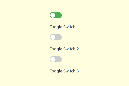
A toggle switch changes between two states, usually on and off. It suits a setting such as notifications when the change takes effect as soon as the switch is activated. The position of the switch should communicate the current state.
Use a stable label such as “Email notifications” and show the state through the control, not color alone. Keep the label the same when the state changes so users can identify the setting consistently. Include a visible focus state and an accessible name in the implemented control.
Make the result clear. If the change needs a network request, show progress or an error when needed. A switch that appears on while the setting has failed to save gives the user misleading feedback.
What is a checkbox?
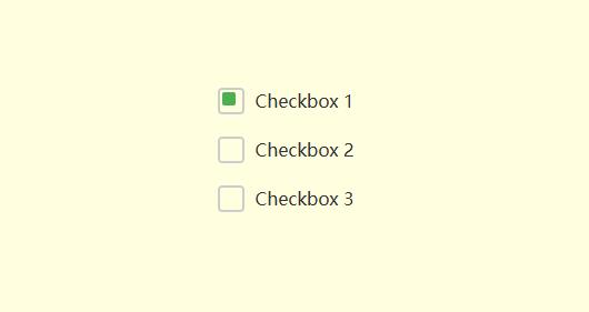
A checkbox represents a selected or unselected option. Several checkboxes can let users choose any combination from a group, such as topics for an email digest. A single checkbox can also record a choice, such as agreeing to terms. Both switches and checkboxes can appear in groups.
In a form, checkbox selections commonly take effect when the user submits or saves. They can also update results immediately, as in product filters. Make that behavior consistent and make any required confirmation easy to find.
Toggle switch vs. checkbox: the practical differences
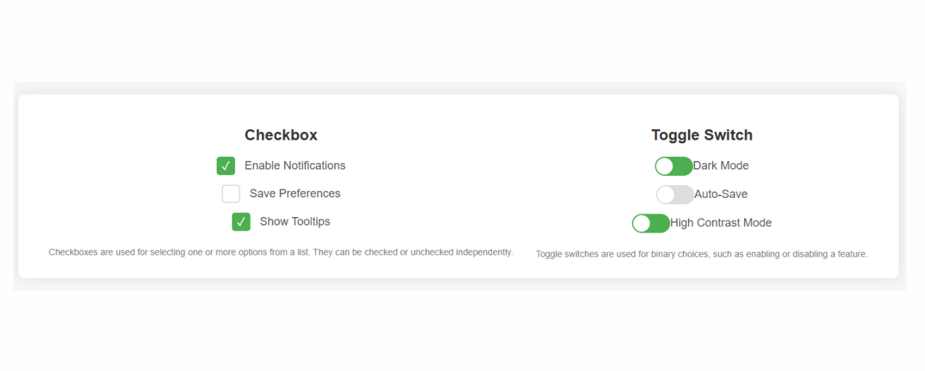
The key distinction is the user's expectation of the action, not whether the control looks more interactive:
- Appearance: A switch uses a track and a moving thumb; a checkbox uses a marked or unmarked box. Show state clearly without relying only on a color change.
- Meaning: A switch commonly turns a setting on or off. A simple checkbox selects an option or item. Several checkboxes can represent many combinations, while a parent checkbox can summarize the state of a group.
- Commit behavior: A switch generally applies its change immediately. A checkbox may be part of a set of choices saved together. Both controls should give immediate visual feedback when activated.
- Typical uses: Use switches for settings such as dark mode or notifications. Use checkboxes for choosing several filters, selecting rows, or recording a form choice. Follow the established behavior of the surrounding interface.
- Mixed state: A parent checkbox can show an indeterminate state when some, but not all, child items are selected. This summarizes the selection below it; it does not mean that an extra option is available.
When should you use each control?
Start with three questions: what is changing, when does it take effect, and does the user need to select several items as a group?
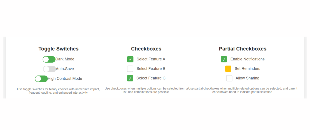
- 1. Use a toggle switch for an immediate setting
For a notifications setting, turning the switch off should disable notifications without a separate Save action. Keep related settings together, label each one clearly, and explain any important dependency near the affected control. Frequency of use is not, by itself, a reason to choose a switch.
2. Use checkboxes for selections or form choices
For an email subscription form, offer separate checkboxes for topics such as product updates, tutorials, and events. Users can choose the combination they want, then save the form. If selections update results immediately, as filters often do, show the updated result count or list.
3. Use a mixed checkbox for a partly selected group
A “Select all files” checkbox can be unchecked when no files are selected, checked when every file is selected, and mixed when only some are selected. Define what activating the parent does and make that behavior consistent. The mixed state describes the children; it should not become an unexplained third choice.
For a choice that requires exactly one option from several alternatives, consider radio buttons instead. For a destructive action, use a clearly labeled action control and an appropriate confirmation. A switch is not a substitute for explaining consequences.
Choose by behavior, then design the state
Use a switch when users expect an immediate on-or-off setting. Use checkboxes when they are selecting items or preparing choices to submit. Then test the label, current state, keyboard operation, and saved result together. A familiar control only works well when its behavior matches what it communicates.
For related interface decisions, explore the practical guides in Pixso articles.



![[Detailed Review] UI VS UX](https://pixso.net/assets/media/core-of-ui-ux-19d28f0203322729.webp)


