Scott
A merge screen should let someone predict the resulting record before they commit. Show which values will be kept, what happens to linked work, and whether the decision can be reversed. Two names that look alike are a reason to investigate, not proof that two records represent the same person or organization.
This guide designs a supplier-record merge for an operations team. The data table component tutorial covers the rows and selection controls that lead into this task. Here, the important decision happens after two records have been selected: exactly what should their combined record contain?
Separate identity, field choices, and linked work
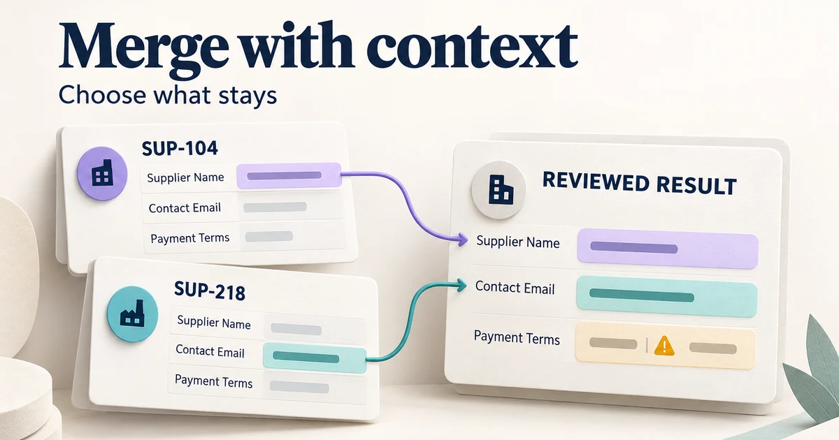
Imagine a purchasing system containing two records for Northstar Studio. Record SUP-104 has an older billing email and three purchase orders. SUP-218 has a newer billing email and two purchase orders. One purchase order appears on both records. The matching company name makes them candidates for review; a different registered address might instead reveal two separate businesses.
The screen needs to answer three different questions. Do these records belong together? Which conflicting values should become the final values? What will happen to purchase orders, notes, files, and references? A single instruction to “keep the newest record” hides all three decisions behind one default.
Use stable record identifiers alongside the name, plus enough distinguishing context to make a wrong match visible. A verified domain, an account number, or a known office address can be more helpful than another avatar. Show where important information came from and when it was last verified. “Updated yesterday” is weak evidence if yesterday's change was only a tag.
Keep a clear way to leave without merging. In a suggested-duplicates workflow, “Not the same supplier” is a different outcome from “Review later.” The first rejects the relationship; the second leaves the question open. Neither should silently delete a record or dismiss unrelated suggestions.
Make defaults visible without making them look verified
A default reduces effort, but it should be explainable. A team might favor one record because it is connected to the purchasing system, while still choosing a billing contact from the other record. Label the preferred source clearly and show each selected value in the result column. Do not rely on a left-to-right arrow to explain which data wins.
Real products make different choices here. HubSpot's merge documentation describes reviewing retained property values, combining associations, and a merge that cannot be undone. Attio documents a different model: the right-hand record's values take precedence where data conflicts, and the merge produces a new record ID. These examples show why the interface must state its own rules rather than assume that “primary” means the same thing everywhere.
In particular, distinguish the preferred source of values from the identity of the resulting record. Keeping a name and email from SUP-104 does not, by itself, mean the result keeps the identifier SUP-104. If the system creates a new identifier, show that consequence. If existing links will resolve to the result, explain that behavior only after engineering confirms it.
Compare conflicts at the field level
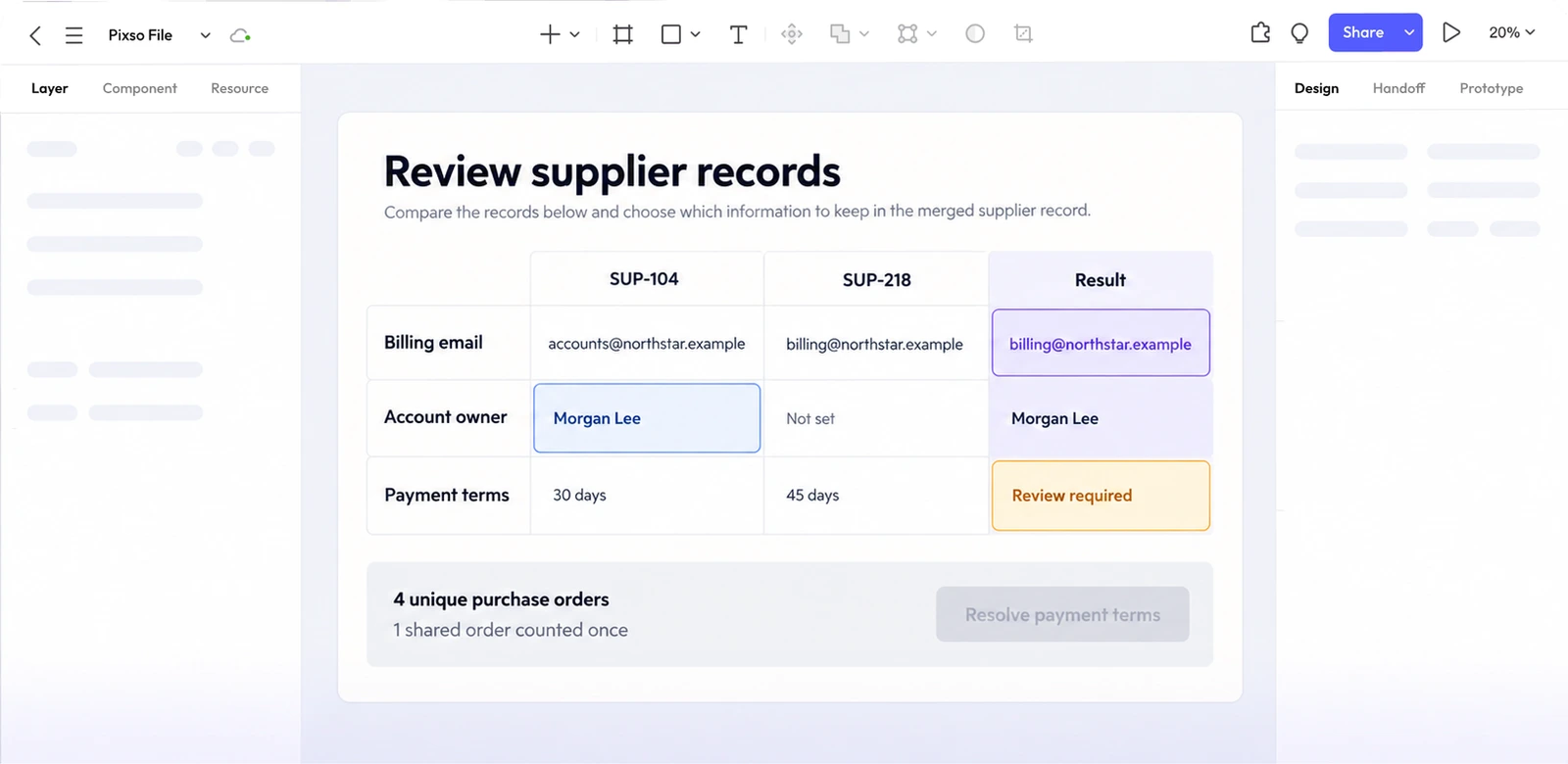
For desktop, a three-column comparison works well when the number of fields is manageable: source A, source B, and the selected result. Keep the field label attached to each row. Highlight a difference with text or an icon as well as color, and make the selected value visibly different from a merely available option.
| Field | SUP-104 | SUP-218 | Review decision |
|---|---|---|---|
| Supplier name | Northstar Studio | Northstar Studio | Matching value; retain once. |
| Billing email | accounts@northstar.example | billing@northstar.example | Choose after checking which address the supplier uses for invoices. |
| Account owner | Morgan Lee | Not set | Keep Morgan Lee if an empty field means no recorded value. |
| Payment terms | 30 days | 45 days | Require review; a recent edit does not establish the correct commercial agreement. |
| Purchase orders | 3 linked | 2 linked | Preview 4 unique orders after recognizing the shared order. |
Keep the source identifier beside each selected value so a reviewer can trace the result without reopening either record.
Offer “Show differences” for long records, while keeping “Show all fields” available. A matching value can still be wrong, and someone may need to see the complete record before approving it. If several conflicts remain unresolved, name them near the action: “Choose payment terms and billing email.” A disabled button with no explanation gives no route forward.
Do not treat every blank as interchangeable. “Not recorded,” “intentionally cleared,” and “not permitted to view” can require different handling. An inaccessible value should not be presented as an empty field that a user can confidently overwrite. Where a protected field prevents a safe merge, explain who can review it without exposing the value.
Preview relationships instead of adding counts
Combining two records affects more than the fields in the comparison grid. Purchase orders may refer to the supplier by an internal identifier. Files can share a filename while containing different documents. Notes may carry authorship and dates that should remain attached to the original note.
In our example, the result contains four distinct purchase orders, not five. Show the actual linked items or a meaningful expandable summary, including the order that was present on both sides. Avoid a blanket “All data will be kept” message when some relationships are deduplicated, restricted, or handled separately.
Explain exceptions where they matter. If a record has an external integration that prevents merging, show that before asking the user to resolve twelve other fields. If an attachment cannot transfer, name it and the available route to resolve the problem. The design should distinguish a rule that blocks the operation from an optional item the user may deliberately leave behind.
Keep policy-sensitive fields out of simplistic precedence rules. Subscription preferences, access rights, and verified identity attributes should follow the product's approved rules. A newer timestamp or a non-empty value does not automatically make either source authoritative.
Confirm the consequence, then handle the real outcome
A useful confirmation summarizes the choice just made: “Merge these two supplier records into one,” followed by the selected billing email, the purchase-order result, and any irreversible consequence. If the comparison screen already presents that information clearly, another generic “Are you sure?” dialog adds little. Place the final commitment where the result is easy to inspect.
The final action should name the operation, such as “Merge supplier records.” Keep “Cancel” or “Back to records” unambiguous. Do not offer Undo unless the system can restore the relevant values, relationships, and downstream effects. A saved audit event is evidence of a change; it is not a recovery mechanism.
After submission, keep the distinction between processing and completion visible. “Merge requested” should not look like “Records merged.” If the operation continues in the background, give it a stable status location and explain where the user can return. Avoid issuing another merge merely because the first response is slow.
A connection failure can leave the outcome unknown. In that case, offer to check the operation's status rather than telling the user that nothing changed. A confirmed validation failure is different: show the specific field or relationship that blocked the merge, retain the user's choices, and let them correct it.
Also prepare for concurrent changes. Suppose another teammate updates the billing email while this review is open. Before committing, compare the data used for the preview with the current record. If it changed, show the changed field and ask the user to review that consequence. Silently applying an old preview makes careful comparison pointless.
On completion, open or link to the resulting record, identify what happened to the two originals, and preserve a readable change history. The audit log design guide covers how to present the actor, operation, affected records, and outcome without confusing them with a loading error.
Keep the comparison usable on small screens and with a keyboard
On a phone, squeezing three desktop columns into the viewport makes long values difficult to compare. Group each field vertically instead: field name, value from SUP-104, value from SUP-218, then the selected result. Repeat short record identifiers at each choice so the user does not have to remember a header that has scrolled away.
Use an appropriate selection control for one retained value, with a label that includes the field and the source. A clickable colored cell alone is not enough. If a row allows combining several values, make that different rule explicit rather than presenting it as another single choice.
Keep keyboard focus visible and preserve it when the preview changes. Announce an updated result without moving focus to the result column after every selection. If submission reveals an unresolved conflict, provide an error summary that leads back to the relevant control. Test the implemented controls with assistive technology; the design file can describe this behavior but cannot establish it by appearance alone.
Build the decision in Pixso before polishing the screen
Start a Pixso design file with the two supplier records and the resulting-record preview. Use realistic values from the example, including the conflicting payment terms and the shared purchase order. Build one reusable comparison row, then use instances for the other fields so spacing and selection treatment remain consistent.
Set up separate frames for the initial review, a changed billing-email choice, an unresolved conflict, processing, an outcome that is not yet known, a source record changed by a teammate, and the completed record. Connect the relevant click paths in a prototype. The aim is to let a reviewer follow the user's decisions; data reconciliation and the actual merge service belong in the implemented application.
Give a teammate a concrete task: “Keep the verified billing email from SUP-218, preserve the existing account owner, and find out how many purchase orders will remain.” Watch which information they look for and whether they can explain the result before pressing the final button. If they cannot, improve the comparison or the consequence wording rather than adding another warning.
For handoff, place the field-precedence rules next to the relevant rows and the pending, failure, and concurrent-change behavior beside their frames. Include the application's supported recovery actions and the rules for updating linked records.