On this page

Scott
A reliable stepper component design shows where users are, what is complete, what needs attention, and how they can move without losing work. This tutorial builds one concrete account-onboarding flow in Pixso: Account, Organization, Preferences, and Review. The result is an editable multi-step form UI with reusable step states, responsive layouts, validation recovery, submission feedback, and implementation notes.
Define the sequence before drawing the stepper
Start with the form contract, not circles and connector lines. For the onboarding example, list the purpose, required fields, validation owner, and completion evidence for each step. Account collects email and password. Organization collects company name and size. Preferences collects notification choices and is optional. Review shows a readable summary before the user creates the account.
Decide what the sequence means. A progress stepper is suitable when the work has distinct stages and users benefit from knowing what remains. It is not useful for a two-field form or a process whose stages occur automatically. Avoid splitting a short form only to make it look easier; every additional step introduces navigation, state persistence, and recovery requirements.
| Step | Fields or content | Exit condition | Return behavior |
|---|---|---|---|
| Account | Email, password | Required values pass validation | Preserve entered values and show current validation |
| Organization | Name, company size | Name present; size selected | Keep selections unless policy requires re-entry |
| Preferences | Product updates, research invitations | Optional; explicit choices recorded | Allow edits before submission |
| Review | Summary of earlier answers | User submits; server confirms success | Link each section back to its step |
This state model prevents a common error: marking the entire process complete because every field looks valid. Field validity, step completion, submission in progress, submission failure, and account creation success are separate states.
Create the base step item in Pixso
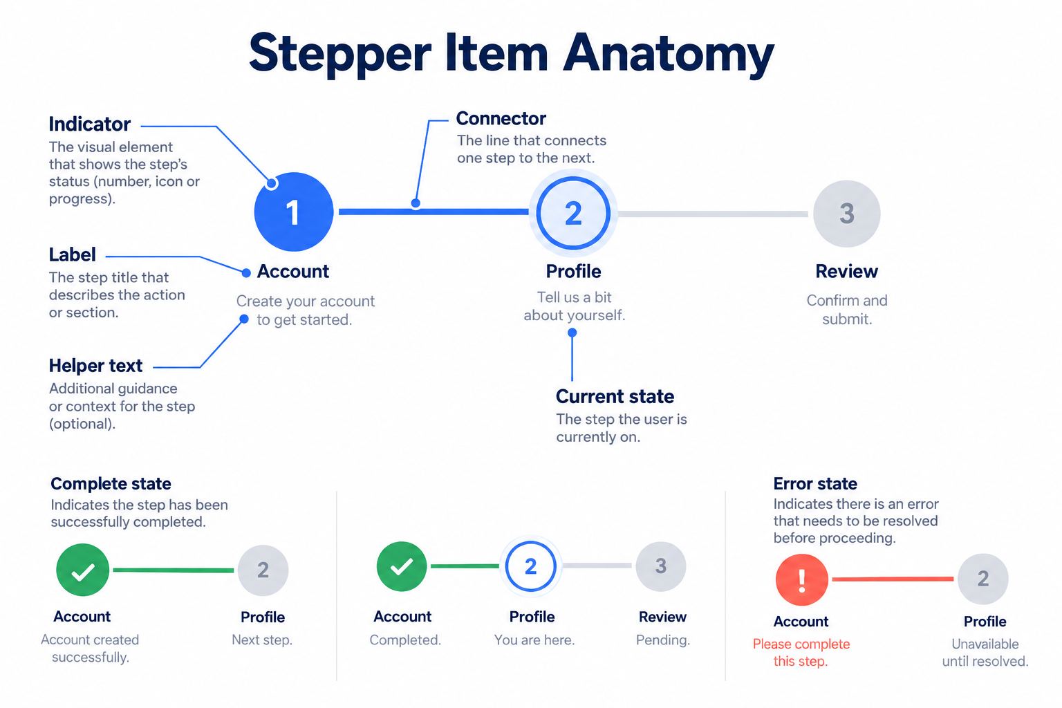
Open a design file in Pixso and create the smallest reusable unit: one step item. Add an indicator, label, optional helper text, and connector. Use Auto Layout to control spacing between the indicator and label, and place the item in a parent Auto Layout frame so text expansion does not require manual repositioning.
Create a component after the anatomy is stable. Name it by function, such as Stepper/Item, rather than by appearance. The editable artifact should contain text properties for the label and helper, plus a status property with meaningful variants: upcoming, current, complete, error, and disabled only when the workflow truly prevents access. The Pixso components documentation explains how related components and variants are organized.
Do not rely on color alone. Pair the current state with a visible label or distinct indicator treatment, complete with a checkmark, and error with an icon plus text. Keep labels readable at normal zoom and provide enough target space if completed steps are interactive.
Assemble horizontal and vertical stepper variants
Place four instances of the step item in a parent component called Stepper/Account onboarding. For wide screens, use a horizontal arrangement with flexible connectors. For narrow screens, use a vertical arrangement or a compact “Step 2 of 4” header paired with the current label. Shrinking four labels until they become unreadable is not a responsive solution.
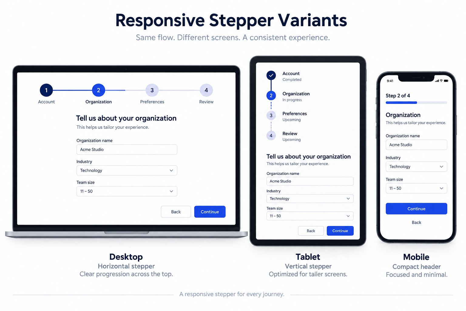
Use realistic labels when sizing: “Organization details” reveals spacing problems that “Step 2” hides. Test completed, current, error, and upcoming combinations. A progress stepper should not imply that users may select future steps if the workflow forbids it, so visually distinguish navigable completed steps from informational upcoming steps.
In the layer panel, keep a predictable hierarchy: stepper, item, indicator, status icon, label, helper, connector. Pixso's component structure and shared library can preserve this organization across screens. Designers still need to review every component instance after a master update, especially when local labels or state overrides exist.
Build the form shell and navigation states
Create a form shell beneath the stepper with a title, short instruction, field group, inline message region, and navigation row. Use consistent content width so the screen does not jump between steps. Back and Continue belong in stable positions, while the final action changes to “Create account” only on Review.
Represent navigation as separate frames or state groups in the design file:
- Ready: required fields are available; Continue is enabled according to the chosen validation policy.
- Validation error: entered values remain visible, an error summary identifies affected fields, and focus intent is documented.
- Saving: the step transition is waiting for a server response; repeated activation is prevented.
- Save failure: entered values remain available for correction or retry, except sensitive fields governed by security policy.
- Restored: a returning user sees previously saved progress and the last confirmed step.
Do not use disabled Continue as the only explanation for missing information. If the button is unavailable, state the unmet requirement nearby. In many forms, allowing activation and then presenting specific validation feedback is clearer than leaving users to discover why a control cannot be used.
Design error recovery with the same example
On the Account step, show an invalid email exactly as entered, an inline message that explains the required format, and an error summary linking to the field. The step indicator changes to error only after validation has run. It should not show red while the user is still typing a normal value.
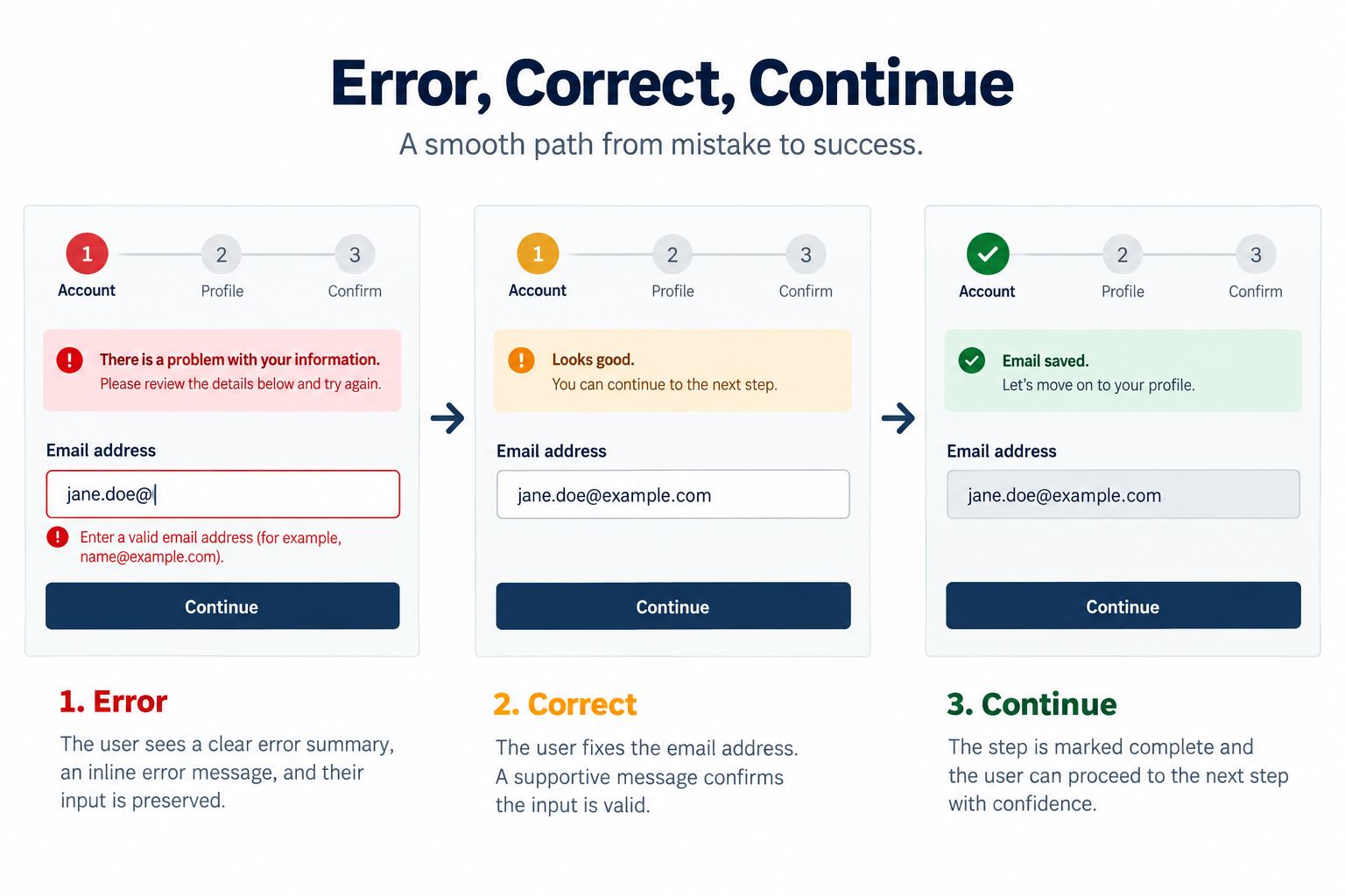
When users return from Review to Organization, preserve their valid and invalid entries so they can understand and correct them. Sensitive values such as passwords may require a different policy after session expiry; document that exception rather than promising universal persistence.
The Review step needs edit links that name their destination, such as “Edit organization.” If an earlier edit changes eligibility for later options, mark affected steps for review instead of silently keeping incompatible selections. This makes the multi-step form UI honest about dependencies.
Separate review, submission, and success
The Review frame summarizes Account, Organization, and Preferences without exposing the password. The user can go back, edit, and return. Selecting “Create account” starts whole-form submission, which is different from completing the Review step.
Create explicit submission frames: submitting, failed with retry, and success. During submission, retain context, show a progress label, and prevent duplicate requests. On failure, explain whether retry is safe and keep non-sensitive input available. On success, provide evidence that the account exists, such as the account email and a clear next action. A green checkmark beside every field is not sufficient proof of successful account creation.
Use comments in Pixso to review the state transitions with product and engineering. The design file communicates intended behavior; implementation must verify real validation, persistence, keyboard order, focus movement, announcements, request deduplication, and security.
Prepare the component set for review and handoff
Place the component anatomy, variants, responsive examples, and onboarding screens on a documentation page in the same design file. Include usage notes: when to use a stepper, maximum practical label length, whether completed steps are selectable, validation timing, persistence rules, and the mobile alternative.
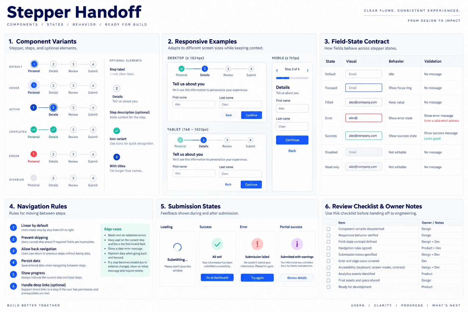
Publish approved components to the team library when your team's governance allows it. Developers can inspect spacing, typography, assets, and annotations in the shared file. If code generation is used, treat it as a starting artifact for engineering review rather than proof that the production form handles data and accessibility correctly. The Pixso collaboration workflow can keep comments and handoff context attached to the relevant frames.
Check labels, numbering, and accessibility intent
A step number can help users understand sequence, but it should not be the only label. “Step 2” has little meaning without “Organization details.” In the implemented multi-step form UI, the current step needs a programmatic indication, while visual complete and error icons need equivalent text. The page title and stepper should not announce contradictory positions.
Review stepper component design at 200% zoom and with long translations. Make sure status text remains adjacent to the correct step, connector lines do not imply skipped completion, and a vertical layout follows the expected reading order. If completed steps are links, their names should communicate destination. If they are not interactive, do not style them like buttons.
When documenting stepper component design, include focus intent after Continue, Back, validation failure, and submission failure. A design frame cannot prove focus behavior, but it can prevent ambiguity during implementation. Record whether focus moves to the new step heading, the first invalid field, or an error summary, then test that decision in the browser.
Stepper component design checklist
- The sequence reflects a real user task and is not arbitrary pagination.
- Current, complete, upcoming, error, and unavailable states are visually and textually distinct.
- Color is not the only status signal.
- Completed-step navigation and future-step access are explicit.
- Back navigation preserves correctable input according to security policy.
- Field validity, step completion, form submission, and final success remain separate.
- Long labels and narrow layouts use an intentional responsive variant.
- Errors identify the problem and provide a recovery path.
- Implementation testing covers keyboard order, focus, announcements, persistence, and duplicate submission.
Conclusion
Good stepper component design starts with the workflow contract and ends with tested recovery, not decorative numbered circles. In Pixso, build reusable step states, assemble responsive variants, apply them to one complete multi-step form UI, and document navigation, validation, persistence, submission, and success. The resulting editable component set gives design and engineering a precise artifact to review before implementation.