Scott
A bulk action should never make someone guess what “selected” means. Show the count, name the selection scope, preview the consequence, and return a result that identifies both successful and failed records. These four signals matter more than an oversized toolbar. The difficult case is not selecting five visible rows; it is selecting five rows, changing a filter, and then wondering whether an action will touch five records or every match.
Consider an operations team updating a supplier directory. A reviewer wants to archive 14 outdated records from a filtered result of 86. We will design the interaction as a UI workflow in Pixso, where the table, selection state, confirmation and result can be compared as connected screens. The table is a fictional application being designed, not a native Pixso record-management feature.
Define the selection scope before placing a checkbox
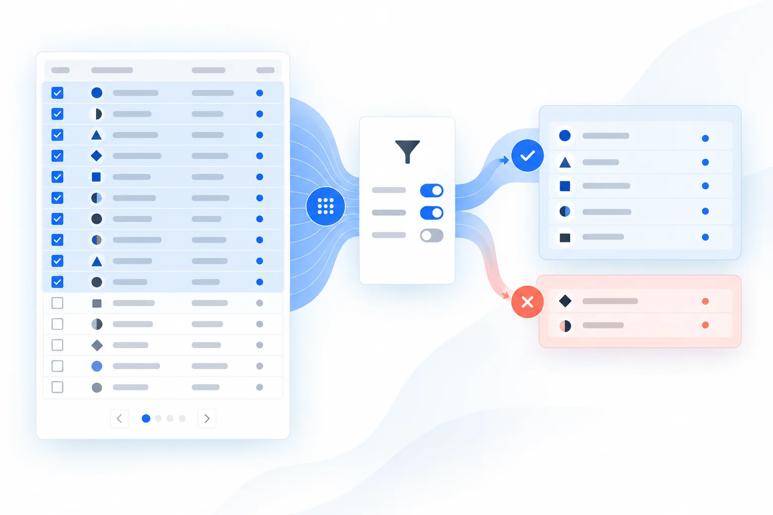
“Select all” is incomplete when the table is paginated. Does it select the 25 rows currently rendered, all 86 matching the filter, or every record in the directory? Pick a rule and express it next to the control. In the supplier example, the header checkbox selects only the current page. A separate, explicit link can extend the selection to all 86 filtered results. Never turn a page-level click into a site-wide operation without a second choice.
State the count in the same language as the task: “25 suppliers on this page selected” and then “Select all 86 suppliers matching this filter.” When the selection is extended, replace the first message with “All 86 matching suppliers selected.” A reviewer should not have to infer scope from the checkbox icon. The mixed state of the header checkbox means some, but not all, rows in its defined group are selected; it does not mean an action is partly complete. The W3C checkbox pattern describes checked, unchecked and mixed states and their keyboard interaction.
A server-backed “all matching” selection may represent a query rather than an array of IDs. If the results can change while the selection is active, decide whether the action uses a frozen snapshot or the current query result. The interface should say which. Otherwise a new record arriving under the same filter could be archived without ever appearing in the reviewer’s selection.
Keep selection stable while the context changes
Pagination, sorting and filtering test the selection model. If the reviewer selects six rows, moves to page two and selects eight more, the toolbar should show 14 selected, not merely the eight visible on page two. Returning to page one should restore the six checked rows. If this product does not support cross-page selection, clear the selection when changing pages and announce that behavior before the person loses work.
Filtering is more subtle. Imagine the reviewer selects 14 suppliers, then changes the status filter from “Inactive” to “All.” There are two defensible designs: preserve the 14 selected IDs and show that some are outside the current view, or clear them with an explicit notice. Silently retaining hidden selections is dangerous; silently clearing them is frustrating. A compact message such as “14 selected; 6 are hidden by this filter” gives a path to inspect or clear the hidden records.
Keep row identity stable. A checkbox belongs to a supplier ID, not to row 7 of the current sort. When a result is reordered, selection must follow the record. This is also why the action bar should name the entity, not only a number: “Archive 14 suppliers” is clearer than “Archive 14.”
Show actions only when they apply
The bulk toolbar appears after at least one row is selected, but its position should not shift the table so abruptly that the pointer lands on a different row. Reserve its space or attach it to a stable region. Put the most likely non-destructive action first. Separate “Archive” and “Delete” if both exist: one changes visibility, the other may remove data. A single generic “Remove” label hides the distinction.
Eligibility may vary by record. If two of the 14 suppliers cannot be archived because they have active orders, decide whether to disable the action entirely or process the 12 eligible records. Either approach can work, but the interface must preview the exception before submission. “12 can be archived; 2 have active orders” tells the reviewer more than a disabled button. For an irreversible action, name the selected object and consequence in the confirmation. For a reversible archive, a clear undo path may be more useful than a blocking dialog; the delete confirmation UX guide examines that decision in depth.
Preview the specific consequence
Before the supplier archive runs, a confirmation can state: “Archive 12 suppliers. They will leave the active directory; 2 selected suppliers with open orders will remain.” Offer a list or expandable detail of the affected names when the cost of a wrong choice is high. Do not substitute an abstract “Are you sure?” for a factual preview.
Make scope and action agree. If the toolbar says “14 selected” but the confirmation says “12 will be archived,” explain the difference in the confirmation and in the final result. If records are spread across pages, the preview should remain independent of the current page. Where the user lacks permission for some records, do not present them as eligible merely because their checkboxes were visible.
For a very large set, showing every name may be impractical. Use a precise count, the filter criteria that formed the set, a few representative examples and an accessible route to inspect the full selection. If the operation will run in the background, say how completion or failure will be reported. Do not promise an immediate result for work that is asynchronous.
Report partial success with a recovery path
After submission, “Done” is not enough. Suppose 11 suppliers were archived, one update failed due to a temporary server error, and two were ineligible. The result should name all three groups: “11 archived, 1 not archived, 2 unchanged.” Keep the failed supplier selected or provide a direct “View failed record” route. Retrying should target the failed ID only, not repeat the whole batch and risk applying an action twice.
Do not clear the selection before the result is known. During processing, show an in-progress state and prevent accidental duplicate submission, while allowing the reviewer to understand which set is being processed. On completion, announce the result in a way assistive technology can perceive; W3C’s status-message guidance covers non-disruptive feedback for success, progress and errors. A transient toast should not be the only place where a partial failure is described.
If undo is offered, its scope must match the operation. “Undo archive of 11 suppliers” is meaningful; “Undo” without an object is ambiguous when other table changes can occur. If the action cannot be undone, show that fact before submission rather than as a surprise afterward.
Prototype one complete reviewer journey
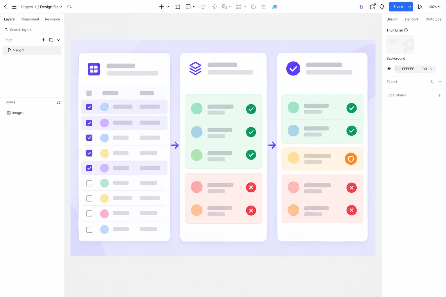
In Pixso, create four screens for this supplier-directory exercise: a filtered table with six selected rows, a second page with eight additional selections, a confirmation showing 12 eligible and two blocked records, and a result showing 11 successes plus one retryable failure. Keep the supplier names and counts consistent across every screen. The design file is a place to inspect the proposed application UI and discuss its behavior with the team; the application’s server-side eligibility rules still need implementation.
Give a reviewer this task without explaining the interface: “Archive the inactive suppliers except those with open orders.” Observe whether they can tell what happens when they change pages, whether they see the two blocked records before committing, and whether they can locate the single failed record afterward. A design that passes only the first-page happy path is not ready for a real bulk operation.
Bulk-action UX works when the interface preserves the connection between a record, its selection and its outcome. The control should communicate the exact set before action; the result should account for every member of that set after action.