Scott
Design the page around one useful conversion
A landing-page conversion is the action the page is designed to support: a signup, a qualified enquiry, a download or a purchase. Good landing page design makes the offer easy to understand, gives visitors a reason to trust it and carries them through that action without avoidable friction.
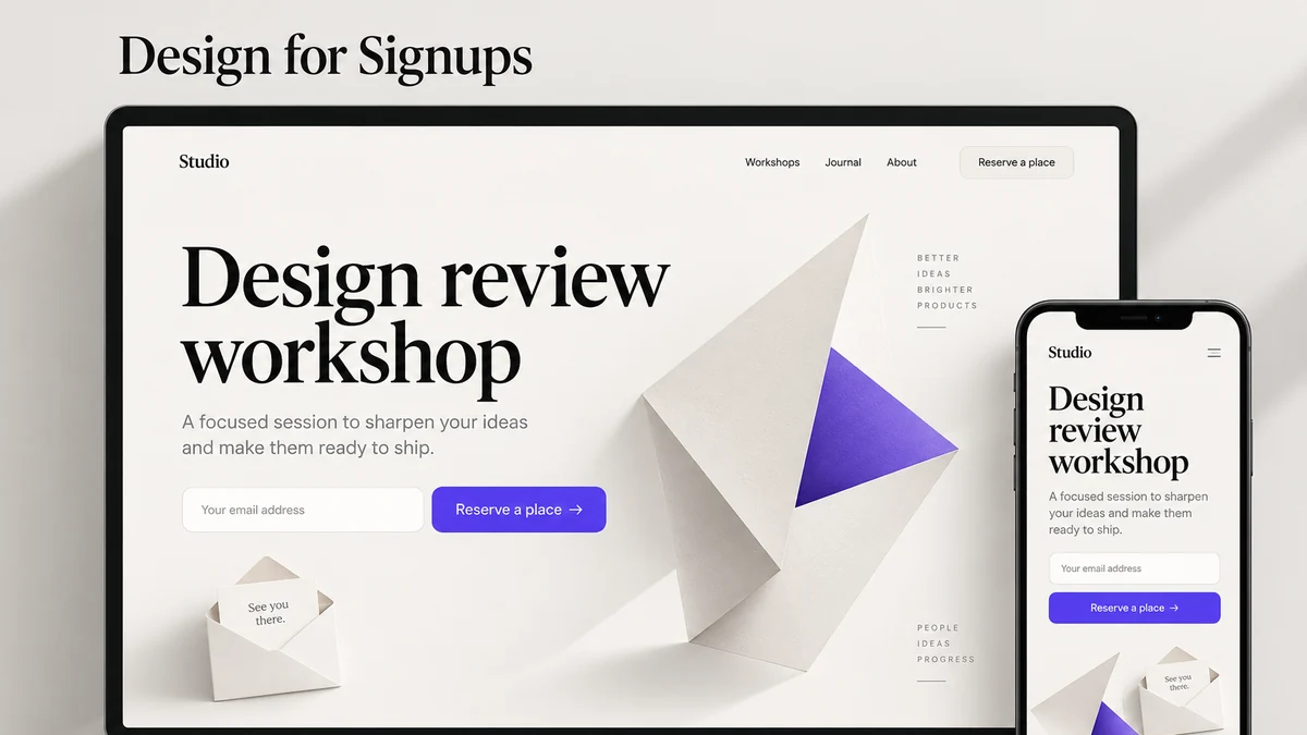
Take a signup page for a design-review workshop. Its audience is designers who need a better way to discuss unfinished work. Its promise is a practical session on giving useful feedback. The main action is “Reserve a place,” followed by an email explaining how to join. The page needs to answer what the session covers, who it suits, when it happens and what the visitor will receive—not merely collect a click.
This example runs through the layout, form and measurement decisions below. Keep the offer and audience constant while reviewing the design so a changed result has an explanation.
1. Define the audience and task
Write the situation in the audience’s language. “A designer who needs to review a prototype with a remote team” is more useful than “everyone who wants better collaboration.” Identify the trigger that brought the visitor to the page and the question they need answered before they act.
For the workshop, the practical questions are whether it covers the visitor’s type of work, whether they need to prepare a file and whether the time suits them. Put the topic and audience in the headline and supporting copy, then place the schedule, time zone and preparation details near the signup. Link to fuller access or privacy information where it affects the decision. A vague “Transform your design workflow” headline leaves all of those questions unanswered.
2. Build the message hierarchy
The first viewport should communicate who the page is for, what the product helps them do and what the next action is. A headline can be concise; the supporting line should supply the missing context. Use a descriptive CTA such as “Start a UI review” or “Compare workspace plans” when the result is known. “Learn more” is useful only when the destination is clear from its surrounding text.
Write the workshop hero as a connected argument: “Make your next design review useful” names the outcome; “Practice turning vague feedback into decisions about a real interface” explains the activity; “Reserve a place” names the action. Add the actual date, time zone and any fee beside it when the offer is ready to publish.
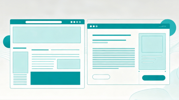
On desktop, the explanatory copy and signup can sit beside one another. On a phone, place the promise and essential conditions before the form, then the detailed agenda. This is a reading sequence, not a fixed F- or Z-shaped eye path: the same content must remain understandable when it stacks and wraps.
3. Use proof without turning it into a promise
Choose proof that answers the offer’s hardest question. For a workshop, show a short agenda, the host’s relevant experience and an example of the exercise. A before-and-after feedback note—“Make it pop” changed to “Increase the contrast of the primary action”—shows the teaching approach more clearly than an unrelated wall of customer logos.
Use attendee quotes only with permission and context, and connect any measured result to the session and population that produced it. If the workshop is new, let the agenda and exercise do the work rather than inventing attendance figures or promising better conversion rates.
4. Explain the workflow visually
Use a short sequence to show what happens after the first action. For a design collaboration page, the sequence might be import or create, invite reviewers, collect decisions and hand off the approved state. Each step should answer one question and link to supporting detail if needed.
The visual should work without tiny labels. Add a text caption or numbered list for people using zoom, a screen reader or a slow connection. Avoid a carousel that hides the only explanation of an important capability. If an animation illustrates a relationship, provide a still version and respect reduced motion.
5. Design the form as part of the promise
Ask only for information needed at this step. Explain required fields, use a suitable input type and preserve values after a validation error. Tell the visitor what happens after submission: an email, a workspace, a demo request or a confirmation page. A disabled submit button that supplies no reason can make a valid task feel broken.
Model more than the success state:
| State | User needs to know | Design response |
|---|---|---|
| Empty | What belongs in this field? | Label, example and requirement |
| Editing | Is the value valid so far? | Non-blocking guidance where useful |
| Invalid | What is wrong and how do I fix it? | Specific message beside the field |
| Submitting | Did the request start? | Progress and disabled duplicate action |
| Failure | Was anything saved? | Preserve safe input and offer retry |
| Success | What happens next? | Confirmation, expectation and return path |
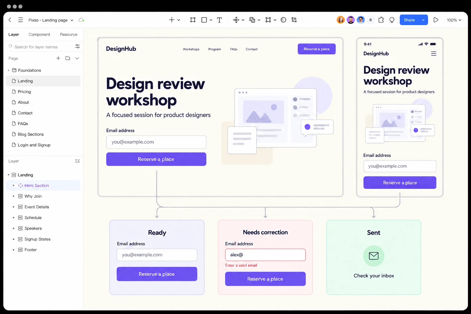
For the workshop, start with the email address needed to send joining details. Keep the label visible after typing. If a visitor enters “alex@”, place “Enter a complete email address” beside the field, preserve the entry and let them correct it. After an accepted submission, show “Check your inbox” and explain what message to expect.
Format validation is only the first check: it does not establish that an inbox exists or that the visitor owns it. Use server-side validation and the appropriate confirmation flow in the implementation. MDN’s form-validation guide distinguishes browser checks from server validation; W3C’s notification guidance covers clear field errors and successful submissions.
Build the same signup promise at desktop and mobile widths in Pixso. Keep the headline, email field and next action consistent, then place the empty, invalid and sent states beneath the layouts. A visitor should see how to correct the field and what happens after submitting it. Review that sequence with marketing and development before implementing the page or measuring conversions.
6. Make accessibility part of conversion quality
The WCAG 2.2 requirements are a baseline for a page that people can perceive, operate and understand. Check heading order, keyboard focus, contrast, text enlargement, target size, link names and form errors. A color change alone cannot communicate success or failure. A modal with no keyboard exit or a button that becomes unreachable when text is enlarged can prevent the intended action regardless of visual polish.
Test the page with the actual content and a narrow viewport. Long words, translated strings, browser zoom and a virtual keyboard can change the hierarchy. A high-performing experiment that excludes users is not a finished design; accessibility is part of the product promise and the measurement context.
7. Responsive layout and performance
Design the first viewport for the user’s task, not for a fixed screenshot. Define what reorders, collapses or remains persistent on a phone. Keep the primary action reachable when text wraps. Do not hide essential conditions in a horizontal scroll area.
Use one appropriately sized hero asset, reserve its space and lazy-load images below the first viewport. A landing page should not make a visitor download a large video before they can read the promise. After launch, check the image dimensions, alternative text and caching behavior on the live landing page. Performance issues can look like copy or conversion issues when people leave before the page appears.
8. Design experiments that can be interpreted
An A/B test is not a license to change every element at once. Choose one primary outcome, define the audience and observation window, and record all material changes. A click can mean curiosity rather than qualified interest; a form completion can be followed by invalid data or no activation. Pair the event with a downstream signal where the product can measure it responsibly.
For the workshop page, distinguish three events: accepted form submission, confirmed registration and attendance. Choose the event that matches the page’s purpose as the primary outcome, and use later steps to detect poor-quality signups. Do not call a click on “Reserve a place” a registration if the form can still fail.
To compare layouts, keep the offer, audience rules and form fields unchanged, then test whether putting the preparation details beside the form helps visitors decide. Record the denominator as well as the outcome. As an arithmetic example, 40 confirmed registrations from 1,000 eligible visitors is a 4% registration rate; those numbers describe a calculation, not a result from this page. A percentage by itself says nothing about whether the change caused an improvement.
Plan the test window and sample rule before reading the result. Include traffic source and device mix in the analysis, and watch whether a higher signup rate is followed by more invalid contacts or fewer attendees. When traffic is too low to distinguish variants reliably, examine the signup task with intended visitors and fix observable friction first.
9. Handoff with context
Provide the source design, content states, asset dimensions, analytics event names, privacy or cookie requirements, accessibility notes and unresolved questions. State which CTA is primary and what the confirmation or failure path does. A developer should not have to reconstruct the experiment from a screenshot.
Include a content freeze date and an owner for legal, pricing and eligibility text. Dynamic plan names and prices can change; let the CMS or product source supply them rather than duplicating stale copy in an image. If a localized page exists, translate the promise and error states as a unit instead of leaving an English CTA inside a translated layout.
A practical review table
| Layer | Review question | Evidence |
|---|---|---|
| Audience | Can the intended visitor recognise the page? | First-screen comprehension |
| Promise | Is the outcome specific and bounded? | Copy review and source |
| Proof | Can a visitor verify the claim? | Dated reference, demo or example |
| Action | Is there one clear next step? | Focus order and click path |
| Form | Can a person recover from an error? | State test with long/invalid input |
| Access | Can keyboard, zoom and assistive tech use it? | Accessibility test record |
| Measurement | Can the result be interpreted? | Event and experiment plan |
Where to look when visitors do not complete the form
If people leave before reaching the offer, inspect load time, message clarity and traffic relevance. If they start typing but do not submit, inspect field requirements, error messages and the mobile keyboard layout. If the form succeeds but registration remains low, inspect confirmation delivery and the explanation of the next step.
Match the redesign to that point of failure. Replacing the hero image will not repair a missing confirmation email; shortening a form will not make an irrelevant offer more useful. The page, the form and the post-submit experience need to make the same promise.
Further reading and sources
- WCAG 2.2
- WCAG target size
- Pixso’s landing-page design tips, UI design process, typography guide and web designing page.
FAQ: interpreting a landing-page result
Should a landing page have only one link?
It should have one primary action. Supporting links can be appropriate when visitors need security, pricing, documentation or legal information before they decide. Give each supporting link a descriptive name and make its relationship to the primary action clear; do not hide necessary evidence to force a click.
Is a longer page always worse?
No. Length should follow the questions the audience needs answered. A complex enterprise decision may require security, workflow and implementation detail, while a simple campaign may need only a concise explanation. Use headings, summaries and progressive disclosure so a reader can stop when the decision is clear.
What if traffic is too small for an A/B test?
Use a qualitative task review, a usability session, a copy comprehension check or a before/after observation with a clearly bounded period. Record the limitation. A small sample can reveal a broken form or ambiguous label without supporting a precise percentage claim.
Content and legal review
Landing pages often contain the most frequently edited claims: plans, eligibility, privacy, integrations and customer names. Give these fields a source of truth and an owner. Never embed a changing price or guarantee in a hero image. A reviewer should be able to trace a statement from the page to the current product or legal source and see when it was checked.