On this page

Scott
A cognitive walkthrough inspects whether a first-time user can work out each step of a task. Reviewers predict learnability problems from the interface; the output is a set of findings to investigate with users.
You can prepare the screens and discuss findings in a UX design workspace. Start with one complete task. The example below follows a library member reserving a book for collection, including the important difference between requesting a book and being told that it is ready.
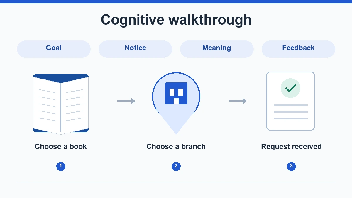
When to use a cognitive walkthrough
Use a walkthrough for an unfamiliar route, where a newcomer has to discover what to do. A heuristic evaluation checks broader usability principles. Usability testing observes participants; a walkthrough predicts where they may struggle.
The four questions below follow Nielsen Norman Group's cognitive-walkthrough method. Our library scenario is an illustrative design exercise, not a report of a library study.
For this example, the member knows which book they want and has a library account. They have never placed an online reservation. They understand a branch as a physical library, but do not know the service's internal terms. These assumptions matter: a staff member who uses the catalogue every day would interpret the same controls differently.
Define the task and its actual endpoint
Write the task in the member's language: “Reserve this book so you can collect it at the Central branch.” The endpoint is a recorded reservation for the right book and branch, with a clear explanation of what happens next. It is not a completed collection or proof that a copy is already waiting.
Prepare four states: book details, branch selection, reservation review and confirmation. Include the book title, branch, availability and any information that changes the member's decision. If the prototype starts after sign-in, record that starting condition. Do not silently skip an authentication step and then claim the whole reservation journey was inspected.
Also prepare one unavailable state. A route that only works when a copy is immediately available leaves the hardest wording unexamined. Here, the book is available to reserve but must be transferred from another branch. The design therefore needs to distinguish a successful request from readiness for collection.
Ask four questions at every meaningful action
- Goal: Would the member understand why this action helps with the task?
- Visibility: Would they notice the action they need?
- Meaning: Would they connect the control's wording with the intended result?
- Feedback: After acting, could they tell what changed and what to do next?
Use only information available on the screen. If reviewers need an explanation from the designer, record what the interface leaves unclear.
Inspect meaningful decisions separately. Choosing a collection branch warrants a step; moving the pointer does not.
Worked example: reserve a library book
1. Find the reservation action
The book page displays “Available at another branch” and a button labelled “Request item.” The member's goal is to collect a copy at Central. The button is easy to see, so visibility is not the main issue. Its meaning is less clear: does “request” reserve a copy, ask staff a question or suggest a purchase?
A more specific option is “Reserve for collection,” followed by the branch choice. Keep “Available at another branch” as useful context. Removing the availability information to make the page shorter would make the next decision harder. The finding should identify the ambiguous action, rather than simply asking for a larger button.
2. Choose where to collect it
The next screen lists Central, Riverside and North. Its heading says “Location,” while the highlighted entry reflects the branch that currently owns the copy. A new member may assume the highlighted branch is the only place to collect it.
Separate ownership from collection. Label the choice “Collection branch,” show Central as a selectable destination, and explain the transfer if it affects timing. The reviewer should be able to point to the text that supports this interpretation. If the service does not allow transfers, the proposed design must respect that rule instead of offering a false choice.
3. Review before confirming
The review screen should repeat the selected book and collection branch. Suppose it shows the title but omits the branch. The member cannot confirm whether their earlier choice was retained. That is a feedback gap between steps, even if the final button works.
Add the branch and a way to change it before submission. After returning from the branch selector, preserve the book choice. This makes the design's state visible and prevents a correction from unexpectedly restarting the whole request.
4. Interpret the result
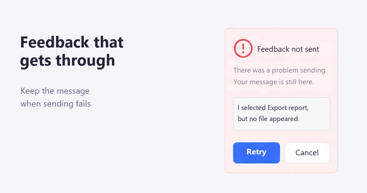
A confirmation that says only “Success!” leaves the member guessing whether to visit the branch now. For this scenario, a clearer result is: “Reservation received. Collect at Central after your ready-to-collect notification.” Show the book title and a link to the reservation details.
The distinction is consequential. A successful reservation is not a promise of immediate availability. If the expected timing is unknown, explain the next notification instead of inventing a collection date. A later ready-to-collect state should use different wording from the initial request confirmation.
5. Review the unavailable route
If no reservable copy remains, do not reuse the success screen. Explain that the request was not created, retain the chosen book and offer a meaningful next action, such as viewing another edition if the service supports it. “Try again” alone is unhelpful when retrying cannot change the underlying availability.
Keep this branch distinct in the walkthrough record. A good primary route does not cancel a blocked alternative. Conversely, a missing backend response in a prototype is a limitation of the artifact; it is not evidence that the production service mishandles reservations.
Record a finding that leads to a design decision
Use one row per problem. Keep the screen condition separate from the predicted effect and the proposed change. That distinction helps a developer or researcher challenge the explanation without losing the original observation.
| Step and visible condition | Likely difficulty | Design response and follow-up |
|---|---|---|
| Book details: “Request item” | Member cannot tell whether this starts a reservation. | Use task-specific wording; check whether new members understand it without explanation. |
| Branch selection: “Location” and an owning branch highlighted | Member may confuse storage location with collection destination. | Separate those concepts and make transfer conditions visible. |
| Confirmation: “Success!” | Member may travel to the branch before the book is ready. | Distinguish reservation received from ready for collection; check interpretation. |
Prioritize by the consequence in this task. An unnecessary journey to the library matters more than a minor alignment issue. Record uncertainty about frequency instead of inventing a percentage. If reviewers disagree, identify the assumption behind the disagreement: for example, whether the member has previously used another reservation system.
Prepare and review the flow in Pixso
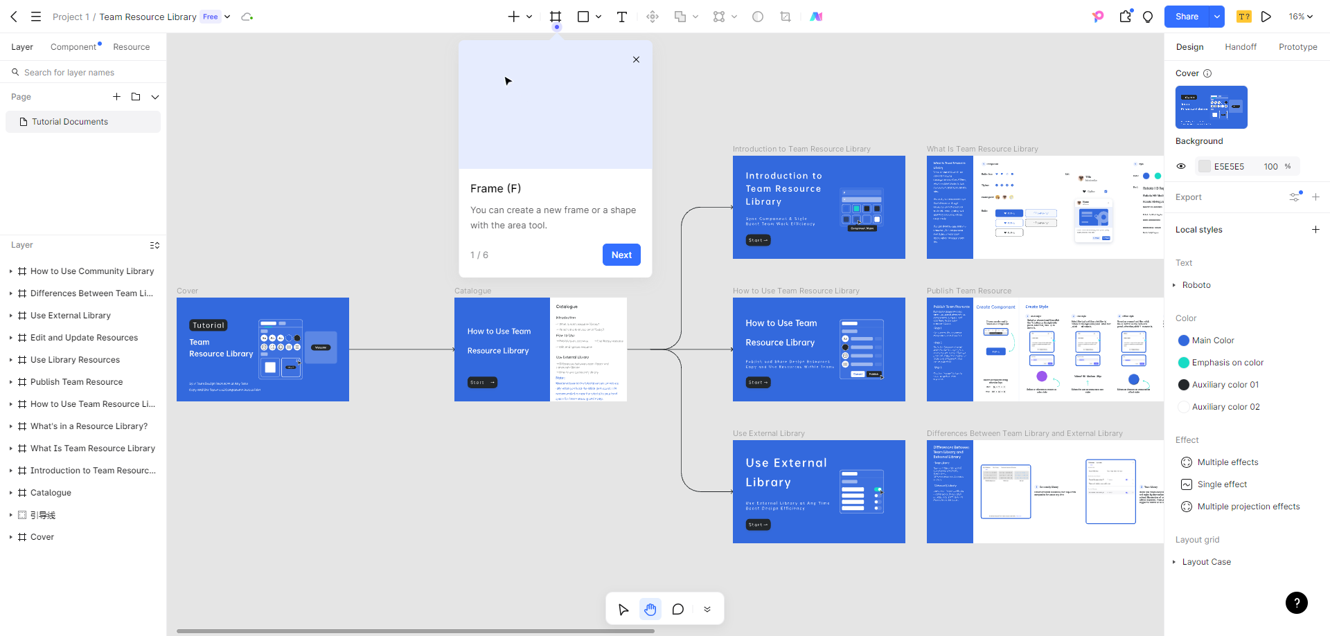
Keep the book details, branch choice, review and confirmation as separate frames. Connect the intended actions, including a return to the branch choice and the unavailable route. Set an appropriate starting point and open the presentation. A reviewer should encounter the same information the hypothetical member would see, rather than starting at the final screen.
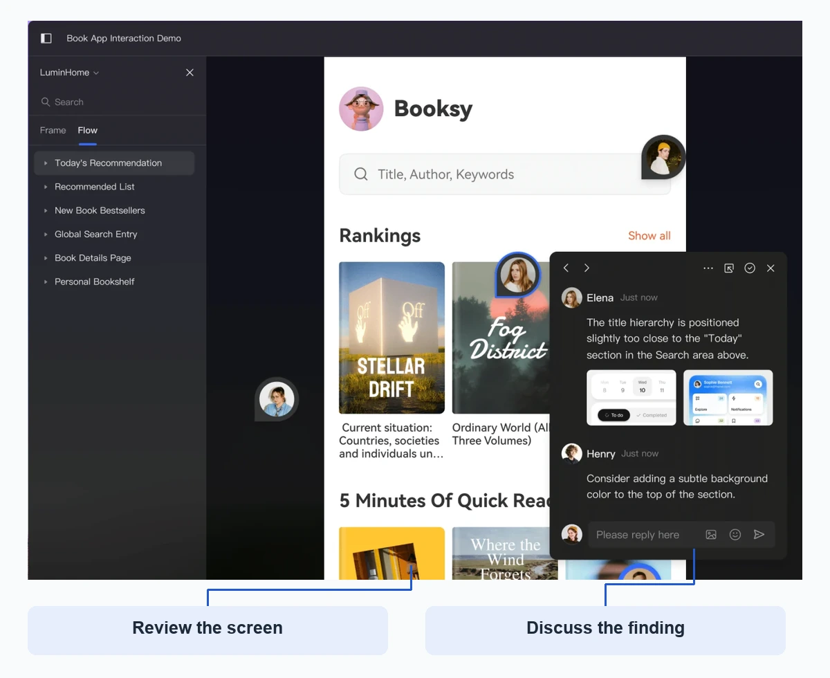
Attach a comment to the relevant label or state and reference the step in the finding record. Keep the proposed wording near the affected frame so the team can compare it. Comments document the discussion; they do not automatically establish that a first-time user would succeed.
Use the prototyping controls to demonstrate the proposed changes, then repeat the same task from its original starting state. Check that the new collection label, review screen and final message agree. A copy change on only one screen can leave the flow contradictory.
Turn the strongest prediction into a user test
The confirmation problem gives the next study a clear question: after placing the reservation, does a new member understand when to visit the branch? Ask them to reserve the book and explain what they would do next. Do not tell them to wait for a notification in the task itself; that would supply the answer you want to evaluate.
Use goal-based usability test tasks to keep the instructions neutral. If participants still misunderstand the result, revisit the message and the timing information together. If they understand it but cannot find their reservation later, that is a different task and should have its own review.
A useful walkthrough ends with an improved flow and a few explicit questions to verify. For this library example, the priority is a consistent distinction between choosing a collection branch, submitting a reservation and receiving permission to collect. More screens or more animation would not solve that ambiguity on their own.