Scott
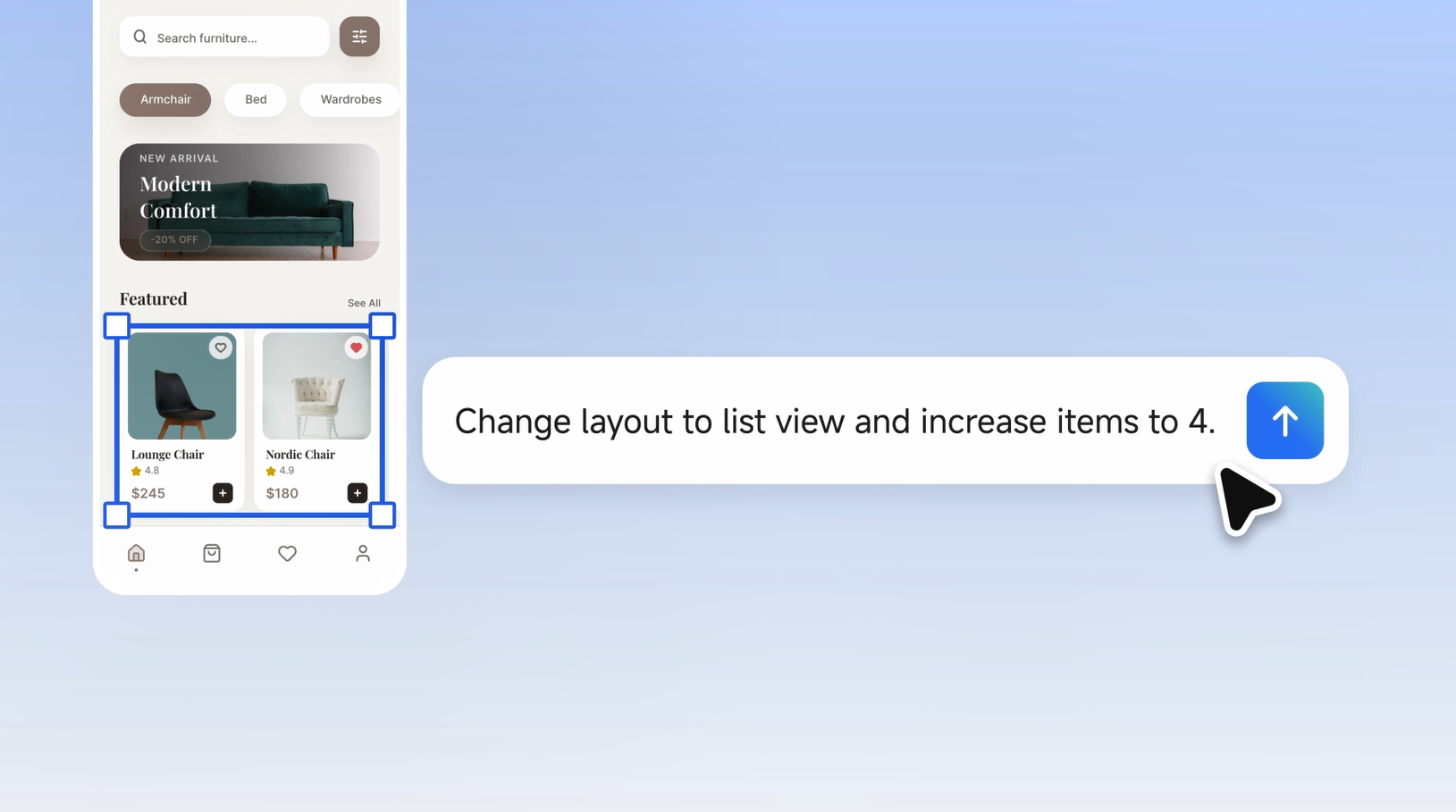
A grid view excels at visual discovery, while a list view is built for structured data comparison. In real-world product workflows, designers cannot rely on intuition alone; they need to test both layouts side by side to validate decisions with stakeholders and user data. However, manually duplicating artboards, restructuring Auto Layout frames, and adjusting component hierarchies across variations often consumes days of repetitive production work.
Pixso AI eliminates this bottleneck by automating structural transformations directly on the design canvas. With simple text prompts, designers can instantly convert a multi-column grid into a clean list view, generating fully editable vector layers with adjusted proportions and spacing in seconds. This guide breaks down a practical decision framework, supported by real-world case studies, to help you explore and compare UI variations with maximum efficiency.
Part 1. How to Choose Between Grid View and List View
1.1 Grid View: Strengths and Strategic Use Cases
A grid layout is a visually driven UI structure that organizes content into two, three, or more responsive columns. Its primary advantages are high visual density and strong aesthetic impact.
Ideal use cases for grid layouts include:
- Products where imagery is the primary decision driver, such as fashion apparel, home decor, and digital artwork.
- Discovery oriented user journeys where browsing precedes deliberate filtering.
- Content items with minimal accompanying text and few technical specifications.
- Screen real estate where maximizing the number of visible items above the fold is essential.
Grid layouts also have clear trade offs. When content cards require dense metadata, multiple lines of descriptive copy, pricing tiers, and action buttons, a multi column grid quickly becomes cluttered, making it difficult for users to scan key details.
1.2 List View: Strengths and Strategic Use Cases
A list layout is an information first structure that presents content in a single, full width vertical column. Each row provides ample room for structured typography, subheadings, descriptive badges, and interactive elements.
Ideal use cases for list layouts include:
- Catalog items requiring explicit parameter comparison, such as product names, exact dimensions, stock status, and ratings.
- Analytical user tasks focused on filtering, sorting, and systematic evaluation.
- Mixed content types that require a consistent, standardized visual spine.
- Workflows where users need to make fast, informed decisions with minimal cognitive friction.
The limitation of a list layout lies in its lower visual density. For image heavy browsing experiences, a standard vertical list can feel monotonous and limits the number of items visible per viewport.
1.3 Why There Is No Universal Default
A common design pitfall is choosing a layout based on personal preference without testing alternatives in context. In practice, the ideal layout depends on user intent, device constraints, and the specific stage of the product lifecycle.
This reality highlights the importance of rapid layout exploration. The objective is not to guess a single correct answer upfront, but to produce multiple viable directions rapidly, giving design reviews and usability tests tangible visual evidence.
Part 2. Core Capabilities of AI in Layout Exploration
While several platforms offer generative features, their capabilities in structural layout exploration vary significantly.
Mainstream tools often restrict their automated capabilities to basic layer renaming, asset population, or style token generation. When a designer needs to convert an entire catalog layout from cards to rows, manual restructuring is still required. Some code generation platforms build functional front end interfaces from prompts, but they lack vector editing flexibility on the design canvas. Other wireframing tools produce rapid low fidelity drafts, which fall short when evaluating polished, high fidelity UI options.
Pixso takes a distinct approach by merging native vector manipulation with semantic prompt parsing. Designers can execute structural layout transformations through natural language prompts directly on the design canvas, drastically accelerating layout exploration.
2.1 Key Capabilities of Pixso AI for Layout Exploration
Semantic Intent Analysis
Before executing any layout transformation, Pixso AI inspects the existing canvas structure. It identifies container frames, content cards, image ratios, and repeating list elements. This semantic comprehension ensures genuine structural transformation rather than crude layer duplication.
Automated Structural Restructuring
When you select an existing product grid and enter a prompt such as "Convert this layout into a single column list view while retaining the thumbnail, title, price, and customer rating," the system automatically executes several operations:
- Recalculates card dimensions and horizontal constraints.
- Reconfigures image and text relationships, shifting from stacked vertical cards to side by side horizontal rows.
- Realigns padding and gap parameters according to the active design token system.
- Preserves existing typography scales, color styles, and component libraries.
This transformation completes in seconds and produces native, editable vector frames rather than static flattened bitmaps.
Parallel Multi Variant Generation
Pixso AI allows designers to explore multiple layout paradigms simultaneously. Within the same workspace, you can instruct the engine to generate a compact list view, a multi-column grid view, and a masonry layout in parallel. Placing these alternatives side by side gives product teams an immediate comparative view during design critiques.
Each generated iteration is tracked within version history, allowing designers to experiment freely with full rollback capabilities.
Context Aware Refinement
When refining a selected layout, Pixso AI retains conversational context. It tracks prior prompt adjustments and understands overall page hierarchy, ensuring that secondary modifications preserve global visual cohesion.
Part 3. Step by Step Workflow: E-Commerce Mobile App Layout Exploration
To see how ai tools that generate different ui design variations streamline production, consider this practical scenario: designing a category listing page for a lifestyle e-commerce mobile application featuring product images, brand tags, titles, pricing, and review scores.
Step 1: Open Pixso and Set Up the Base Frame
Create a new file in Pixso or import an existing vector file directly from your current design library. Structuring your initial product card with Auto Layout components ensures optimal accuracy during automated transformation.
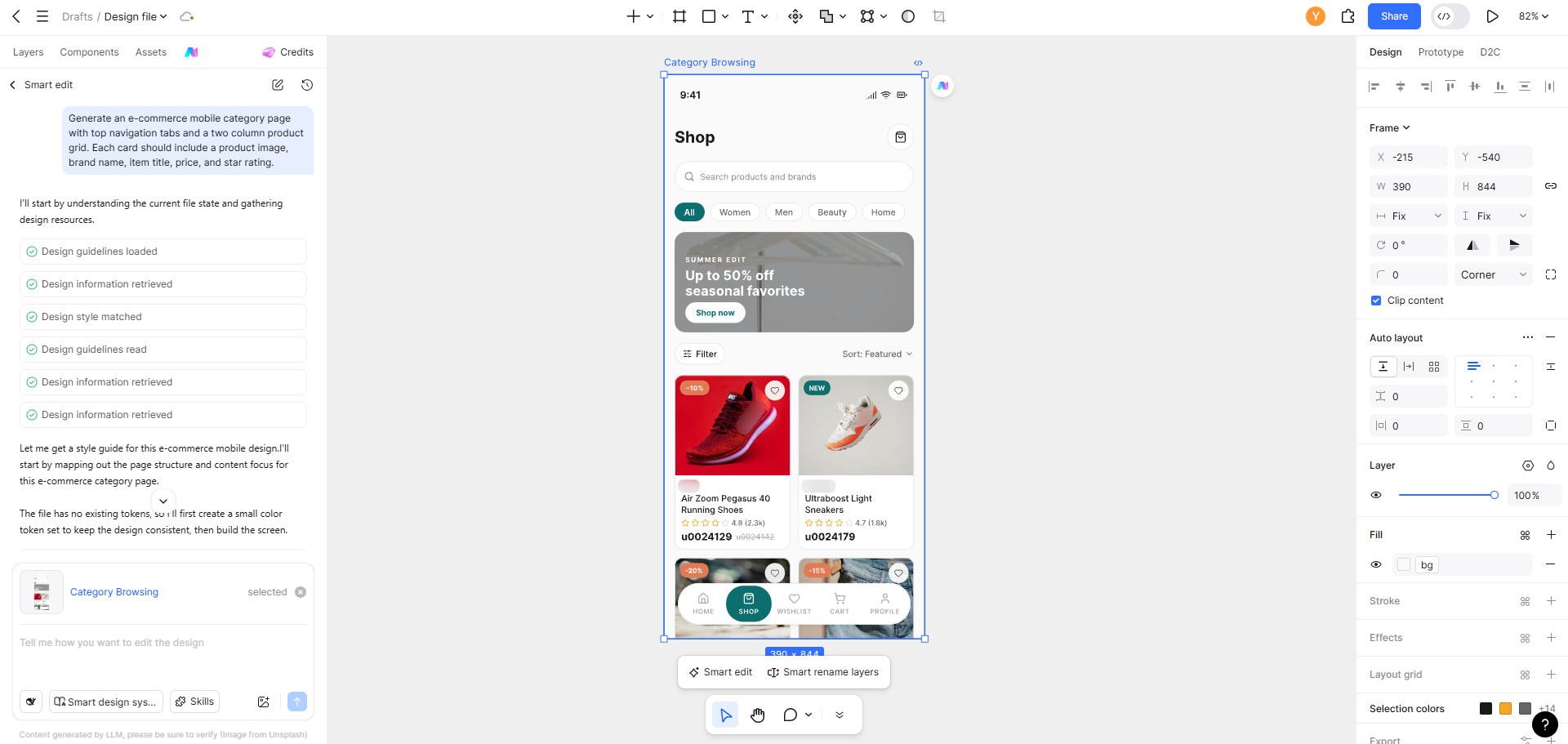
If starting from scratch, you can generate the baseline screen using a prompt:
"Generate an e-commerce mobile category page with top navigation tabs and a two column product grid. Each card should include a product image, brand name, item title, price, and star rating."
Pixso AI will produce a structured mobile frame with clean component layers and predefined styles.
Step 2: Select the Target Component and Apply Layout Transformation
Select the product grid frame. The contextual AI assistant panel will analyze the selection and offer relevant transformation options.
Enter the following prompt:
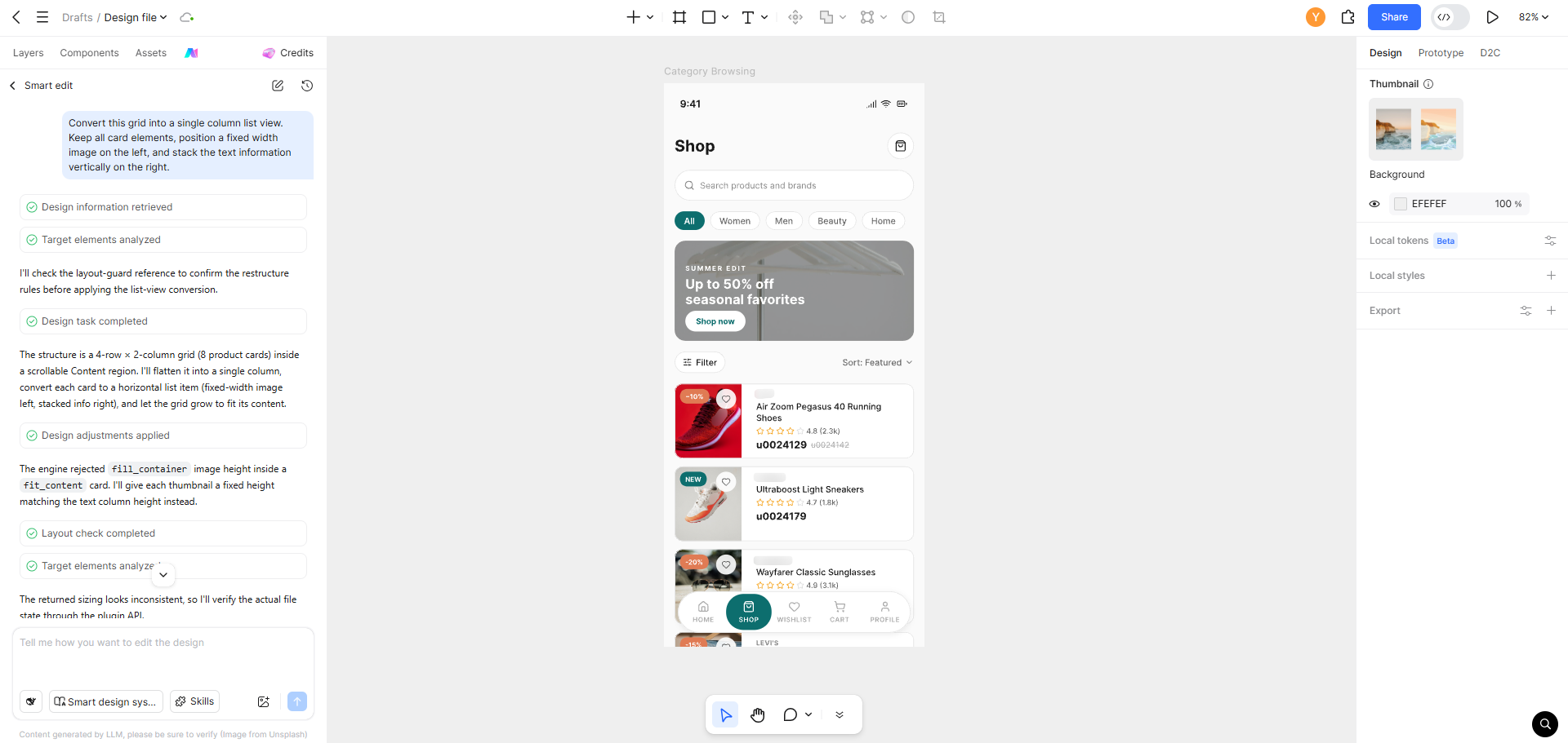
"Convert this grid into a single column list view. Keep all card elements, position a fixed width image on the left, and stack the text information vertically on the right."
Pixso AI will systematically restructure each component into a clean row format in real time.
Step 3: Generate Alternative Variations in Parallel
Expand the exploration by requesting additional layout patterns through the prompt console:
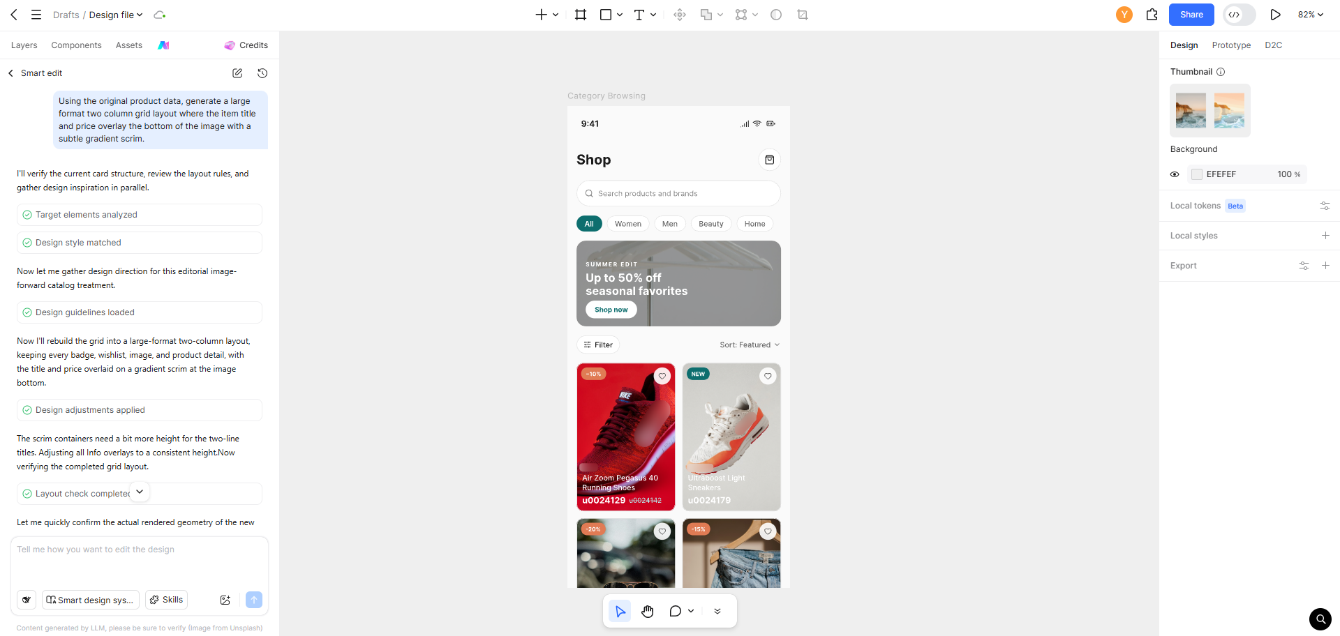
"Using the original product data, generate a large format two column grid layout where the item title and price overlay the bottom of the image with a subtle gradient scrim."
Within seconds, a third distinct layout variation appears on your canvas, completing a comprehensive visual exploration.
Step 4: Compare Variations and Collect Stakeholder Feedback
Organize the generated layouts inside a shared review frame. Add descriptive labels and functional annotations. At this stage, you can:
- Share a direct review link with product managers and UX researchers.
- Gather asynchronous feedback via contextual canvas comments.
- Modify individual frames based on stakeholder input without impacting adjacent versions.
Step 5: Finalize and Deepen the Chosen UI Direction
Once the team aligns on a layout direction, you can refine micro interactions and visual details. Polish typography contrast, configure skeleton loading states, define empty list screens, and set edge cases. Pixso AI remains available throughout this stage to adjust specific component states on demand.
Part 4. Real World Case Studies: Choosing Layouts by Product Domain
Selecting the right layout pattern requires evaluating specific user intents. Below are three representative product scenarios illustrating this decision logic.
4.1 Vertical Fashion and Apparel Commerce
- Final Decision: Multi Column Grid View
- Strategic Rationale: Apparel shopping is predominantly visual. Users browse silhouettes, colors, and styling rather than technical specifications. Usability metrics show that high-density image grids achieve 23% higher dwell time and increased tap-through rates compared to text-heavy lists.
- Value of AI Exploration: Using Pixso AI, the design team generated a two-column grid, a three-column compact grid, and a single-column editorial layout within minutes, completing the review cycle in one hour instead of nearly two days of manual drafting.
4.2 Consumer Electronics and Hardware Catalogs
- Final Decision: List View with a Viewport Toggle
- Strategic Rationale: Purchasing electronics requires comparing technical specifications including storage tiers, processor models, warranty terms, and discounts. A list view organizes these attributes cleanly. To satisfy visual shoppers, the interface includes a toggle in the top navigation allowing users to switch between list and grid presentations.
- Value of AI Exploration: The design team utilized ui design ai to generate both active layout states alongside interactive prototype transitions, clarifying the interaction model early in development.
4.3 Content and News Aggregation Platforms
- Final Decision: Adaptive Hybrid Layout
- Strategic Rationale: Content aggregation platforms handle diverse media types. Breaking news benefits from prominent hero cards, community discussions fit compact text rows, and multimedia posts demand rich thumbnail previews. Enforcing a single rigid layout across all content types compromises user engagement.
- Value of AI Exploration: Through iterative prompts, the design team explored a dynamic feed architecture that adapts card layouts to specific content categories, completing the entire conceptual phase in a single afternoon.
Part 5. Six Best Practices for AI-Assisted Layout Exploration
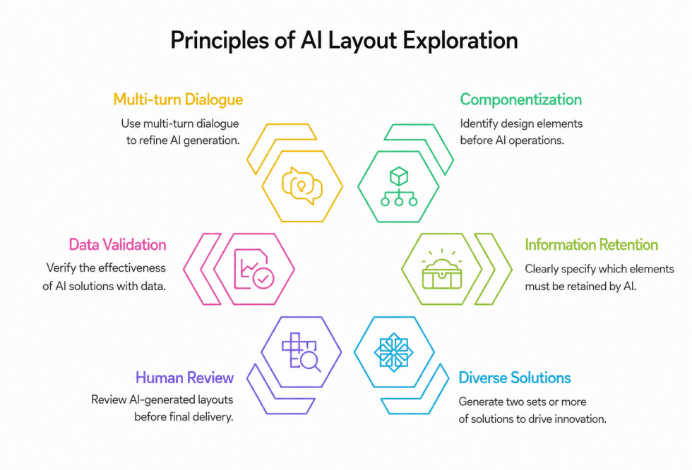
To maximize efficiency when applying ai design tools to structural exploration, keep these principles in mind:
5.1 Build with Clean Components First
Generative design engines interpret well structured frames with greater precision. Investing a few minutes to organize Auto Layout containers and component naming conventions significantly enhances automated layout accuracy.
5.2 Specify Elements to Retain in Your Prompts
When requesting layout shifts, explicitly state which data points must be preserved and which can be removed. A directive such as "Convert to a compact list layout, retain the thumbnail, title, and price, but omit the rating badge" produces far more predictable outputs than generic instructions.
5.3 Generate at Least Three Distinct Options
Evaluating only two options often leads to rigid binary debates. Generating three or more distinct variations frequently reveals hybrid solutions that combine the strengths of multiple approaches.
5.4 Treat Generated Outputs as High Fidelity Drafts
While automated layout generation produces accurate structures, professional refinement is still required. Polish typography scale, touch target padding, and corner radius consistency directly within the vector canvas.
5.5 Validate Visual Concepts with Real User Data
AI rapidly surfaces visual possibilities, but performance must be validated through usability testing and A/B split tests. Integrate automated layout exploration into a continuous product discovery loop.
5.6 Leverage Multi Turn Conversational Refinement
Use iterative prompt chains to refine layouts progressively. Building on previous iterations allows the AI engine to maintain contextual continuity and deliver results closely aligned with your design system.
Part 6. Why Choose Pixso for Layout Exploration
When comparing tools for structural UI exploration, dedicated product design capabilities make a clear difference:
| Feature Dimension | Figma AI | Lovable | Pixso AI |
| Structural Layout Transformation | Limited to basic asset population | Code level layout generation | Native vector structural restructuring |
| Parallel Variant Generation | Manual setup required | Web code previews | Instant side by side canvas generation |
| Editable Vector Output | Native vector output | Code output only | Native vector output |
| Natural Language Prompt Understanding | Standard prompt processing | Code prompt focused | Deep UX contextual understanding |
| Real Time Team Collaboration | Cloud multiplayer supported | Limited design collaboration | Enterprise grade multiplayer workspace |
While traditional platforms continue adding experimental generative features, structural layout changes often remain manual or reliant on third party extensions. Pixso is architected from the ground up as an AI native design platform, aligning generative intelligence with professional vector editing to support real world design workflows.
Summary
The choice between a list view and a grid view rarely comes down to an absolute rule. What matters most is your ability to prototype, compare, and validate both directions with minimal overhead. Modern ai design technology shifts the bottleneck from manual execution to strategic evaluation. When your team can produce multiple high fidelity variations in minutes rather than days, design reviews become more objective and product iterations move significantly faster.
Experience how Pixso AI streamlines layout exploration and accelerates your creative workflow today.
![[Must-know] 8 UX Design Principles](https://pixso.net/assets/media/ux-design-principles-1-05fa3776c794be16.webp)