Elodia
To make a useful prototype, choose one user task, draw the screens needed for that task, connect the actions between them, and let someone try the flow without coaching. The first version should answer a question, not imitate every part of a finished product. This tutorial uses a consultation booking flow: choose a service, pick a time, review the request, and understand the result.
You can build the screens and their transitions in Pixso's prototyping workspace. The prototype can show how a person would experience a booking request; it does not reserve a live calendar slot or implement payment and data storage. Keep that boundary visible to reviewers and developers.
1. Define the task and the decision to test
Write a goal that a reviewer can actually attempt: “Request a 30-minute consultation for Thursday afternoon.” Decide what you need to learn. Can people find an available time? Do they understand whether the time is confirmed or only requested? Does the confirmation screen make the next step clear? These questions determine which screens and states are necessary.
Do not start by polishing a dashboard or all possible account settings. For this task, the essential path is service choice → time choice → contact details → review → outcome. Add a “no times available” state and an invalid-contact state because those can change the user's next action. A one-page sketch of this flow is enough to begin.
2. Make the screens and name their states
Create a frame for each meaningful step. Name the frames by task and state, such as “Booking / choose service”, “Booking / choose time”, “Booking / review” and “Booking / request sent”. A reviewer should be able to scan the canvas and understand the sequence without a spoken explanation.
Use realistic text lengths and content. If the service name can be long, try a long name now. Show the chosen service and time again on the review screen so the reviewer can detect mismatches. Add a state for an unavailable slot instead of silently disabling every choice. At this stage, simple shapes and labels are enough unless visual hierarchy is the thing being tested.
3. Connect actions and check the main route
Link the primary button on each screen to the intended next screen, and link Back to the prior step. Preview the flow from the visitor's entry point. Check whether the selected time appears on review and whether Back preserves the decision you intend to keep. In an interactive prototype these values may be represented by separate prepared states rather than a live database; note which parts are simulated.
Then add the two exceptional routes. If the selected slot is no longer available, where does the visitor return, and what stays selected? If the contact field is invalid, does the message explain how to fix it without clearing the other entries? Showing these routes often reveals more than adding animation to the ideal path.
4. Preview on the device and with the input method that matter
Run the prototype at a desktop width and at a narrow mobile width. Look for labels that wrap badly, actions that move off screen, and error text that separates from its field. If keyboard use matters to the intended audience, walk through the focus order and make sure the next action can be found. The prototype may not reproduce every browser behavior, so record any accessibility or implementation rule that still needs validation in the built product.
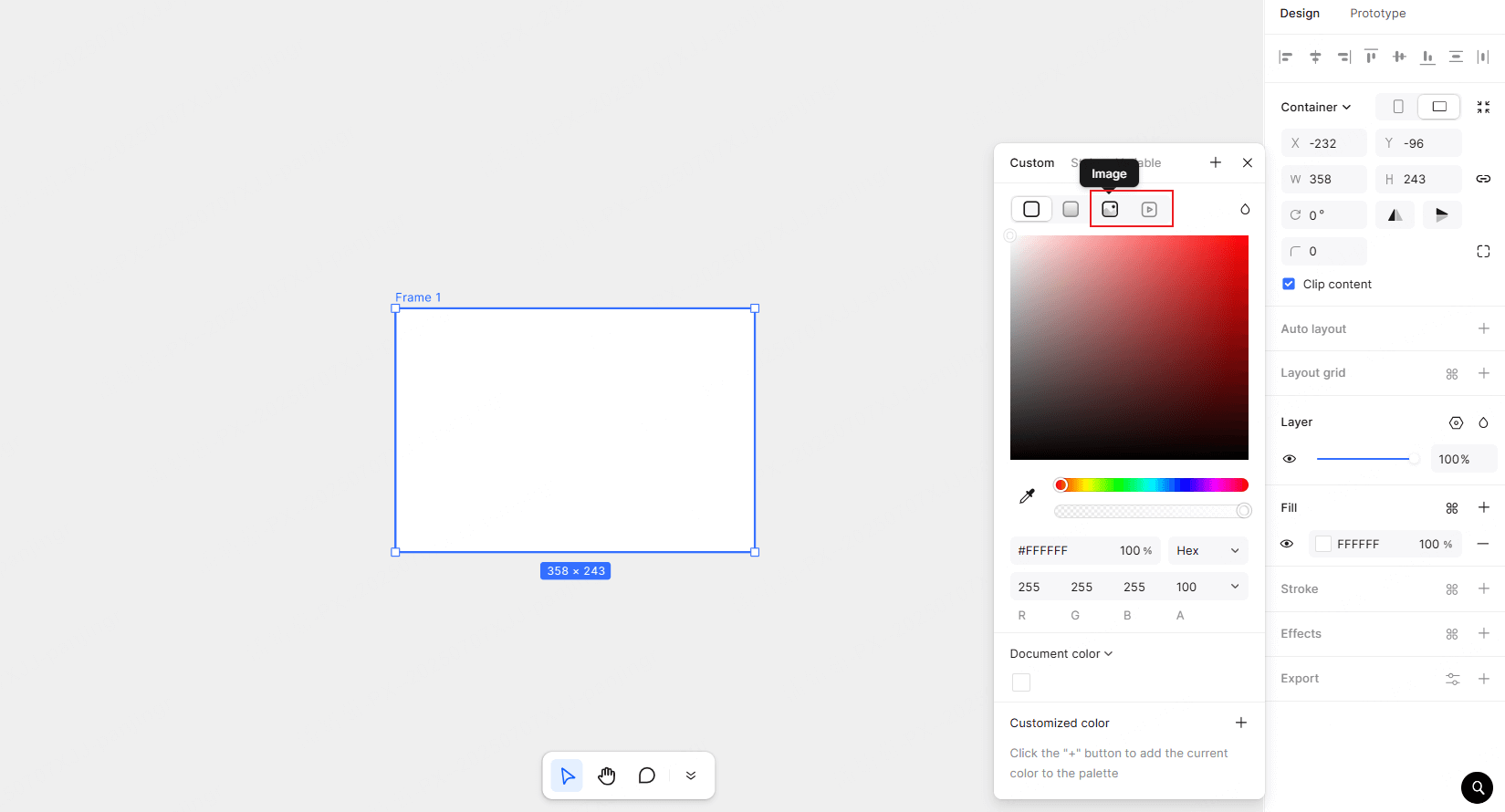
For a media-heavy interface, Pixso supports GIF or video fills in a prototype. Include motion only when it is part of the question. A static booking form does not need a video just to look more complete. If motion could obscure a button or distract from the next decision, test a still alternative first.
5. Ask someone to complete the task without hints
Give the reviewer the starting screen and the task, then remain neutral. Do not point to the time picker or explain what “request sent” means. Record where they hesitate, what they click, what they say they expect, and what actually appears. Keep observations separate from interpretations: “They tapped the disabled time twice” is an observation; “They expected a different time zone” is a hypothesis to investigate.
One session can reveal a problem, but it does not establish a success rate. After the session, choose a concrete change and test the same task again. If reviewers mistake the request outcome for a confirmed appointment, revise the button and confirmation copy before changing the color system.
6. Share the behavior and the missing implementation rules
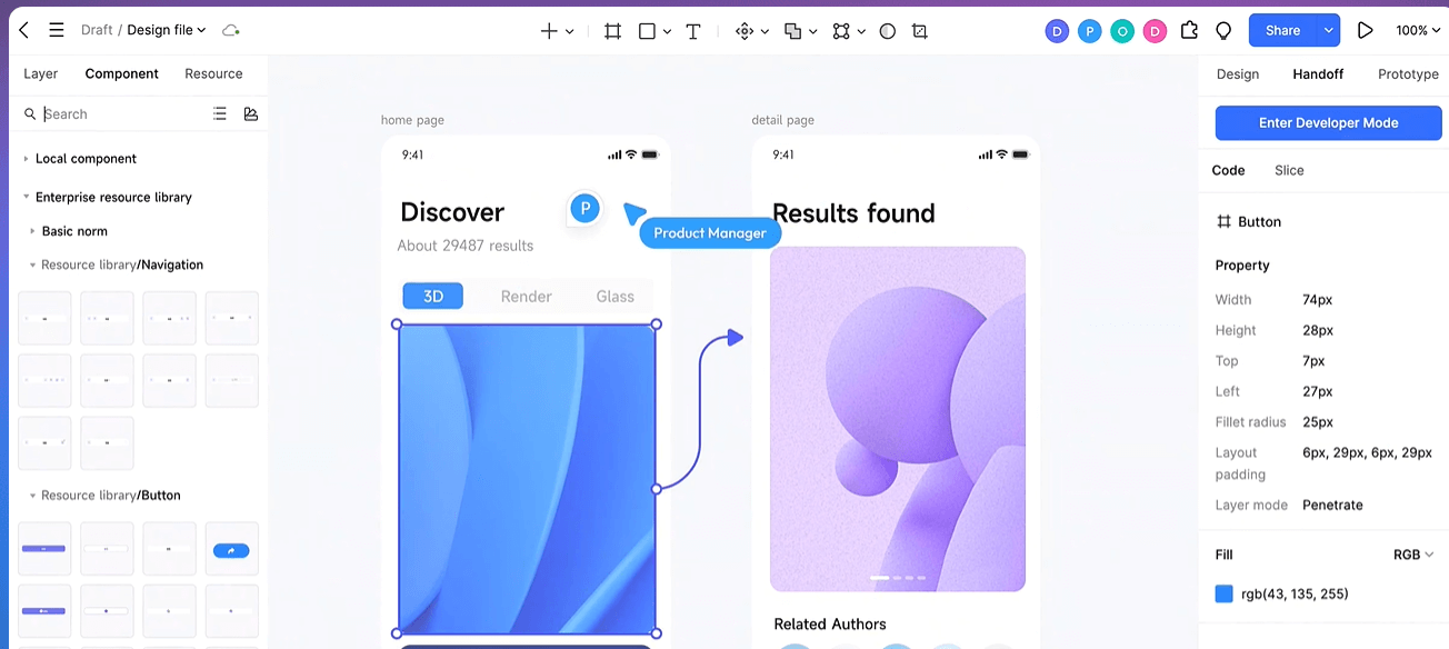
When sharing the prototype with the team, include the task, the start screen, the successful path and the exceptional states. State what is simulated. For this example, engineering still needs rules for checking live availability, handling concurrent requests, validating contact details, storing the request and sending a confirmation. A connected design file communicates the intended interaction, but it is not a substitute for those rules.
The next iteration should be driven by what the review uncovered. Preserve the parts that people understood, revise the confusing state, and repeat the task. If the team is still deciding which fidelity to use or what counts as a prototype, see the prototype definition and fidelity guide; this tutorial focuses on building and testing the flow.