Scott
A responsive data table should preserve the decision a person came to make, not every desktop column. Before shrinking type or hiding fields, rank the information and define what happens to row actions, selection, sorting, and errors on a narrow screen. Use the existing data table component guidance as the structural foundation, then create a mobile-specific priority model for the task your table supports.
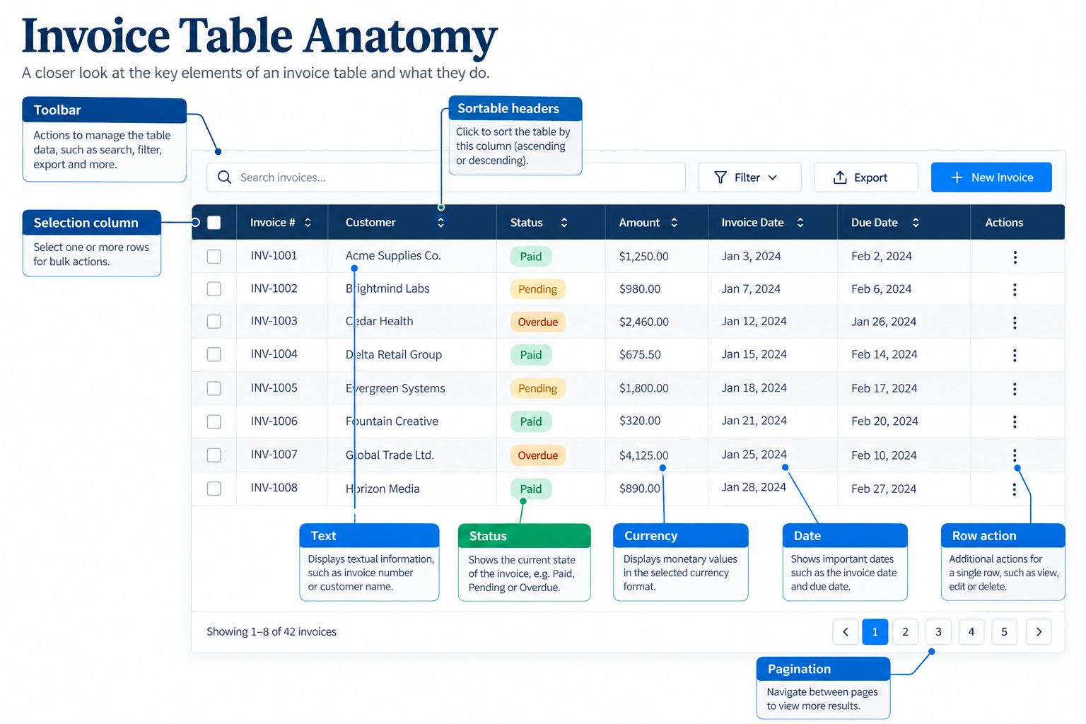
Start with the decision, not the column count
Ask what a person must decide from one row. In a delivery queue, they may need the order, status, destination, and next action; a secondary reference number can move behind a details view. A narrow table is successful when the primary decision remains fast and legible, even if secondary information takes one extra tap.
| Priority | Typical role | Narrow-screen treatment |
|---|---|---|
| Primary | Identity and decision signal | Keep visible in the first row line. |
| Supporting | Evidence needed before acting | Keep visible if it fits without truncating the decision. |
| Secondary | Reference or audit detail | Move to an expandable row or details panel. |
| Action | Next task for the row | Keep one obvious action; group rare actions safely. |
Do not rank by database order. A field used only by support may be essential in one workflow and irrelevant in another. Write the row decision in one sentence, then test whether a person can complete it with the visible fields alone.
Choose a layout that preserves relationships
Three patterns cover most responsive table decisions: a reduced column table, a stacked row, and a table-plus-details view. A reduced table works when the primary fields are short and comparable. A stacked row works when each record needs a small narrative and comparison across columns is less important. A details view works when the table is a scanning surface and the complete record needs more room.
- Keep a stable first field so the person knows which row they are reading.
- Place the strongest status or decision signal near the identity.
- Move supporting values together rather than hiding one half of a relationship.
- Expose the details trigger as a real control with a clear label.
- Keep row actions attached to the row, not floating at an unrelated viewport edge.
Worked example: a release checklist
Imagine a release checklist with eight desktop columns: release name, owner, environment, test status, risk, last update, ticket, and actions. On mobile, keep release name, test status, risk, and one action. Put owner, environment, last update, and ticket in an expandable details region. The row summary answers “can I ship this?” while the details panel supports investigation.
If test status is “blocked”, show the blocking reason in the row or make the details affordance visually explicit. Do not leave a green status visible while the only evidence of a blocking test is hidden behind a second screen.
Preserve actions, selection, and feedback
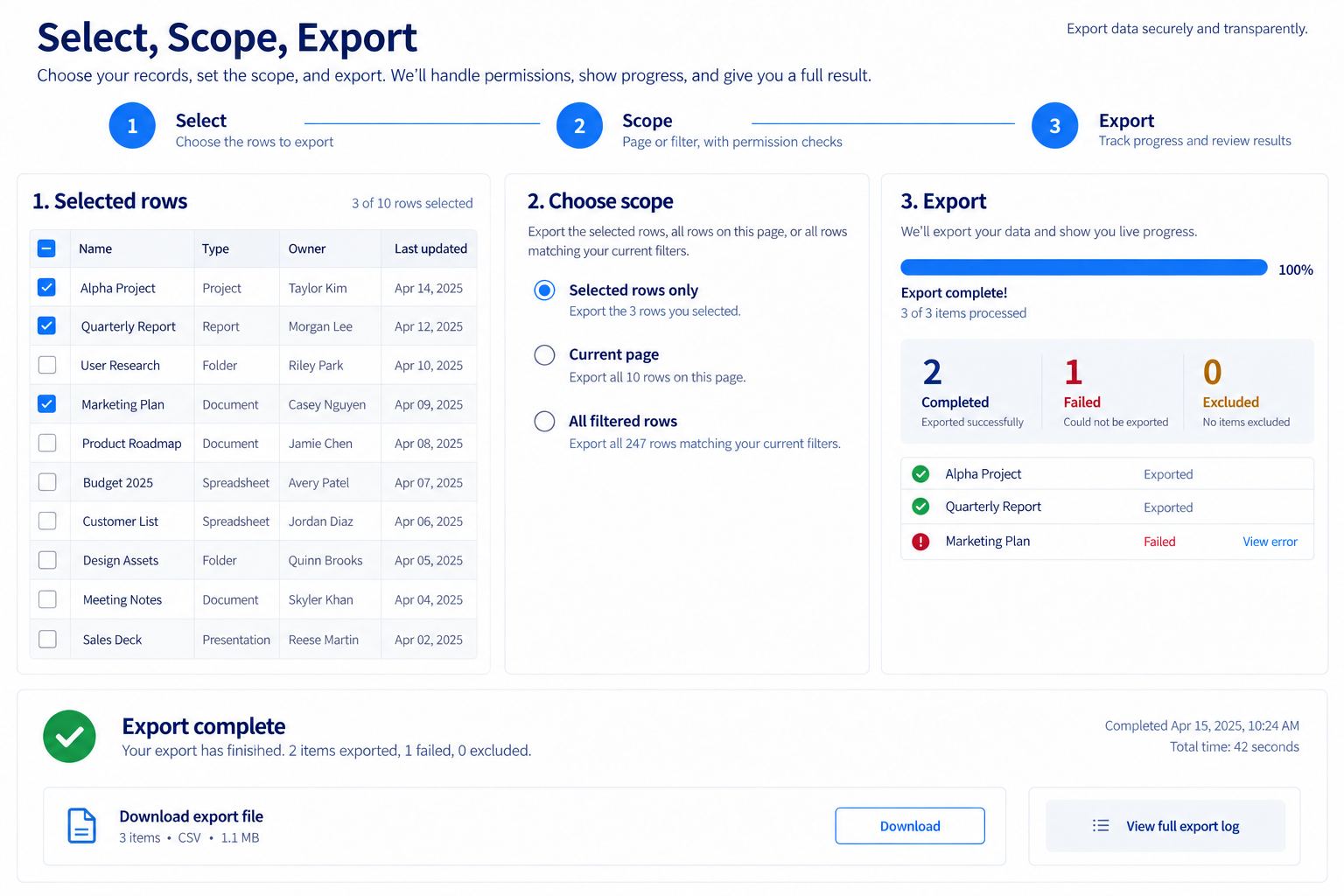
Responsive work often removes the table’s action model by accident. Decide whether selection applies to one row, the visible page, or all matching records, and say so near the control. If a row opens a details view, keep unsaved edits and the return position predictable. A swipe gesture should not be the only way to reveal a destructive action.
| Interaction | Mobile risk | Design response |
|---|---|---|
| Row selection | People cannot tell what scope is selected. | Show selected count and scope beside the toolbar. |
| Sorting | Sort direction is hidden after the column moves. | Expose the active sort label and direction in the compact header. |
| Filtering | A filter removes rows with no visible explanation. | Keep active filters removable and show an empty-result recovery path. |
| Row menu | Rare actions are too easy to trigger. | Group them under a labeled menu and keep the safe action visible. |
| Inline edit | Keyboard and touch save behavior diverge. | Define save, cancel, validation, and conflict states for both paths. |
Handle long values and state changes
Long names, translated labels, and user-entered notes are normal data, not edge cases. Use line limits only when the hidden text remains available through a labeled details view. Ellipses should not hide a status, a negative amount, or the difference between two records. Test strings that are twice the expected length and strings in the supported languages before freezing the column priorities.
Loading, error, empty, and stale states should preserve the same row relationships. A skeleton that changes column order after loading creates a second layout to learn. When data refreshes, show whether the current sort and filter remain active. If a save fails, keep the edited value visible with a specific recovery action rather than silently reverting it.
Test keyboard and assistive paths
A compact table still needs a predictable focus order. Keyboard users should reach the row, details control, selection control, and action menu without traversing hidden desktop columns. Announce the relationship between a control and its row, especially when several rows contain the same “More” label. On touch, ensure the hit target does not depend on a tiny icon at the edge of a horizontally scrolling region.
Use a state matrix for desktop, narrow mobile, zoomed text, and translated content. Record the expected focus after opening details, closing a menu, returning from an edit, and receiving a validation error. These checks find failures that a visual comparison of two static screenshots cannot show.
Hand off priorities with evidence
For each field, record its decision role, fallback when hidden, maximum useful length, and test data. Link the compact and expanded states so reviewers can compare them in one flow. In Pixso, keep the priority matrix next to the responsive frames and annotate which controls are shared across breakpoints. This gives developers a clear source for behavior instead of a desktop screenshot plus an ambiguous mobile crop.
Before release, ask a person unfamiliar with the table to complete the primary task on a narrow viewport. If they need to open every row to find the decision signal, the table has preserved data but lost its purpose. Revisit the priorities rather than adding another compressed column.