On this page

Scott
Touch target size measures the area that responds to a tap or click, not the size of the icon inside it. For web interfaces, WCAG 2.2 AA uses a 24 × 24 CSS-pixel minimum with specific exceptions. Apple commonly recommends 44 × 44 pt hit regions, while Android recommends at least 48 × 48 dp. Choose the rule for the platform, then check adjacent controls together.
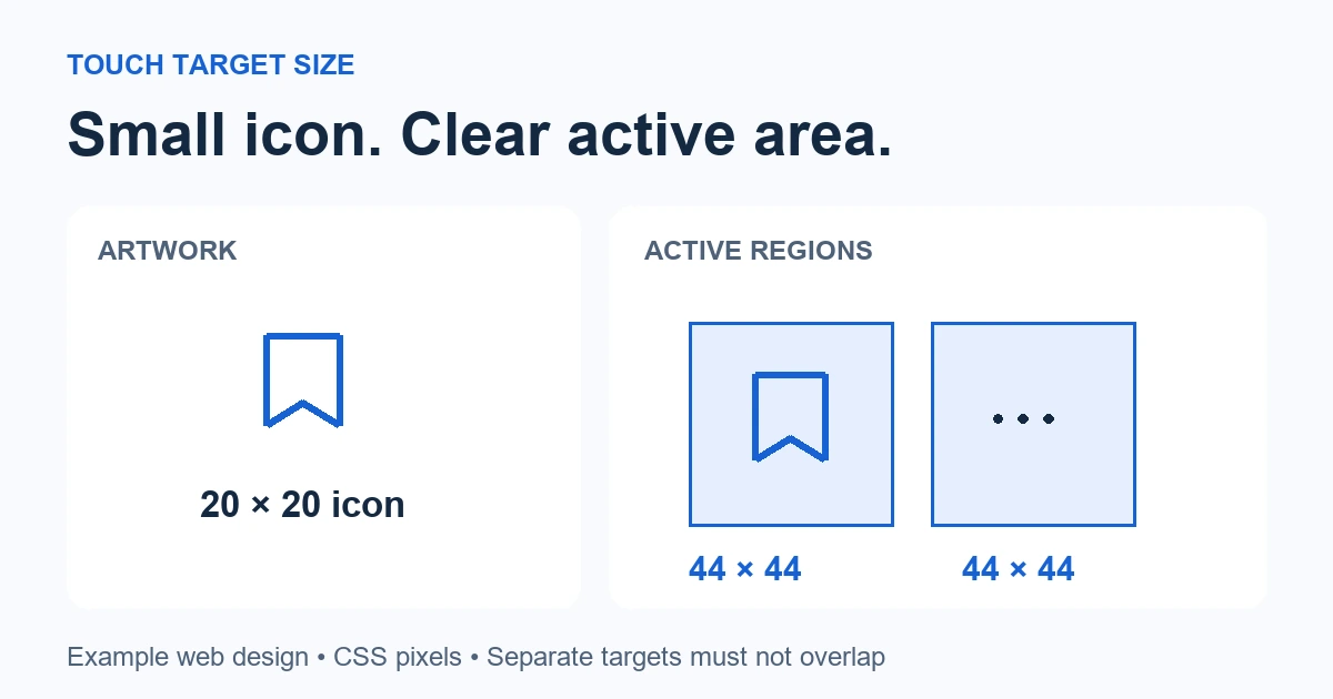
Consider a saved-items list with a small bookmark icon and an overflow menu at the end of each row. The artwork can stay compact while its interactive area grows. In Pixso’s UI design workspace, represent those two boundaries separately so the person implementing the screen knows which dimensions describe the icon and which describe the control.
24, 44, or 48: choose the platform and the unit
These numbers answer different questions. A web accessibility criterion, an enhanced criterion, and native platform guidance should not become one unlabeled “minimum button size” token.
| Context | Target guidance | What to record in the design |
|---|---|---|
| Web, WCAG 2.2 AA | 24 × 24 CSS px, or an applicable exception under SC 2.5.8 | Actual clickable region and any exception being used |
| Web, WCAG 2.2 AAA | 44 × 44 CSS px under SC 2.5.5, with its own exceptions | The enhanced target and the relevant conformance scope |
| Apple platform buttons | Generally at least 44 × 44 pt; Apple specifies 60 × 60 pt for visionOS | The intended platform and hit region, in points |
| Android touch interfaces | At least 48 × 48 dp recommended | The component’s touch region, in density-independent pixels |
The primary references are W3C’s minimum target-size explanation, its enhanced target-size criterion, Apple’s button guidance, and Android’s accessibility guidance. Meeting one target-size criterion does not establish accessibility of the whole interface.
CSS pixels, points, and dp are logical units in different environments. Do not measure a screenshot in physical display pixels and assume it proves the target size. For the saved-items web example below, all measurements refer to CSS pixels. A larger 44 × 44 target is a deliberate design choice for the row actions, not a claim that WCAG AA always requires 44.
Keep the icon small and make the target explicit
Start with a 20 × 20 bookmark icon inside a 44 × 44 button. Centering it leaves 12 pixels on each side. Draw the neighboring overflow action with its own 44 × 44 region and an 8-pixel gap between regions. This pair occupies 96 pixels: 44 + 8 + 44. Reserve that space before allocating the remainder of the row to the item title.
The 8-pixel gap is this example’s spacing choice. It is not a universal WCAG requirement. The larger targets already meet the minimum size condition; the gap helps keep the pair visually distinct and prevents their regions from colliding.
Use the same boundary for the actual button and its documented hit region where possible. A transparent rectangle placed behind the icon in a design file does not make the final application clickable. If the implementation uses padding, an expanded hit area, or another mechanism, record that choice and verify its result in the running interface.
A saved-items row also needs a clear interaction structure. If the item title opens the item and the end controls perform separate actions, specify those regions separately. Do not treat an entire row as one button and then nest competing buttons inside it. Give each action a name, such as “Remove Atlas from saved items” or “More options for Atlas,” rather than exposing two unnamed icons.
How the 24-pixel spacing exception works
For an undersized target, WCAG’s spacing exception uses an imaginary circle with a 24-CSS-pixel diameter, centered on the target’s bounding box. That circle must not overlap another target or a corresponding circle around another undersized target. Check vertical and diagonal neighbors too.
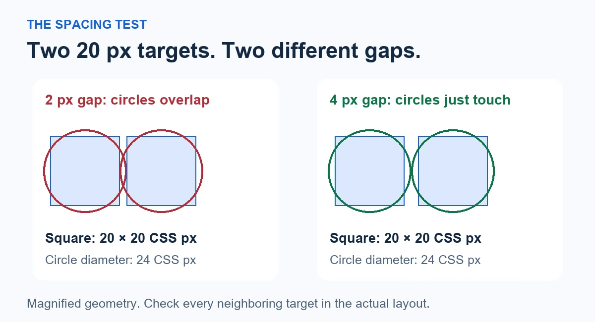
In the diagram, two 20 × 20 square targets separated by 2 pixels have centers 22 pixels apart. Their 24-pixel circles overlap. Increasing the gap to 4 pixels moves the centers 24 pixels apart, so the circles just touch. The spacing condition is satisfied in this simplified arrangement, provided no other target intrudes.
That calculation is not a formula for every shape. A nearby full-size control can intersect one of the circles even when the two small controls are sufficiently separated from each other. Measure the complete neighborhood, including actions in the next row.
Other exceptions cover equivalent controls, inline text, unmodified user-agent controls, and essential presentations. Apply an exception to the specific case it describes. A toolbar action does not become an inline-text exception simply because its label looks like a text link. For a new mobile-oriented list, enlarging the buttons is usually easier to specify and review than depending on minimum-clearance geometry.
Build a target-size specification in Pixso
Create the saved-items row with a realistic title, metadata, and the two actions. Keep the icon artwork as a child of its button frame. Use the frame dimensions for the intended active area, and name the layers clearly: Bookmark icon / 20 and Bookmark action / 44 communicate different responsibilities.
Pixso’s layout settings guide explains frame sizing, spacing, and padding. Auto Layout can help keep the icon centered and the action group spaced consistently. Set the dimensions deliberately, then inspect the resulting frame rather than assuming that padding alone produces the intended size.
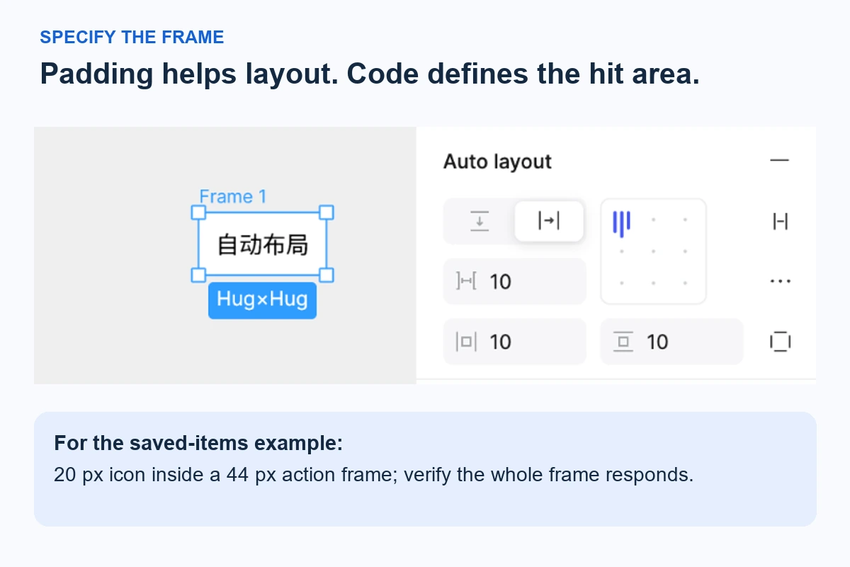
- Annotate the boundaries. On a review copy, outline each 44 × 44 action region and label the 20 × 20 artwork. Keep annotation layers separate from production assets.
- Check the whole row. Place long and short titles beside the 96-pixel action group. At a narrow width, let text wrap or revise the row layout; do not quietly shrink the actions.
- Compare states. Show default, keyboard focus, pressed, and menu-open states. Opening the overflow menu introduces another set of targets that needs review.
- Write a handoff note. “Web: each end action is 44 × 44 CSS px; icon 20 × 20; 8 px between action regions; no overlap with the title link.” Include accessible names and the intended keyboard behavior separately.
For a native Android version, redesign the group around 48 dp targets instead of merely relabeling the web dimensions. The two 48 dp targets plus an example 8 dp gap occupy 104 dp. Recheck the available title width and row height in that platform’s layout.
Verify the active region in the running interface
The design review establishes intent. The implementation check establishes which pixels actually respond. In the web build, inspect the button element’s dimensions, then activate it near each edge of the intended region. A 44-pixel frame in Pixso does not help if the click handler is attached only to the 20-pixel icon.
Repeat with the adjacent action and the item-title link. Confirm that the gap activates neither action, the targets do not overlap, and an overlay or clipped parent does not intercept part of the region. Check the compact layout with long titles and an open menu, not just the spacious desktop version.
Also follow the keyboard focus route. Target size does not provide a keyboard name, visible focus, or correct focus return after a menu closes. These are separate requirements that must work together.
Record a concrete defect when a check fails: “Saved-items row, 390 CSS-pixel viewport: the bookmark’s right edge activates More options.” Attach the expected boundaries and the observed behavior. That gives engineering a fixable geometry problem instead of the vague instruction “make the icons easier to tap.”