Scott
Let’s be honest for a second. Building a digital product right now feels like hitting a constantly moving target. User expectations are incredibly high, and the aesthetic rules seem to shift almost every single month. Web design trends to watch in 2026 aren't just about picking prettier colors anymore. It is completely about survival in a crowded market. If you are still relying on clunky, disconnected workflows, you are going to fall behind fast. We are seeing a massive shift toward AI generation and lightning-fast performance. Every creative lead is desperately trying to figure out how to create websites that actually hold a user's attention for more than three seconds. Pulling that off takes the right mindset and, frankly, the right software. Let's look at the actual movements shaping the internet right now, and more importantly, how you can actually build them without losing your mind.
Part 1. The tooling problem and why Pixso is the answer
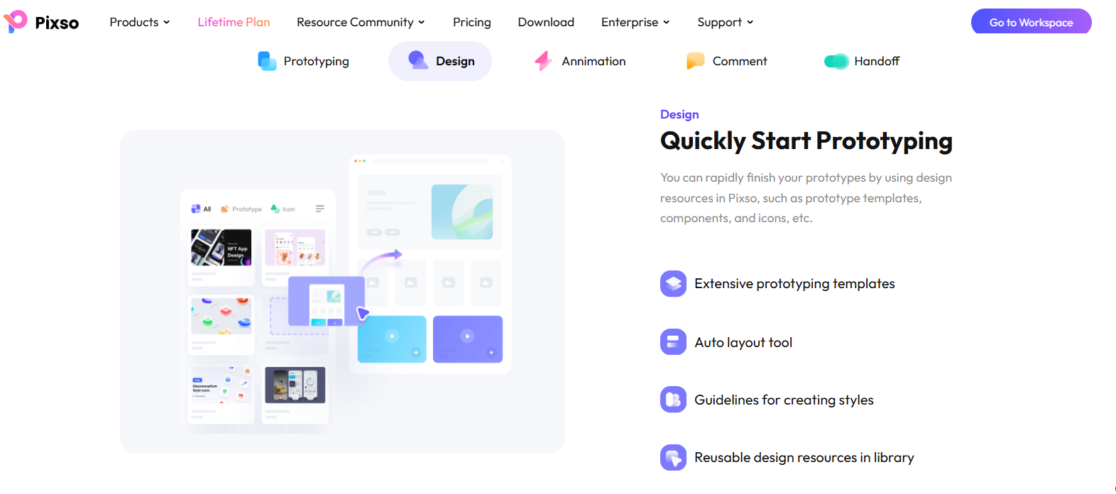
Before we even look at visual trends, we have to talk about the elephant in the room: your software stack. You cannot execute the best web design when your team is fragmented. Hopping between one app for wireframes, another for high-fidelity mockups, and a third just to show the developers a prototype is a total nightmare. It burns time and destroys your budget. This is exactly why Pixso is completely stealing the spotlight right now. Instead of juggling five different subscriptions, Pixso handles the entire creative lifecycle in one browser-based workspace. I want to bring this up early because understanding your tools dictates what you can actually create.
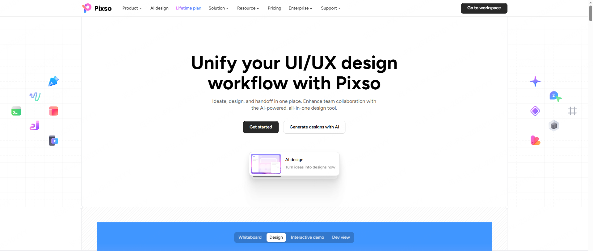
The biggest headache for any team right now is the sheer speed at which things need to be done. Pixso solves this with an absolutely crazy feature: AI one-click trend implementation. You don’t have to stare at a blank canvas anymore. You can literally use AI to generate 2026 high-fidelity trend interfaces in seconds. It doesn't just spit out a flat image, either. It creates a full adaptive design and an atomic design system right out of the gate. All your buttons, fonts, and spacing rules are mathematically perfect and ready to edit. On top of that, Pixso handles smart optimization for compliance and performance automatically.
There is also the massive issue of legal safety. Grabbing random assets off the internet is a great way to get your company sued. Pixso packs a commercial asset library with license terms to review alongside strict data privacy compliance. It drastically lowers your commercial risk while giving you AI performance optimization to keep your files running fast.
Part 2. Web design trends in 2026
Trend 1: Dopamine aesthetics and emotional visuals
For the last five years, everything on the internet looked exactly the same. We had this flood of sterile, hyper-minimalist corporate software. People are incredibly bored with it. That is why one of the biggest web design trends to watch in 2026 is the explosion of emotional visual templates. We are talking about dopamine color palettes, wild Y2K retro throwbacks, and warm minimalism. Designers are finally allowed to have fun again. Variable fonts are a massive part of this movement too. They let typography physically stretch and shrink based on how the user scrolls, perfectly balancing a ton of personality with strict readability.
If you want a real-world example, take a look at the Gen-Z brand Starface. Their entire website is a masterclass in dopamine design. They rely on blinding neon yellows, early-2000s pixelated graphics, and thick brutalist borders that make the shopping experience feel like a vintage arcade game rather than a standard online store. It instantly grabs your attention and refuses to let go.
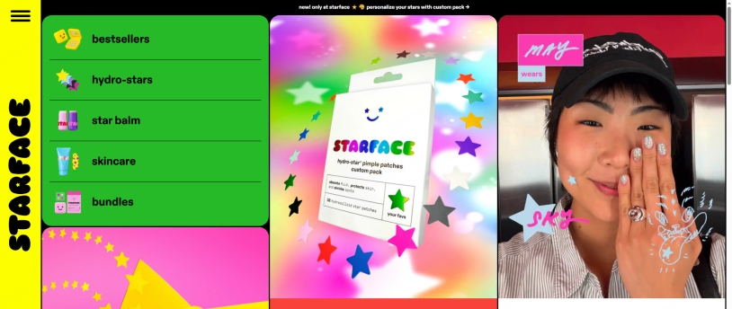
Trying to pull this off can be tricky because finding high-quality assets for these bold styles takes forever. This is another area where Pixso shines. Because of that massive commercial asset library I mentioned earlier, you can pull dopamine palettes, Y2K stickers, and variable fonts directly into your canvas safely. You get all the emotional impact with zero copyright anxiety.
Trend 2: Lightweight 3D and scroll-driven micro-interactions
Remember when everyone tried to put massive, heavy 3D scenes on their homepages, and it made your laptop fan sound like a jet engine? Yeah, that trend is dead. Nobody wants a website that kills their battery. Today, the focus is all on lightweight 3D and dynamic interactions. Designers are using tiny, drag-and-drop 3D components, subtle scroll animations, and fluid micro-interactions. You get all the depth and visual interest, but performance remains completely lossless.
Apple remains the absolute gold standard here. Whenever they drop a new product page, it is a masterclass in scroll-driven animation. As you push down the page, a phone smoothly rotates, parts fly in, and text fades up. It feels incredibly premium, but it loads instantly.
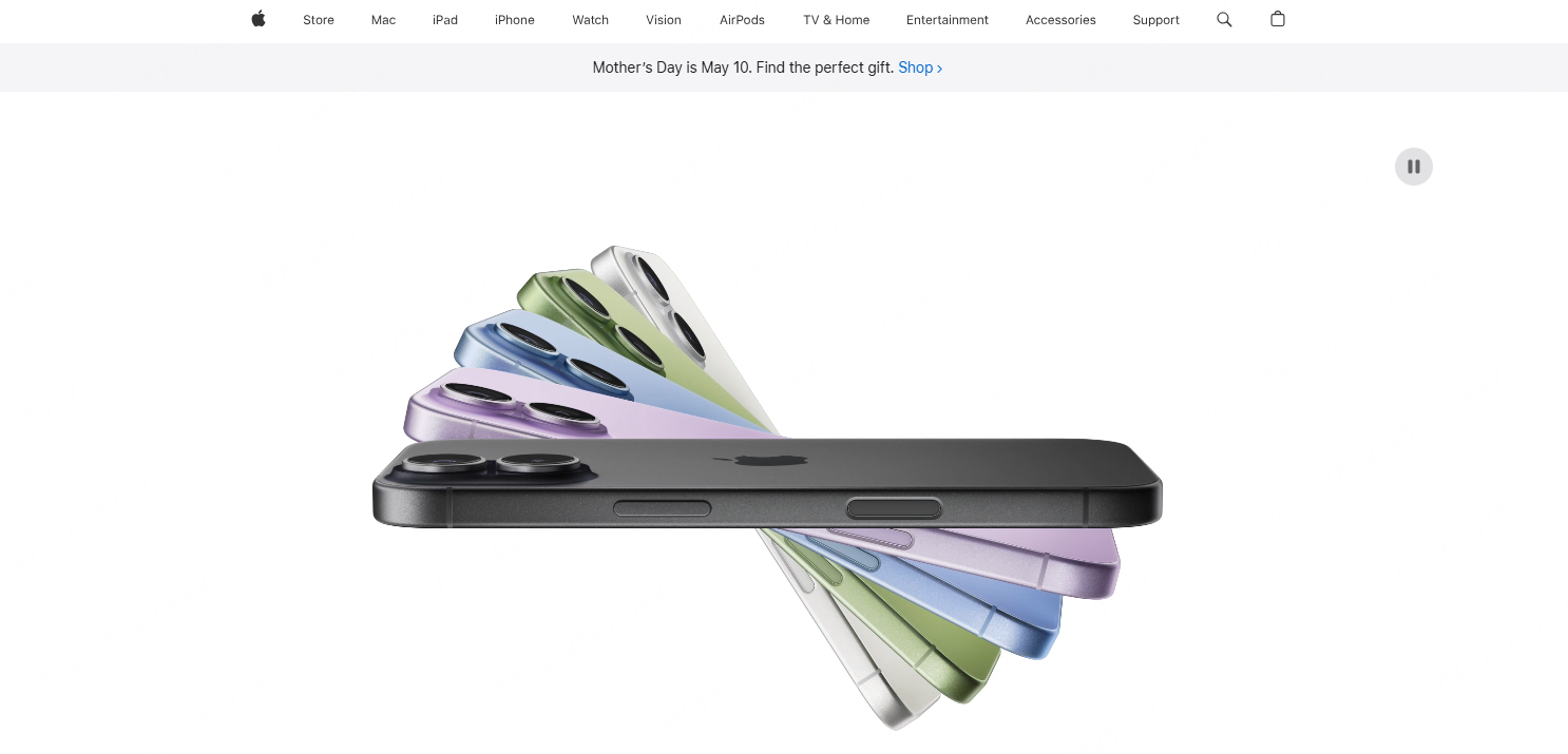
Building this used to require an engineering degree or a dedicated motion graphics artist. Not anymore. Pixso gives you drag-and-drop 3D components that are already optimized for the web. You can build these intricate micro-interactions directly on your canvas. Because Pixso natively handles the complex rendering, your prototype will never lag. Even better, when you are done, you get a one-click export of usable code, meaning those animations will actually work exactly as you designed them when the site goes live.
Trend 3: Absolute accessibility and low-carbon sites
Let’s talk about things that actually matter to your business legally. Sustainability and accessibility are no longer just nice buzzwords to put in a slide deck. They are strict legal requirements, especially if you are operating in English-speaking markets. Inclusive design means someone with a visual impairment can actually navigate your store. Meanwhile, low-carbon design is all about optimizing your page weight so data centers consume less energy.
Take a look at Wholegrain Digital. They are pioneers in this space. Their site actually tracks and displays the carbon footprint of every single page load. It proves that you can have a highly accessible, eco-friendly digital experience that still looks sharp and modern.

This is a massive pain point for agencies. Auditing a site for accessibility usually takes hours of manual labor. Pixso just builds it into your workflow. It features a built-in A11y checker that instantly flags any color contrast issues or legibility problems. Add in its low-carbon design mode, and your exported files are naturally lightweight and compliant with modern environmental demands. You don't need third-party plugins to do the right thing.
Part 3. A step-by-step guide: how to actually build this
Talking about trends is fine, but actually executing them is what pays the bills. Whenever I am teaching a junior team how to design web layouts that actually convert, I force them to focus on the actual operational steps. Having a great idea is useless if your workflow is a mess. Here is exactly how you can build a modern, trend-ready site using Pixso's actual interface right now.
Step 1: Start with AI and the Smart Design System
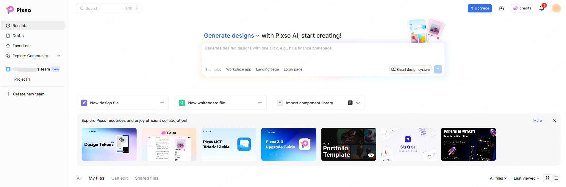
Open your Pixso dashboard. Right at the top, you will see a massive prompt box that says, "Generate designs with Pixso AI, start creating!" Don’t waste time drawing empty rectangles. Type in exactly what you need—like an e-commerce landing page using dopamine aesthetics. Hit the "Smart design system" button. Within seconds, Pixso deploys the entire structural layout. And here is the best part: it isn't just a flat image. If you look at your left-hand panel, everything is neatly organized into Layers, Components, and Assets. Your primary buttons and bold "WEAR YOUR DOPAMINE" typography are already componentized. If your client hates the neon green, you update the master hex code in the right-hand panel, and it changes globally.
Step 2: Set Up Multi-Device Adaptation
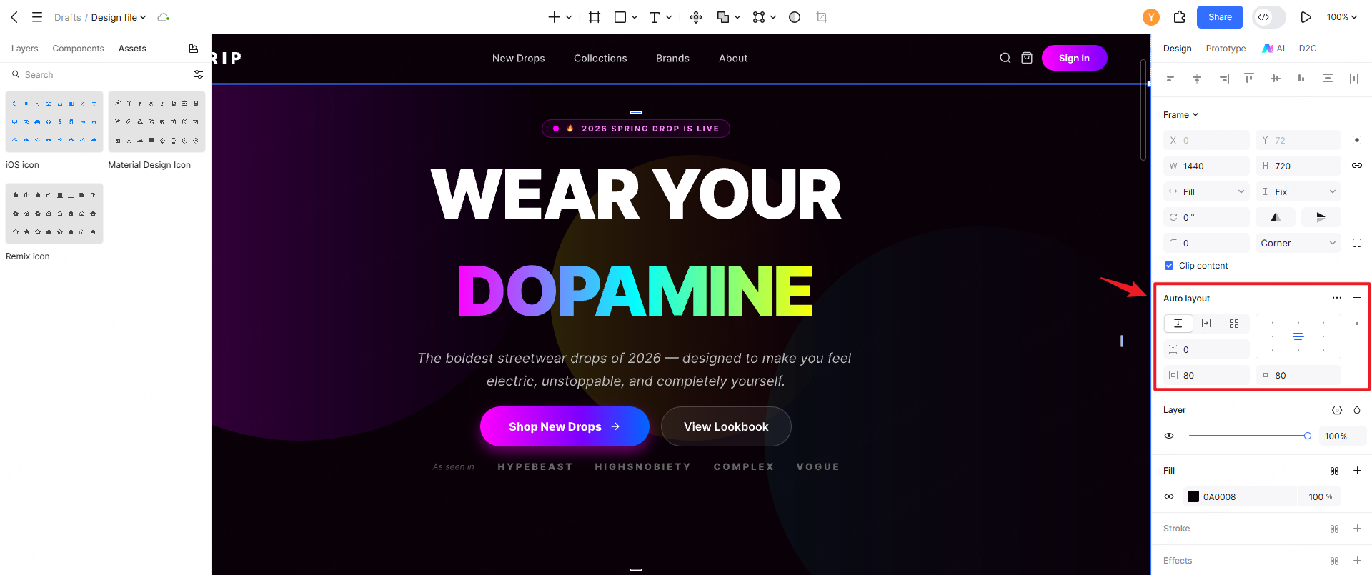
When figuring out how to design web layouts for modern users, mobile optimization is absolutely mandatory. Select your main desktop frame and look at the right-hand properties panel. Right under the dimensions, you will see the "Auto layout" section. Click the plus icon. You instantly get precise controls for horizontal and vertical alignment, spacing, and padding. As Pixso’s native documentation points out, adding layers to an auto layout frame instantly creates adaptive distributions. You basically design the core desktop view once. When you resize the frame for a mobile breakpoint, the grid reflows automatically. You can isolate specific mobile layers to bump up touch targets without rebuilding your main desktop file.
Step 3: Add the Lightweight Elements
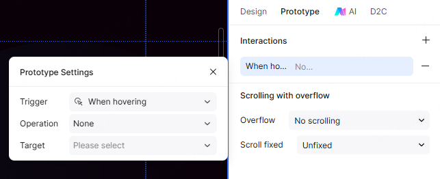
Let’s make it engaging. On the left sidebar, switch from the Layers tab over to the Assets tab. You can search the built-in community library for high-quality, pre-optimized icons or graphics. Drag your chosen asset straight onto your hero section. Next, look back at the top right of your screen and click the "Prototype" tab (located right between Design and AI). Select your new graphic and set an interaction trigger like "On Scroll." Because Pixso natively handles the complex rendering in the browser, mapping these subtle animations is completely frictionless and runs smoothly without draining your laptop battery.
Step 4: Polish with AI Smart Editing
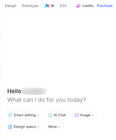
Before you hand this off to the developers, you need to ensure your bold colors are actually legible. Instead of hunting down a third-party contrast plugin, click the "AI" tab on the right-hand panel to open the "Smart editing" assistant. You can literally just chat with the AI to fix your design. As seen in the tool's capabilities, you can type something like, "The product card text colors could be more readable," or "Fix the visual ordering." The AI will run through your layers, darken backgrounds, or adjust layer opacity to ensure your dopamine aesthetic meets contrast standards. You can also use the floating bottom toolbar to quickly generate "Smart text." It is exactly like having a senior designer reviewing and fixing your file in real time.
Part 4. Frictionless handoff and full-cycle collaboration
The worst part of any project usually happens at the very end. The friction between design and engineering teams is legendary. Traditional setups result in lost redlines, outdated files, and incredibly frustrated developers.
Pixso completely gets rid of this wall by giving you a true full-cycle collaboration ecosystem. You can have three designers, a copywriter, and a project manager all working in the same file simultaneously. The version control is fully automated. If a client suddenly wants to revert to the layout from last Tuesday, you just roll back the version history with one click. No panic, no lost work.
When the file is finally approved, the handoff is genuinely frictionless. Developers do not need to buy a paid seat just to inspect the file. They can jump in and click on any element to get the exact spacing and color variables. But the real magic is the multi-platform code export. Whether your devs need CSS for a standard web build, Swift for an iOS app, or XML for Android, Pixso seamlessly exports the exact code they need. It creates a totally seamless connection to development, ensuring that the final live product looks exactly like the prototype. This is how you guarantee you are delivering the best web design possible.
Wrapping up the future of digital experiences
The web design trends to watch in 2026 demand a lot from creative teams. You have to balance wild dopamine aesthetics with strict low-carbon accessibility rules, all while keeping 3D interactions perfectly smooth. If you are still spending hours wondering how to build web design workflows that don't burn out your staff, you need to change your toolset. Pixso completely removes the friction of a fragmented process. With its insane AI generation, built-in compliance checks, and seamless developer handoff, it empowers you to focus on actual creativity. Executing the best web design is infinitely easier when your software does the heavy lifting for you. Stop fighting with outdated tools and start building something amazing today.