
Elodia
A website wireframe should answer a specific question before visual design begins: can someone find the information they need and complete the page's main task? Choose a tool that lets you arrange content, compare screen widths, connect the next step, and discuss unresolved decisions. A polished interface is not the goal yet. A wireframe is useful when it exposes a missing state or a confusing order early enough to change it.
For a practical example, imagine a consultation-booking page for a small service business. The visitor needs to understand the service, see what happens after submitting a request, and choose a time. In Pixso's web-design workspace, you can draft the page as frames, compare desktop and mobile layouts, and share the structure for review before refining the visual treatment. The booking system itself is a separate implementation; a wireframe describes the interface and its states.
Start with the page task, not empty boxes
Write one sentence that names the visitor and their decision: “A first-time visitor can decide whether this service fits, choose an available consultation time, and understand what happens next.” This sentence keeps the wireframe from becoming a collection of arbitrary rectangles. List the evidence the visitor needs: service scope, duration, price or pricing approach, availability, and a contact path for questions. If any of those facts is unknown, label it as an open content decision rather than filling the space with invented copy.
Sketch the main route first: service overview → available times → contact details → review → confirmation. Then add two exceptional states: no times available and a submission that fails. A page that only shows the ideal path can look finished while leaving the most important recovery decisions unresolved.
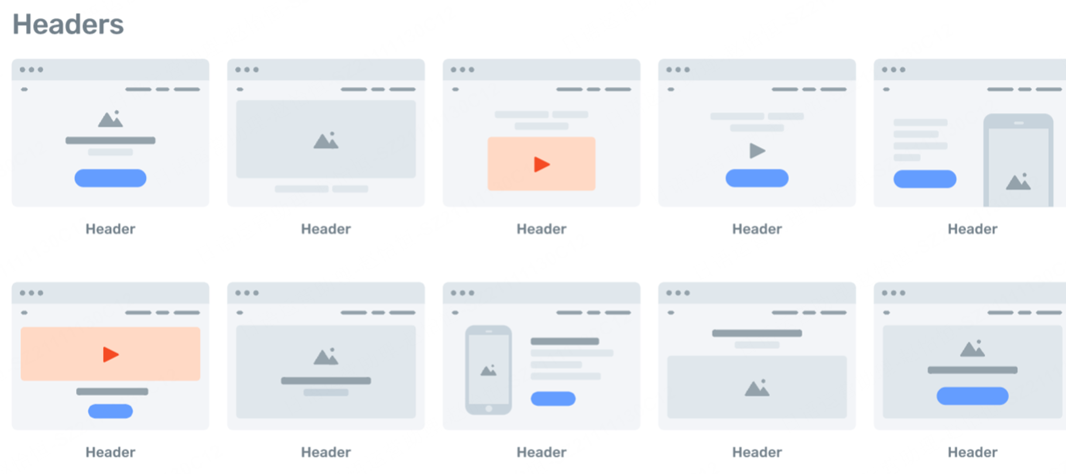
What to check in a website wireframe tool
Can you move content without rebuilding the page?
At the wireframe stage, the team may move a price explanation above the booking form, split a long section, or add a comparison. Check whether the tool makes those structural changes easy. In Pixso, frames, text and reusable components can help you try two page orders without redrawing the same header or button repeatedly. A simple sketch may be faster for an individual first pass; a shared design file becomes more useful when several people must inspect states and widths together.
Can you compare a narrow screen with the desktop version?
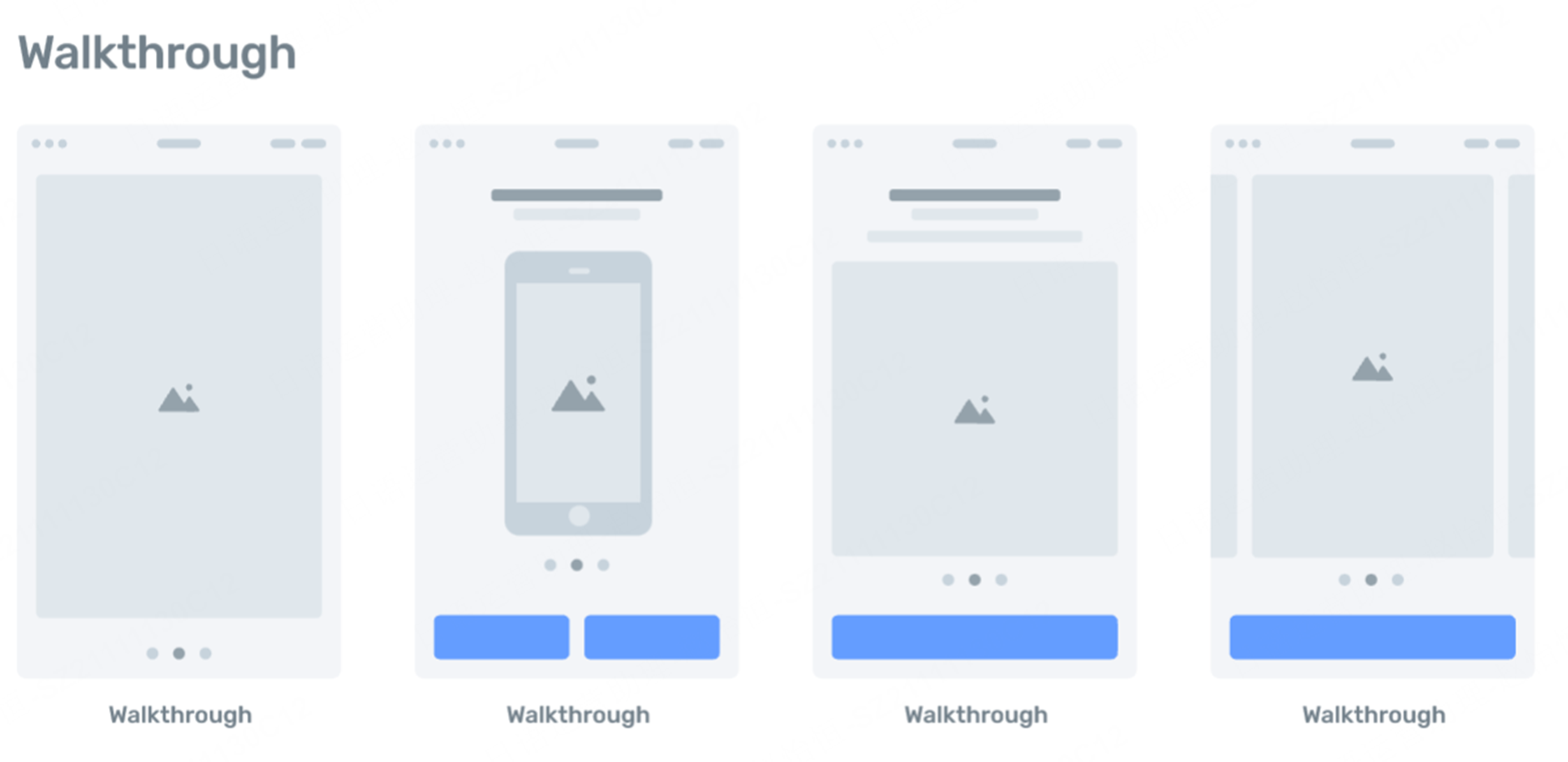
Do not merely shrink the desktop frame. For this booking page, decide whether the service summary stays above the time picker, how long service names wrap, and whether the primary action remains visible after validation errors. Place a narrow-width frame beside the desktop frame and use the same content in both. If the mobile flow needs a separate step, make that decision visible rather than hiding content to force a one-column fit.
Can reviewers point to a decision, not just a screen?
A reviewer may say “the page needs more trust” when the actual problem is that the visitor cannot see what happens after submitting. Attach comments to the relevant screen or section and record the question: “Does this confirmation mean a time is booked or only requested?” Keep unanswered content and system questions beside the design so they reach the writer and developer. A tool is helpful when it preserves that context during review.
Can the next person understand states and transitions?
A screenshot of the default page is insufficient for handoff. Show the empty, selected, invalid, loading and confirmed states that matter for this task. Link the “Continue” action to the next screen in a prototype when sequence matters. The team should be able to tell which interactions are represented in the design and which rules require implementation, such as checking a slot's real availability.
Build the consultation-page wireframe step by step
- Map the content. Put the service explanation and the key decision information before the form. A visitor should not have to start entering personal details to learn the duration or booking conditions.
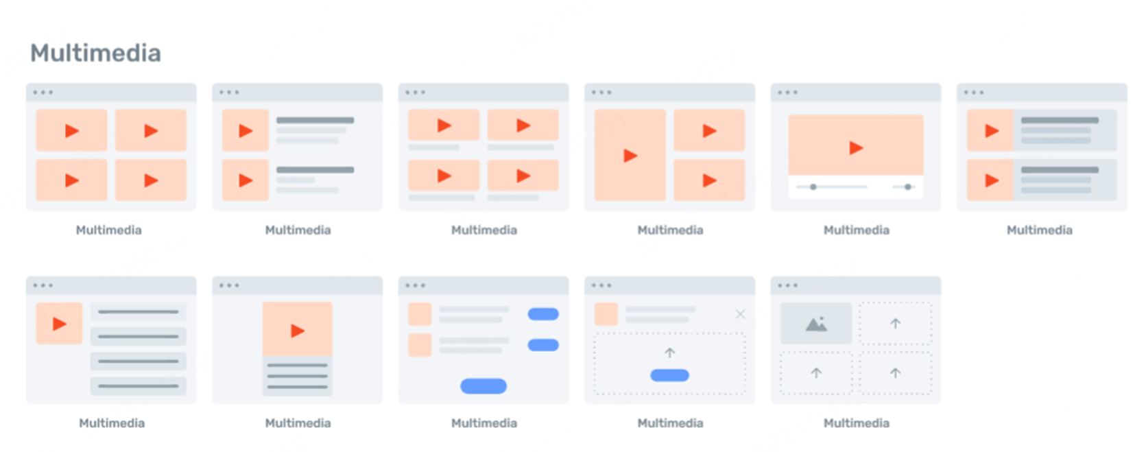
- Block out sections. Make a frame for the page, then add the header, service summary, proof or FAQ, time selection, contact fields, and the next-step explanation. Use realistic label lengths, not rows of identical placeholder text.
- Show the next decision. Add a selected time, a review screen, and a confirmation screen. If submission is only a request, say so. Do not visually promise an instant booking when the business will confirm later.
- Add failure and empty states. Show what appears when no slots remain or a required field is missing. Keep entered information where possible so the visitor can recover without restarting.
- Compare widths. Review the same states on desktop and a narrow screen. Reorder sections when necessary, but keep the meaning and key action consistent.
- Ask a reviewer to complete the task. Give them the starting page and the goal, then observe where they hesitate. Revise the structure before making the interface look finished.
Review the wireframe before high-fidelity design
Ask whether the first screen explains the service and exposes the next action; whether the time selector communicates what is available; whether the visitor can correct an error without losing their work; and whether the confirmation accurately describes the outcome. Have a second person follow the flow without a verbal walkthrough. Their questions often reveal missing labels or an assumption that only the designer knows.
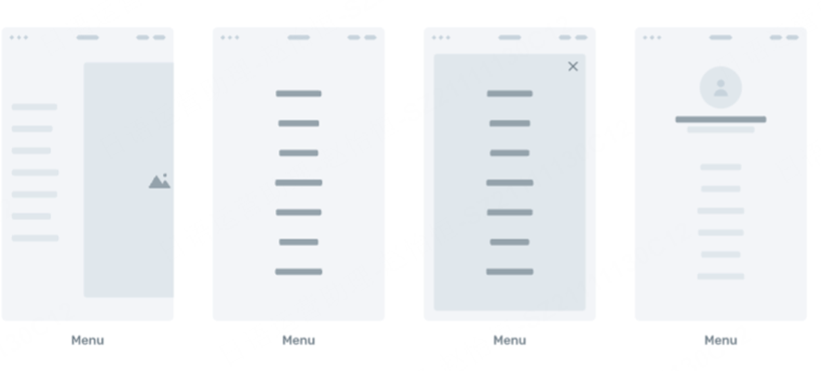
When the structure holds up, refine typography, spacing, color and imagery in the design file. Reusable components can keep the repeated header, form controls and buttons consistent, but they should not freeze an untested page order. A wireframe succeeds when it makes the next design and implementation decisions clearer, not when it looks like a finished product.

![[Full Review] Ant Design VS Material UI](https://pixso.net/assets/media/ant-design-vs-material-ui-e85acb360e96ca74.webp)


