Scott
What a wireframe is—and what it is not
A wireframe is a model of content, hierarchy and actions. It can be drawn on paper, made with grayscale blocks or assembled in a design tool. Its value is not visual roughness; its value is that a team can discuss the task before investing in final imagery, color, animation and component polish.
The right level of detail depends on the question. If the team is deciding whether a checkout needs two steps or three, a simple flow is enough. If it is deciding whether an error message fits beside a field, include realistic text and the relevant state. A wireframe does not prove production performance, accessibility or visual quality. It makes a structural decision easier to inspect.
A repeatable wireframe recipe
- Write the user and task in one sentence.
- List the information and actions required for success.
- Draw the shortest successful path.
- Add cancel, back, empty, loading, permission and error states.
- Use realistic labels and a long value to test density.
- Annotate behavior a static screen cannot show.
- Compare two alternatives against the same task.
- Decide whether the next question needs a mockup or prototype.
Keep the task visible beside the canvas. Reviewers should be able to ask “does this help the person complete the task?” rather than “do I like this arrangement?”
Example 1: Checkout flow
A checkout wireframe should show delivery details, payment, order summary, confirmation and recovery. Start with the minimum information a returning customer needs. Make the primary action clear, but do not hide the total, delivery date or important terms.
States to include
- Empty form with required fields.
- Focused field with helper text.
- Invalid postal code with a specific correction.
- Loading state after submit.
- Payment or network failure that preserves safe input.
- Success state with an order reference and return path.
For a concrete checkout, place the order summary above the final action: “Subtotal $42,” “Delivery $5” and “Total $47.” On a wide layout it can sit beside the form; on a phone it must remain available before “Pay $47.” After an invalid postal code, keep the unrelated address fields and order summary. Attach the correction to the postal-code field rather than replacing the page with a generic error.
Number the wireframe notes: 1 changes to delivery method update the displayed total; 2 a failed submission preserves safe input; 3 payment confirmation appears only after the transaction succeeds. These annotations explain behavior that the boxes alone cannot show.
Review questions
- Does the page tell the user what is required before they press submit?
- Is the next action still findable after an error?
- Can a person go back without losing unrelated information?
- Are terms, fees and delivery timing placed near the decision they affect?
Example 2: Search and filtered results
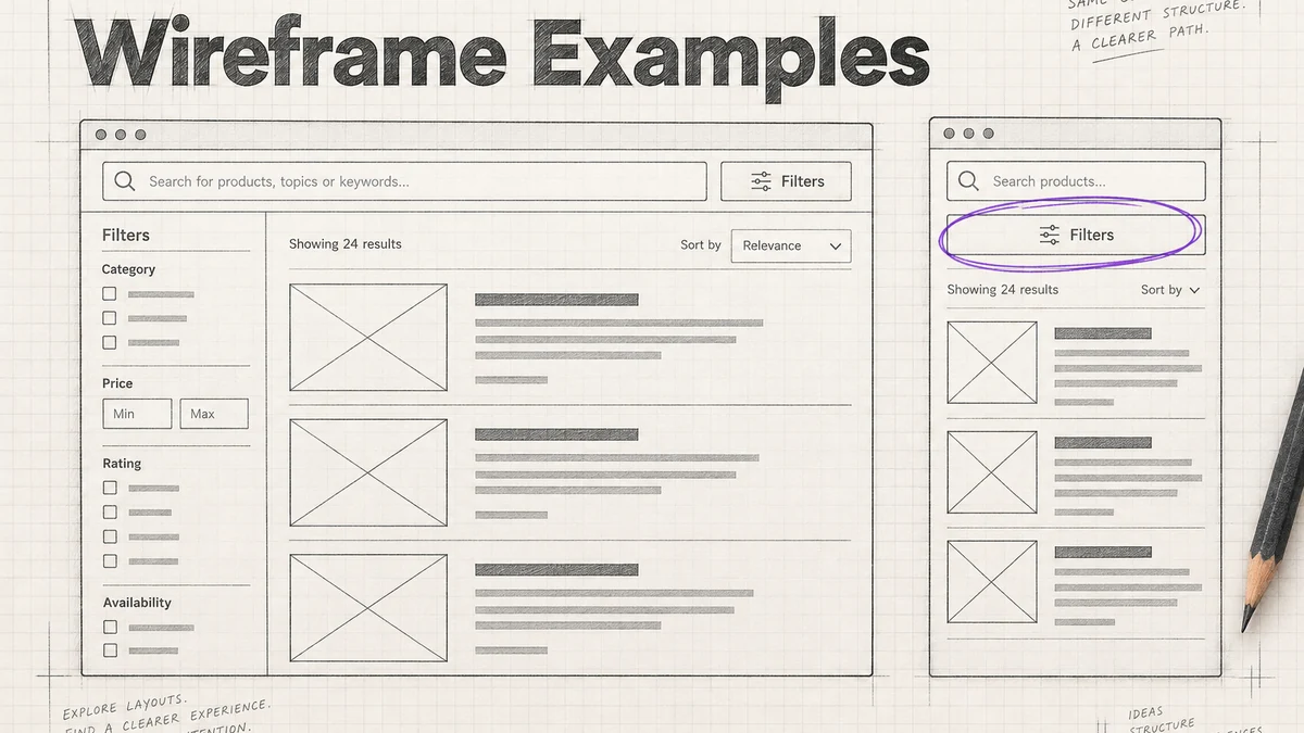
Search is not only the results list. Model the initial state, suggestions, query, filters, no results, partial results and result detail. State what the query covers and how a person removes a filter. A filter that disappears on a new search can make the result appear wrong even when the backend is correct.
States to include
- Empty search field with a useful hint.
- Suggestions or recent searches with keyboard focus.
- Results with a visible query and count or scope.
- Loading or partial results if the system streams data.
- No results with a recoverable next step.
- Filtered results and a clear-all action.
Annotate whether the result order is relevance, date or another rule, and where that rule is explained. Add a long result title and a missing thumbnail so the layout does not depend on perfect content. On a narrow screen, decide whether filters open as a sheet, list or inline controls and how the user returns to results.
Example 3: Onboarding flow
An onboarding wireframe should help a person reach a first useful action. Show the value proposition, required setup, optional preferences, permission request, skip path and return path. Avoid a sequence that forces someone to view every feature before they can try the product.
States to include
- New account with no data.
- Short explanation next to the first required action.
- Permission request with a reason and later path.
- Skip or defer option for optional setup.
- Success confirmation that points to the first task.
- Returning user who has already completed setup.
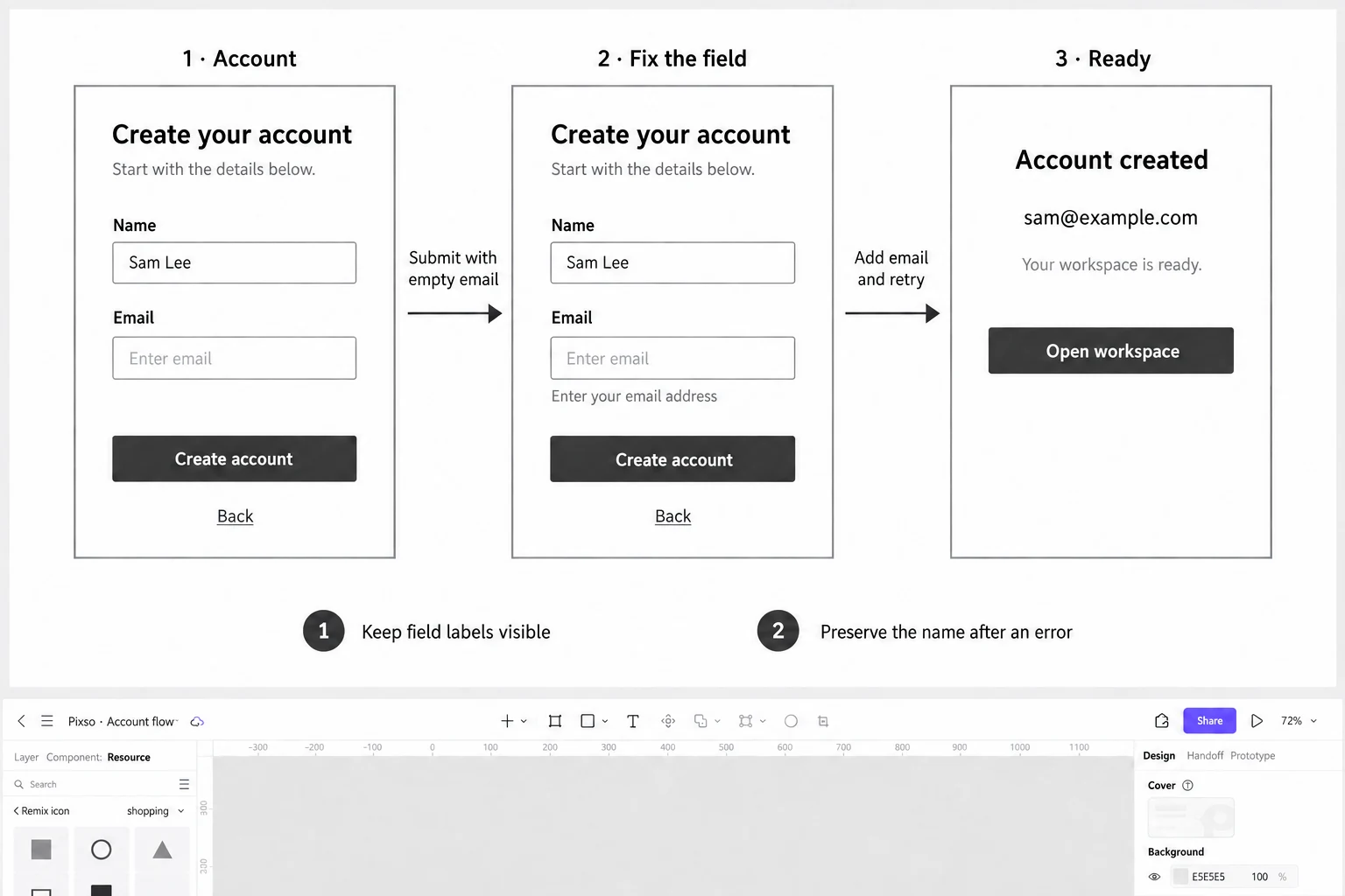
The account-creation example later in this guide has three screens. First, Sam Lee has entered a name but left Email blank; no error appears before submission. Second, submitting the incomplete form reveals “Enter your email address” while preserving the name. Third, adding sam@example.com and submitting again reaches the account-created screen. The correction belongs between the error and success states. It cannot be replaced by an unexplained arrow.
This rough sequence answers useful questions before visual styling begins: does the label remain visible, does the person know which field to fix, and do they have to re-enter valid information? Optional preferences and education can follow account creation when they are not needed for this task.
Example 4: Dashboard and data overview
A dashboard should represent an information decision, not a collection of cards. Start by identifying what a user needs to know or do when they arrive. Include a meaningful empty state, populated values, date or filter controls, loading and permission differences. Show units and periods in labels so a number cannot be interpreted in several ways.
States to include
- First-use empty state with a next action.
- Loading or delayed data with a clear status.
- Populated view with realistic values and long labels.
- Filtered view with a visible scope and reset action.
- Partial failure where one module is unavailable.
- Read-only or restricted view with an explanation.
Ask a reviewer to find one change, compare two periods and explain what a value means. If the answer requires a verbal tour, add context or simplify the hierarchy before moving to visual design.
Responsive wireframes are decision tools
Choose one task and compare a narrow and wide layout. Document what reorders, collapses, scrolls or remains persistent. Do not shrink a desktop wireframe until it fits a phone. A mobile view may need a different information order, a shorter label, a bottom action or a progressive disclosure pattern.
Include a long translation, a large text setting and a field that opens the virtual keyboard. This exposes whether the primary action remains reachable and whether the content can grow. The MDN responsive design guide is a useful implementation reference; the wireframe should still state the product’s own behavior.
Annotate behavior without writing a novel
Use short numbered notes for behavior that a static screen cannot show: “submit validates the postal code,” “preserve input after timeout,” or “focus returns to the field.” Link each note to the screen or component that owns it. Keep a small legend for states and do not mix open business questions with settled interaction rules.
An annotation is successful when another designer can reproduce the scenario. If a note says “make it intuitive,” replace it with the user action, expected feedback and recovery path. Capture unresolved decisions in a separate list with an owner so the wireframe does not become an unreviewable wall of comments.
How to compare alternatives
Make two versions that differ in one structural decision. For a checkout, compare a single-page form with a two-step flow; for search, compare persistent filters with a filter sheet. Give the same reviewer the same task and record hesitation, missing information and recovery. Do not choose the version that looks more polished when the question is structural.
Use a small decision table:
| Question | Alternative A | Alternative B | Evidence |
|---|---|---|---|
| Where does the user see delivery cost? | Summary beside form | Summary on review step | Can they state total before submit? |
| How are filters exposed? | Persistent rail | Filter sheet | Can they change and clear scope? |
| When is permission requested? | At first launch | At the task moment | Do they understand the reason? |
When to move beyond a wireframe
Move to a mockup when the decision is visual: hierarchy, contrast, type, imagery or component styling. Move to a prototype when the decision is behavioral: navigation, timing, feedback or recovery. Move to an implemented slice when the question involves network, performance, accessibility API or production data.
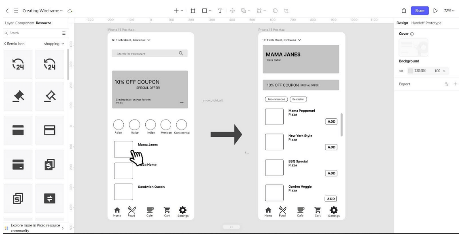
These artefacts are not mandatory phases. A team can return to a rough wireframe after a polished prototype exposes a structural problem. The wireframe vs mockup vs prototype guide can provide a short decision table, while this page supplies concrete flows.
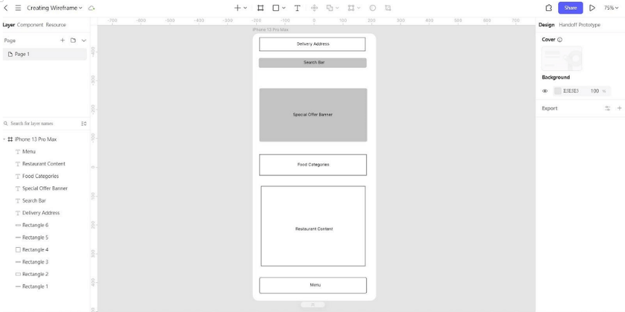
In Pixso, create a mobile frame for Sam's account setup with a visible Name label, an Email label and a “Create account” action. Keep the controls in grayscale and use ordinary text, not polished illustrations. Duplicate the frame for the missing-email error, preserving the name, then add a confirmation frame with the completed email and “Open workspace.” Label the first transition “Submit with empty email” and the second “Add email and retry.” You can review the three frames side by side before connecting them as a prototype. A teammate should be able to describe the correction by reading the wireframe alone.
Choose the right amount of detail
Draw only the states needed to answer the current question, then make those states complete. The account example needs the blank field, the error and a corrected result. It does not need every navigation destination. A checkout review needs an actual total and delivery choice, even if the product photos remain gray rectangles.
Keep real labels and realistic values as you simplify the visual treatment. Removing content makes a screen look cleaner, but it also removes the very constraints a wireframe should expose. Add fidelity when the unanswered question concerns typography, contrast or motion; add another structural alternative when the information order is still uncertain.
Further reading and sources
- WCAG 2.2
- MDN responsive design
- Pixso’s wireframe vs prototype, low-fidelity wireframe, website wireframe tool and prototyping pages.
Example review notes in practice
Imagine that a reviewer is given the checkout wireframe and asked to save an address. They pause at the first field because the label is hidden as placeholder text. After entering a long address, the summary pushes the primary action below the fold. When the postal code fails, the page shows a generic banner but leaves the field unchanged. These are three different design issues: content clarity, responsive structure and recovery.
Write the notes as observations rather than judgments:
| Observation | Likely design question | Next action |
|---|---|---|
| Reviewer searches for a label after the placeholder disappears | Is the field’s purpose persistent? | Add a visible label and repeat the task |
| Long address hides the primary action | What should remain reachable at narrow width? | Reflow the summary and test large text |
| Reviewer does not know how to fix the postal code | Does the error describe the correction? | Add field-level guidance and retry |
This format keeps the review useful when several disciplines participate. Product can decide the requirement, content can revise the wording, design can change the hierarchy and engineering can check whether the recovery state is implementable.
Paper, digital and coded wireframes
Paper is valuable when the team needs to compare many structural alternatives quickly. A digital wireframe becomes useful when a screen needs realistic text, a shared link or a repeatable component. A coded wireframe is appropriate when the unanswered question depends on a browser, device, data source or assistive technology. The label does not define the fidelity; the question does.
Whichever medium you choose, preserve the decision record. Name the task, version the alternatives and mark what is intentionally missing. When a polished screen replaces a wireframe, keep the original rationale nearby so a later change does not recreate a rejected structure by accident.