On this page

Scott
A command palette UI should help experienced users reach an action quickly without forcing them to remember every shortcut. The useful design is more than a floating search box: it needs a reliable trigger, searchable command language, meaningful groups, keyboard focus, permission-aware results, empty states, and feedback after execution. This tutorial builds those states as an editable component set in Pixso.
Part 1. Define what the command palette can do
Start by setting a boundary. A command palette may navigate to pages, run actions, change settings, insert objects, or search recent items. Combining all of those without a ranking rule creates a noisy result list. For the worked example, we will design a palette for a project-management app with three command types:
- Navigation: open My Tasks, Inbox, Reports, or Settings.
- Actions: create a task, invite a teammate, or export the current view.
- Recent items: reopen a project or board the user recently visited.
Write down excluded behavior too. The palette will not delete records, approve payments, or expose admin-only commands to members. Destructive and high-impact actions need more context than a one-line result can provide. A palette may open the relevant screen, but it should not bypass the product’s normal confirmation and authorization rules.
Part 2. Design the trigger and focus contract
Provide a visible entry point even when a keyboard shortcut is available. A search or “Commands” button helps discovery and gives touch users a path. Display the shortcut as supplemental information, not as the only label.
When the palette opens, the intended interaction is straightforward: focus moves to the search field, the current query is announced, arrow keys move through results, Enter activates the selected result, and Escape closes the overlay and returns focus to the trigger. The design file can show these expectations, but the browser implementation must be tested with a keyboard and assistive technology.
Decide what happens to an unfinished query. Closing and reopening during the same short task might preserve it; opening the palette later may reset it. Make that product behavior explicit rather than allowing implementation detail to decide.
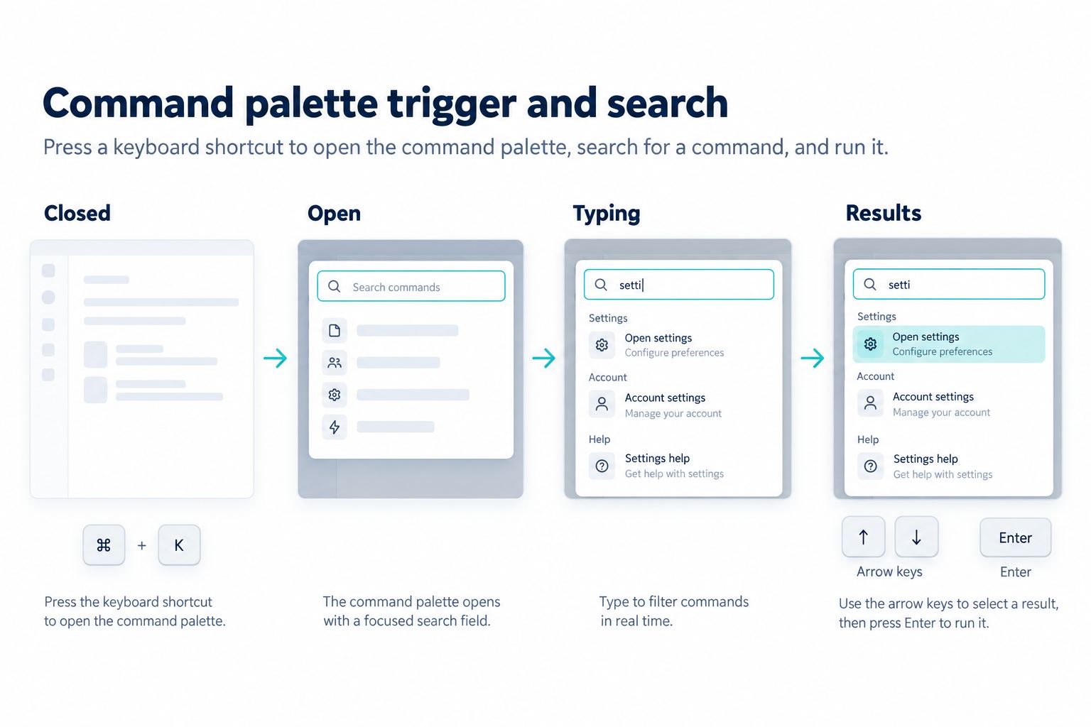
Part 3. Build the command palette UI anatomy
Use a simple, stable structure:
- Overlay or anchored surface: separates the palette from the page without hiding all context.
- Search field: includes a clear label, query, clear action, and optional scope.
- Group heading: identifies Navigation, Actions, Recent, or another source.
- Command item: contains icon, primary label, optional description, and shortcut.
- Selection state: shows which item will run on Enter.
- Status area: explains loading, no results, permission limits, execution, or failure.
Keep item height and alignment stable as results change. Shortcut hints should align in a dedicated column so labels remain easy to scan. Use descriptions only when labels are ambiguous; a dense paragraph under every command defeats the speed benefit.
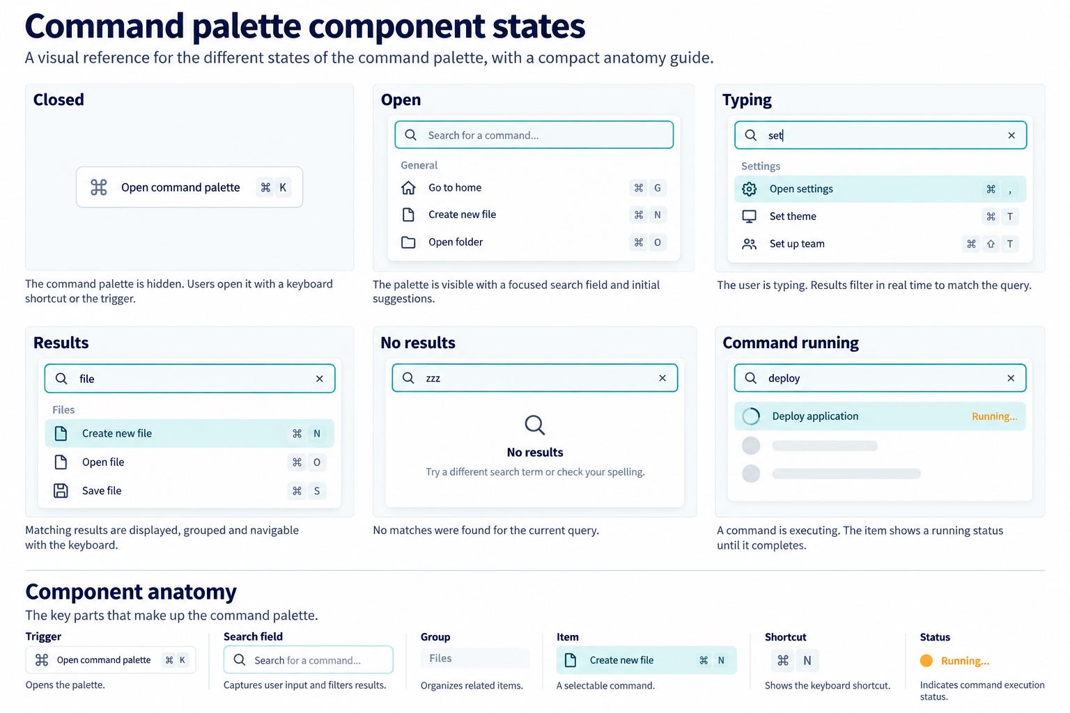
Part 4. Create the command palette UI component set in Pixso
Open a design file in Pixso and create a page named “Command Palette.” Add a reference frame showing the host application so the overlay can be evaluated against real navigation and content. Build the palette surface using layout settings that keep the search field, groups, and status area aligned when content changes.
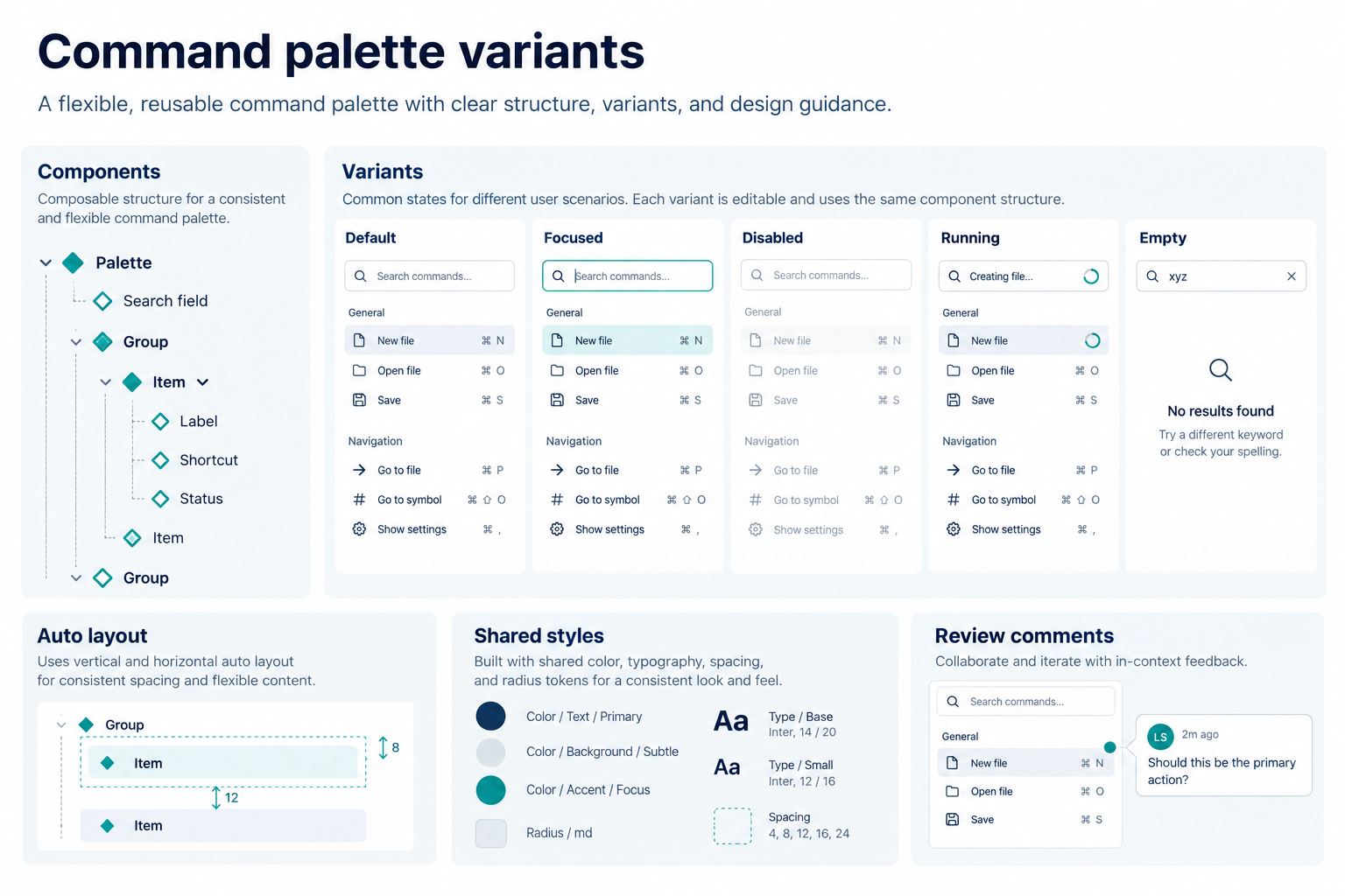
Create reusable components in this order:
- Build a command item with icon, label, optional description, and shortcut regions.
- Add item states for default, hovered, keyboard-selected, disabled, and running.
- Create a group component with a heading and a vertical list of command-item instances.
- Create the search header with query, clear control, optional scope label, and loading indicator.
- Assemble the palette with replaceable result, empty, and status regions.
- Name layers by function, such as
command-labelandshortcut-hint, rather than visual position.
Pixso components, styles, variables, and team libraries can turn this exercise into a reusable system artifact. Keep source components on a clearly named page and test instances with short and long labels. If the structure needs cleanup, Pixso AI smart layout and smart rename can assist selected content, but the designer must verify hierarchy, spacing, and business meaning. The Pixso AI guide describes the current editing tools and their role in the editor.
Part 5. Specify search, aliases, and ranking
A visual mockup cannot define search quality by itself, but it should expose the rules that affect the interface. List searchable fields for each command: display label, synonyms, object names, and shortcut aliases. “New task” might match “create task,” while “settings” should not surface unrelated export actions.
| Signal | Example | UI consequence |
|---|---|---|
| Exact command label | “Create task” | Place first when permitted |
| Approved alias | “New task” | Show the canonical command label |
| Recent use | Reports opened yesterday | Boost within the correct group, not above exact matches |
| Current context | Export current board | Show only when a board is open |
| Permission | Invite teammate | Hide or explain unavailability according to product policy |
Do not imply that disabled and hidden are interchangeable. If a user can understand and resolve the missing prerequisite, a disabled command with a concise reason may help. If the user must never discover the command because of authorization or confidentiality, exclude it. Product and security owners should decide that behavior.
Part 6. Design loading, no-result, and error states
A search palette may use local commands, remote objects, or both. Distinguish “still searching” from “nothing matches.” If results can take time, keep the query visible, show progress without moving focus, and avoid flashing a no-result message before the search finishes.
The no-result state should echo the query and offer a useful next action. For the project app, “No commands match ‘archive client’” can be followed by “Try a task, page, or project name.” Do not invent a command based on the phrase. If recent projects fail to load, local commands can remain available while a status message explains which source is unavailable.
Test long queries, accented characters, right-to-left text where supported, typo tolerance, and duplicate names. When two projects share a name, add enough path or workspace context to distinguish them.
Part 7. Show what happens after activation
Navigation commands can close the palette and move to the destination. Actions need visible feedback. “Create task” may open a form; “Export view” may enter a running state and later provide a download. Do not use a green check merely because the command was accepted. Distinguish request accepted, action running, action failed, and action completed.
Prevent accidental duplicate execution while a non-idempotent action is running. Keep retry available only when the system can do so safely. If an action changes data, show what changed and provide undo only when the underlying product genuinely supports reversal.
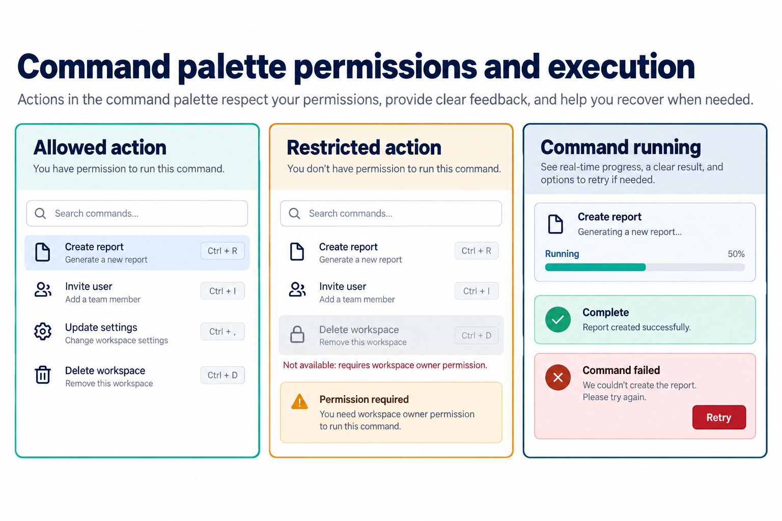
Part 8. Create six review frames
Place the component instances into six full frames: Closed, Open with recent commands, Typing, Results, No results, and Command running. Use the same project context in every frame so reviewers can follow one task. Add concise annotations for focus destination, available keys, data source, and completion evidence.
Share the Pixso file with product, content, engineering, and accessibility reviewers using a link. Contextual comments keep decisions attached to the relevant state. If the pattern becomes part of the team library, document usage and naming in the Pixso design system. Review comments do not replace implementation tests for focus trapping, keyboard order, screen-reader announcements, permissions, or command execution.
Part 9. Adapt the palette without losing speed
On desktop, a centered overlay can preserve surrounding context and enough width for shortcuts. On a narrow screen, a full-height sheet may be easier to use. Keep the search field visible, move shortcut hints out of the mobile layout when they are not actionable, and maintain comfortable targets.
Do not make the mobile version a smaller desktop overlay with cramped columns. Prioritize command label, context, and status. If the product has hundreds of commands, consider a scope switch or staged navigation rather than an endless mixed list.
Also test the palette at 200 percent zoom and with translated command labels. The selected item, status message, and close control must remain visible without relying on a fixed overlay height. When content must scroll, keep keyboard selection synchronized with the visible item and avoid trapping the user in a result region they cannot leave.
Part 10. Command palette UI checklist
- A visible trigger complements the keyboard shortcut.
- Opening, closing, and focus return are specified.
- Groups match command types and user language.
- Selection is distinct from hover and focus is not communicated by color alone.
- Search aliases, context, permissions, and ranking have owners.
- Loading, partial results, no results, and source failure are different states.
- Running, failed, and completed actions have distinct feedback.
- Destructive actions retain their normal confirmation and authorization safeguards.
- The component works with long labels, localization, zoom, and narrow viewports.
Conclusion
A command palette UI feels fast when its rules are predictable and visible. Define the command scope, focus contract, search language, permission behavior, empty states, and execution feedback before polishing the overlay. In Pixso, build those decisions as reusable components and state frames, gather contextual review, and hand engineering a clear interaction contract to verify in the product.