Scott
When a product is small, a designer and developer can easily keep everything in mind, such as a single button color, one font style, and standard spacing between blocks. As the team and product scale, informal agreements break down. Colors diverge, components duplicate, and developers constantly ask designers which shade of gray to use.
Design-system maintenance starts with ownership
A design system is not complete when its first component library is published. Define who owns a token or component, how changes are proposed, and what evidence is required before a breaking change is released. Start with a small set of foundations and components that solve repeated product problems. Connect each component to usage guidance and an implementation counterpart so the system remains understandable to designers and developers.
- Foundation: name color, type, spacing, and elevation roles.
- Component: define states, variants, and content constraints.
- Governance: document contribution, review, deprecation, and release.
- Traceability: link the design source to the implementation and examples.
Building a design system from scratch solves this issue at its root. It establishes a unified design language and codebase so both sides follow identical rules instead of manually aligning on every project. In this guide, we will explore what a design system is composed of, the biggest challenges in design system management, and how Pixso bridges the gap between design definitions and technical implementation.
Part 1. What is a design system and why do you need one?
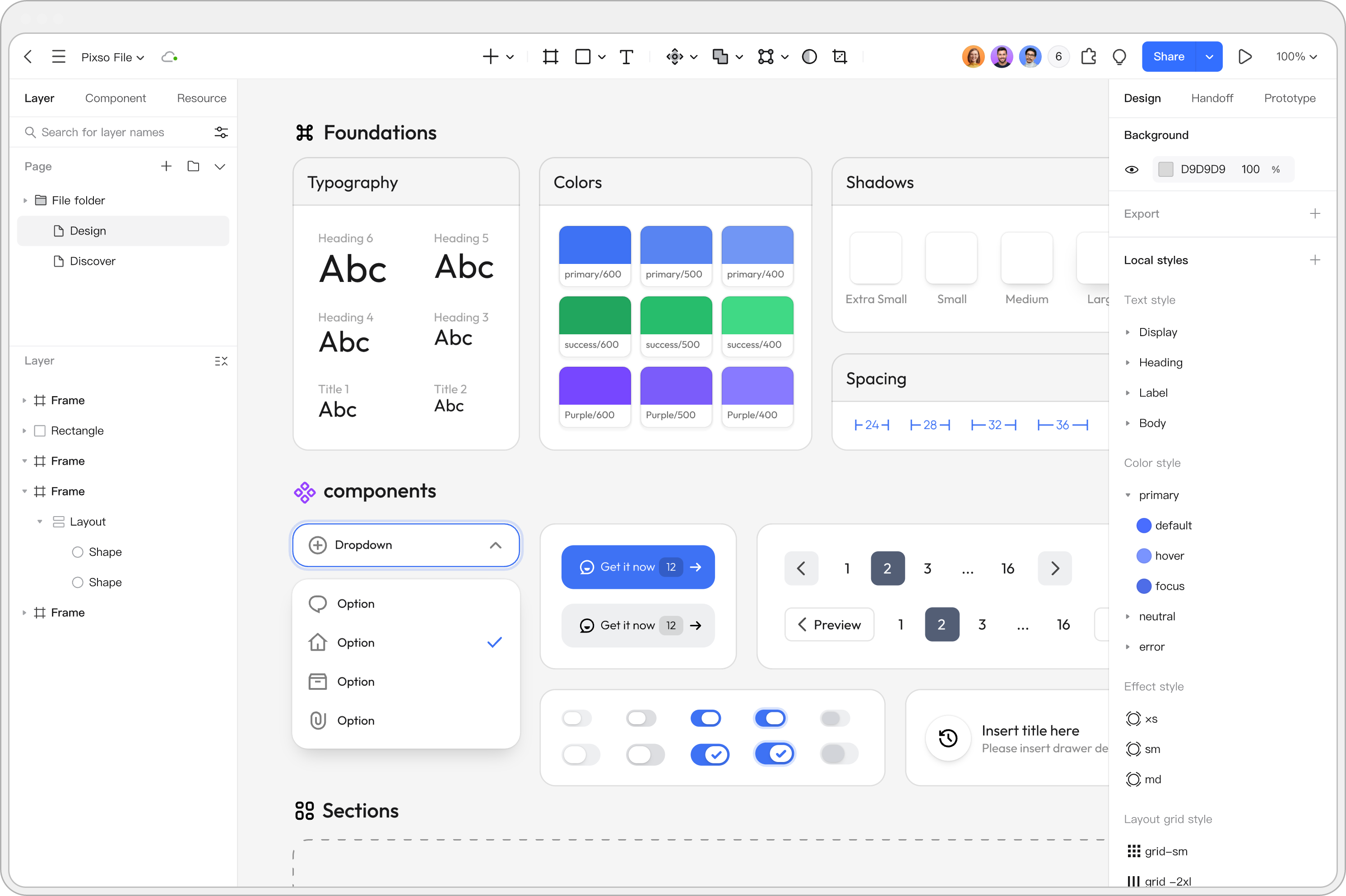
Understanding what a design system is begins with its core purpose. A design system is a comprehensive collection of reusable design system components, visual styles, and clear usage guidelines that keep digital interfaces consistent while accelerating product workflows for designers and developers.
Without a structured system, teams build every new page or feature from scratch. Designers waste valuable time recreating existing assets, while developers struggle to reconcile minor UI discrepancies with the existing codebase. Implementing a proper design system eliminates redundant work and establishes a shared vocabulary across the team, where every component has a single name and a single value that translates seamlessly from UI layouts into production code.
Part 2. Key elements of a design system
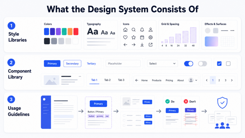
When learning how to build a design system, it helps to understand its three foundational layers: style libraries, the component library, and clear usage guidelines.
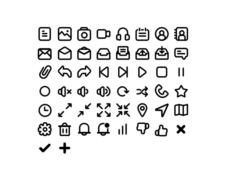
Style Libraries: Color palettes, typography pairings for headings and body text, and icon sets are managed centrally rather than copied manually into every new file.
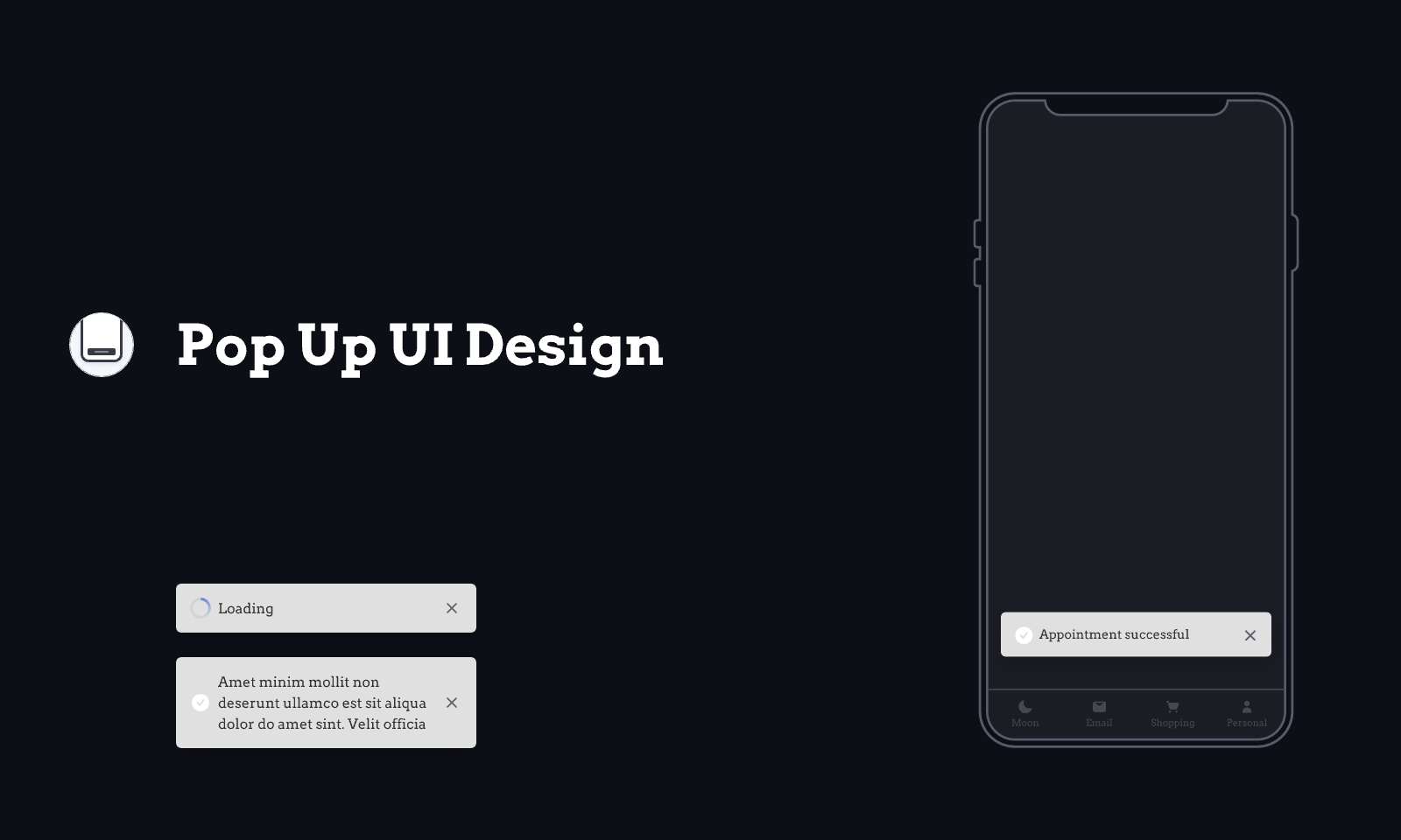
Component Library: Static and interactive UI design system components such as buttons, input fields, and cards are created once and reused across all team projects. Vector graphics, including custom icons and visual elements drawn from scratch, support unique brand assets.
Usage Guidelines: A component library without documentation quickly leads to duplicate work. A designer might recreate a button simply because they were unaware it already existed. Clear guidelines dictate when to use specific components, how to name new elements, and which properties can be customized. Without these rules, even the most complete library loses consistency over time.
Part 3. The biggest challenge in building a design system
The main difficulty when learning how to create a design system is not building the initial components, but keeping design and code aligned over time. Designers and developers typically work with different libraries and naming conventions.
Designers rely on UI libraries inside design tools, while engineers use code repositories. Without a synchronized standard between them, teams face poor implementation fidelity and high communication overhead. Updating a color in the design file requires manual notification to developers, while updating a variable in code leaves the design file outdated. Effective design system management exists specifically to bridge this gap between design specifications and technical execution.
Part 4. How Pixso helps you build and maintain a design system
Pixso resolves alignment challenges through a single source of truth. Designers and front end developers co-create and maintain unified specifications directly inside Pixso rather than managing two parallel workflows.
Design System Management in Pixso: Pixso features built in design system management capabilities for centralized publishing, collaboration, and iteration of design specifications, including component styles and design tokens. Rather than serving as an external third party plugin, it is natively integrated into the platform to maintain continuous synchronization and consistent application of the team design language.
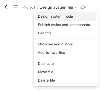
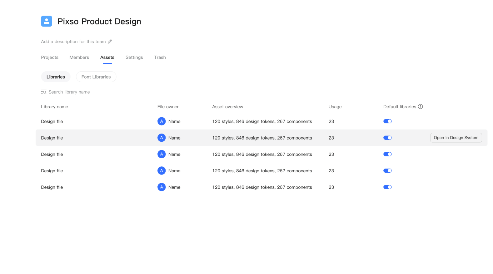
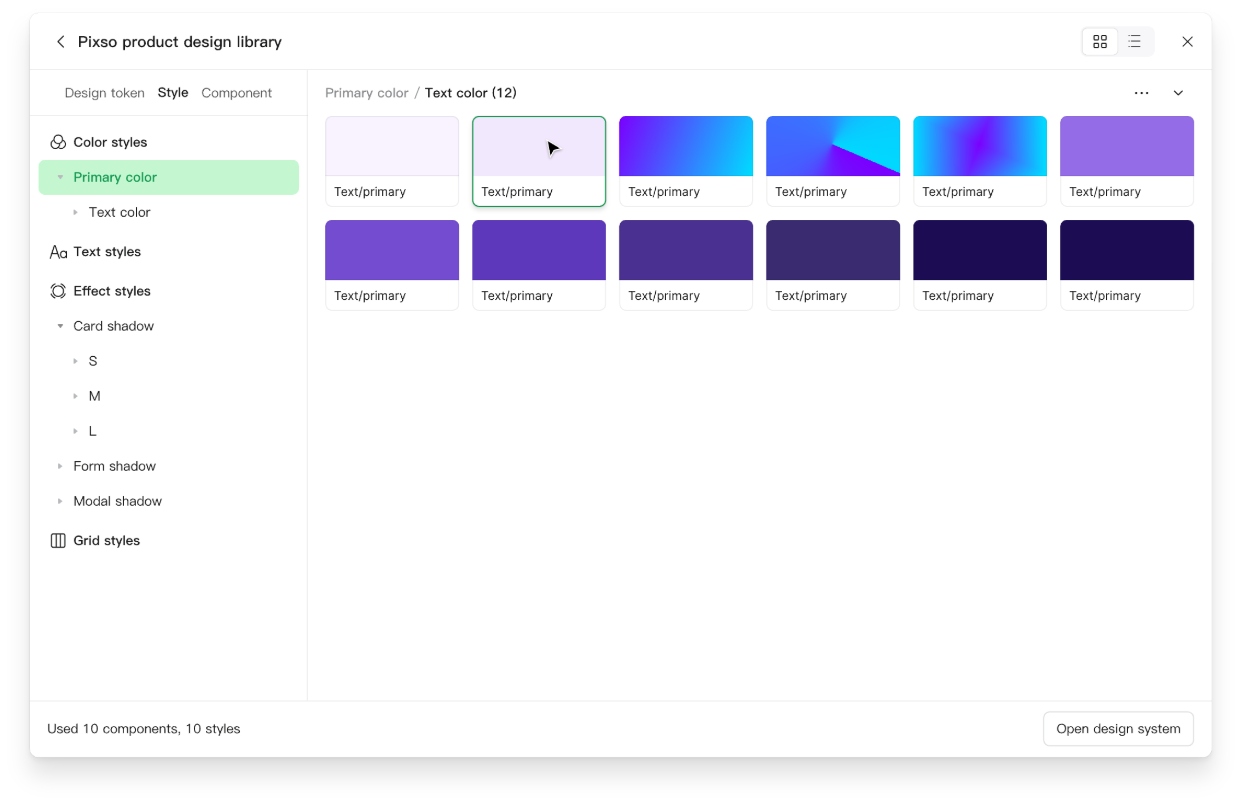
You can enter Design System Management mode in Pixso using three methods:
Through the file name drop down menu on the canvas page by selecting Design system mode.
Through the Assets section on the team home page by clicking Open in Design System.
Through the asset library list on the canvas page by choosing Open design system.
Simply register a Pixso account and publish an asset library. Design system management functionality becomes available for any file within that library without complex setup or extra subscriptions. If your team already has design assets created in other tools, there is no need to rebuild them. Pixso supports importing Figma files as well as importing and exporting Sketch, Adobe XD, and SVG files, making existing assets immediately part of your design system.
Alias Mapping in Pixso:
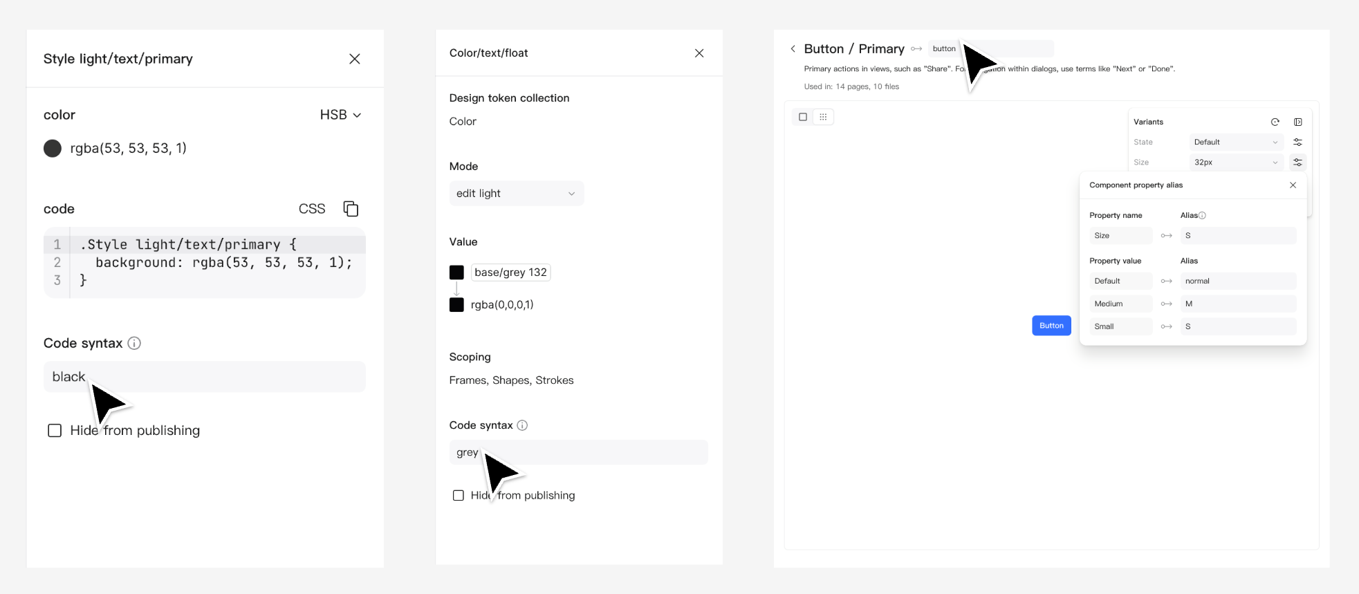
Within the design system management workspace, designers and developers map components to code using alias mapping. An alias functions as a unique ID that allows Pixso to identify specific assets like color values or UI elements accurately. Through alias mapping, design definitions connect with technical implementations at an atomic level, closing the communication gap between teams. Alias formats do not support non ASCII characters or special symbols, and names must not duplicate within the same component set. Teams typically establish naming conventions beforehand using a structured hierarchy.
From Design to Code Directly in Pixso: Once alias mapping is configured for a component, original property names in the corresponding code automatically convert into semantic aliases. Developers can copy code snippets directly from the Pixso code panel and paste them into project repositories without interpreting design files manually. This feature supports multiple front end frameworks. If your framework changes, simply click Regenerate to update the code structure. Pixso also offers bulk export capabilities, converting styles and design tokens into production ready CSS or SCSS with a single click while allowing targeted exports for specific categories such as color palettes or typography styles.
Part 5. How to make your design system reusable, updatable, and collaborative
A design system that cannot be easily reused, updated, or maintained collaboratively quickly becomes obsolete. When systems lack these three pillars, teams inevitably drift back to fragmented workflows. Pixso addresses each requirement with dedicated features and workflows.
Making the System Reusable: Publish components to the shared Pixso team library so every published element becomes instantly available to all team members. Instead of rebuilding elements, designers insert existing components directly. For arranging multiple recurring objects, smart selection automatically aligns items into clean rows and columns. To avoid starting every new file from scratch, begin with smart templates that predefine baseline layouts and visual styles.
Making the System Updatable: Connect icons and visual graphics through the Pixso library in a single click. Updates synchronize across the entire team instantly, eliminating the need to modify files manually. To track evolution across iterations, use version history control by naming and saving milestones directly inside the editor, enabling easy returns to previous versions whenever needed.
Making the System Collaborative: Configure granular permission settings based on individual roles. File owners can assign view or edit access, with advanced permissions available for enterprise organizations. When sharing work with external stakeholders without accounts, enable guest link sharing for registration free access. For developer handoffs, switch to the dedicated developer inspect mode, providing accurate measurements, clean CSS code, and production ready assets without losing fidelity during handoff.
FAQ
Q1. What is an alias in design tokens?
An alias is a unique identifier connecting a component or token in design files to a specific code property. It functions like an ID number, allowing the system to locate resources accurately while providing developers with clean semantic names instead of raw code values.
Q2. Does a small team need a design system?
If a team consists of a single designer working on a small project, a full system may not be required immediately. However, if team growth, frequent release cycles, or multi platform support are planned, establishing structure early prevents component duplication and visual drift before scaling.
Q3. How does a design system differ from a UI kit?
A UI kit is simply a collection of static visual elements such as buttons, inputs, and cards. A complete system is far broader, containing tokens, documentation, governance rules, and automated synchronization mechanisms between design and code, as implemented through alias mapping in Pixso.
Q4. How do developers extract code from the design system?
Once alias mapping is established, developers open the inspect or code panel inside design system management to copy framework specific code snippets with semantic property names already mapped. For bulk asset handoff, styles and tokens can be exported directly into CSS or SCSS files.
Conclusion
Learning how to build a design system from scratch is an ongoing process rather than a one time project. Long term success depends on continuous alignment between what designers create and what developers implement, which is where traditional workflows lose speed and precision.
Pixso bridges this gap through design system management and alias mapping, linking design definitions directly to technical execution at an atomic level. Combined with a robust component library, version history controls, and flexible access permissions, Pixso ensures your assets remain reusable, updatable, and collaborative as your product continues to scale.
Explore the Pixso Design System Guide →