Scott
A chart can be technically correct and still be difficult to understand. A legend may depend on colour alone, an axis may hide the unit, or a tooltip may contain the only exact value. People read charts with different vision, input methods, languages, devices, and levels of data familiarity. Accessible data visualization makes the intended comparison available through more than one path.
Start with three essentials: name the measure and scope, provide a cue beyond color, and make the important values available as text. The examples below apply those essentials to chart labels, keyboard interaction and missing-data states. For choosing a chart type, see data visualization design.
Start with the decision the chart supports
Before selecting a chart type, write the decision the viewer needs to make. “Understand revenue” is vague. “Compare renewal rate by plan and identify the largest change this quarter” gives the chart a job. A chart with no decision often accumulates labels, colours, and controls that compete with one another.
Define the audience, time boundary, unit, and acceptable precision. A finance analyst may need exact values and downloadable data; an executive may need a directional comparison and a clear exception. The same dataset can support two different views, but neither should hide its assumptions.
Use a short chart brief:
| Field | Question |
|---|---|
| Decision | What should the viewer compare or decide? |
| Measure | What is counted, averaged, or estimated? |
| Unit | Is it a count, percentage, currency, duration, or index? |
| Scope | Which users, time range, and filters are included? |
| Uncertainty | Are values delayed, sampled, or estimated? |
The brief keeps the visual language connected to meaning. It also helps content and engineering create the text alternatives later.
Do not use colour as the only encoding
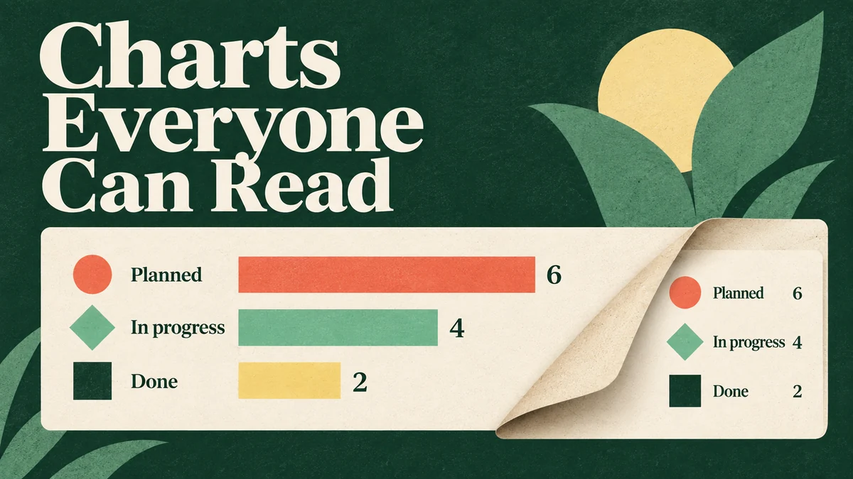
Colour is useful for emphasis, but it is not a reliable sole key for categories, status, or direction. Add a second cue that survives colour changes: direct labels, shape, line style, position, pattern, an icon with text, or a visible annotation. The cue should be consistent across the chart and its legend.
For a line chart, a label at the line’s endpoint may be clearer than a distant legend. For a status table, combine a status word with a colour chip rather than showing only red, amber, and green. For a map, use boundaries, labels, or texture in addition to a colour ramp.
Do not solve every issue by adding more patterns. A busy pattern can reduce readability for everyone. Prefer position and direct labelling first, then use a restrained secondary cue for categories that remain ambiguous.
Check contrast in the context of the chart
Use the relevant WCAG threshold as a starting point. Normal text generally needs a contrast ratio of at least 4.5:1; qualifying large text needs 3:1. Graphical marks needed to understand a chart generally need 3:1 against adjacent colors. Apply the rule to the actual mark and background, not only to palette swatches. Very thin lines can remain difficult to see after anti-aliasing even when their source colors pass.
Inspect the chart in each state the product offers: default, focused, selected, dark theme and print. Direct labels or visible values may carry information that a low-contrast decorative mark does not need to convey; document that relationship instead of declaring the whole palette accessible. Selection also needs a cue such as a label, marker or line treatment that remains recognizable without color.
The W3C text-contrast guidance and non-text contrast guidance describe the requirements and exceptions. Test the rendered chart at its intended size as well as checking the color values.
Label the comparison the viewer should make
Titles such as “Monthly performance” do not explain what performance means. A useful title includes the measure and scope: “Renewal rate by plan, January–June 2026.” A subtitle can state the source, update time, or filter. Axis labels should include units and a readable scale; abbreviations need either a key or a familiar context.
Use annotations for meaningful events, not every data point. Call out the change or threshold that affects the decision, and place the note near the mark it describes. If a viewer must hover to discover an important value, make that value available in visible text or an equivalent table.
For small multiples, repeat the scale or state clearly whether axes are shared. Inconsistent scales can make a small change look dramatic, while identical scales can make a useful difference hard to see. Document the choice in the chart brief.
Design an accessible data table or text summary
Give a complex chart a short description identifying its subject and a nearby text explanation of the important comparison. When readers need exact values, provide a structured table with the same series, units, dates and filters. A download can be useful too, but it should not be the only way to obtain the essential information. Use proper table headers and a caption; a picture of a table is still an image.
A text summary can state the main comparison and exception:
Renewal rate rose for Team and Business plans from April to June. Business had the largest increase; Enterprise data is incomplete for June.
This sentence does not replace the values when exact data matters, but it gives the viewer a meaningful starting point. Avoid describing a trend as “good” or “bad” unless the product has a defined threshold.
Handle zero, missing, delayed, and estimated values
Empty and unavailable data states must be distinct. Zero means the measured value is zero. No data may mean the event has not occurred, the filter has no matches, or the system has not collected the metric. Delayed data needs a timestamp or explanation. An estimated value should be marked as estimated and, when relevant, include the method or range.
Keep axes and labels stable when a filter returns no rows, but explain the changed scope. Do not draw a flat zero line merely to make the chart look complete. If a data source fails, show a recoverable status near the affected chart and preserve the selected filters.
The dashboard UI design examples are useful for card hierarchy, but state definitions should come from the data contract. A calm empty panel is better than an authoritative-looking value that the product cannot support.
Make interaction possible without precision pointing
Make the chart’s functions operable with a keyboard, including filters, series toggles and range controls. Essential values cannot depend solely on hovering over a tiny point. For a simple static chart, labeled values and an accessible table may be clearer than making every mark a tab stop. For an interactive chart, specify the focus order, how a user moves among values, and how they leave the chart without a keyboard trap.
When an interaction updates the chart, announce or expose the new scope in text. If users can hide a series, explain how to restore it. For a scrubber or range control, show the selected dates in a readable format rather than relying on the position of a thumb.
Interaction density matters on mobile. Use a summary card or a focused detail view rather than shrinking a desktop chart until labels overlap. Test with long labels and translated units before fixing a minimum width.
Build a colour system around meaning
Choose colour roles instead of isolated swatches. A categorical palette needs distinguishable, repeatable series; a sequential scale needs an ordered meaning; a diverging scale needs a clear midpoint. Reserve emphasis colours for the selected or recommended series and use neutral tones for context.
Document what happens when more categories appear than the palette contains. Options include grouping the long tail, using direct labels, or switching to a table. Do not add barely distinguishable colours until the legend becomes a puzzle. The design-system material on design tokens and shared values can help teams record roles, but the chart still needs a content rule for new data.
Check palettes in grayscale, at reduced opacity, and against common colour-vision differences. Automated tools can flag contrast pairs, but a person still needs to check whether the intended comparison is obvious in the full chart.
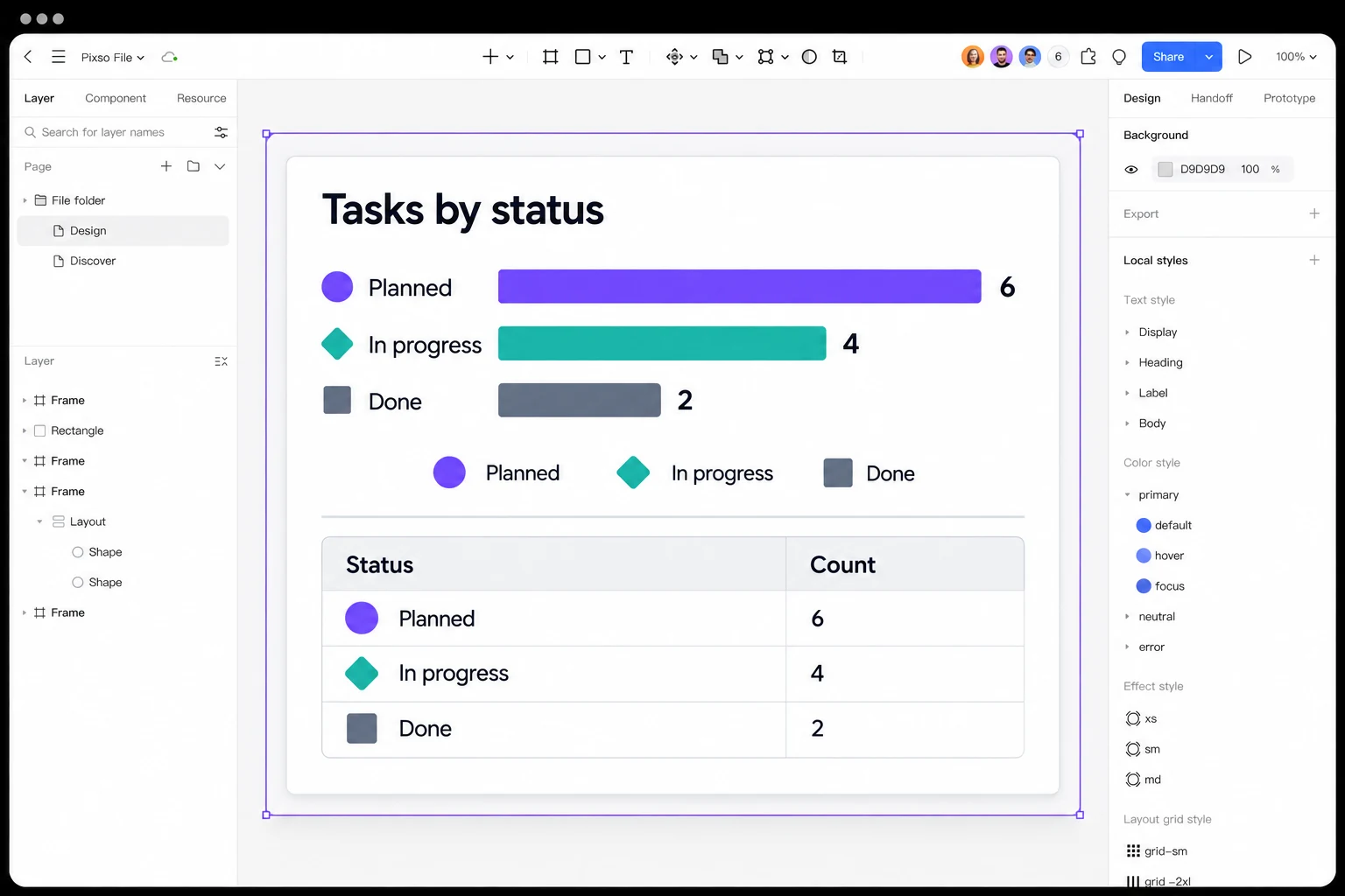
Draw one chart and its companion table in Pixso from the same small dataset. Put the category name and value next to each bar, then repeat both in the table so the meaning survives without color. Use shared text and color styles to compare the views at a narrow width. Review whether a teammate can identify every category and find the exact value before adding hover states or exporting the design for development.
The task-status example uses one small dataset in both views: 6 planned tasks, 4 in progress and 2 done. A concise summary is “Half of the 12 tasks are planned; 2 are complete.”
| Status | Task count |
|---|---|
| Planned | 6 |
| In progress | 4 |
| Done | 2 |
Review charts with real content and constraints
Create a review matrix with chart type, viewport, theme, data state, interaction state, and alternative view. Include the largest expected number of categories, the longest label, the smallest value, a missing value, and an unusual outlier. Review the chart at normal zoom and with text enlargement.
Ask reviewers to complete a task, not just approve a screenshot:
- Identify the measure and unit.
- Find the highest and lowest relevant value.
- Explain what changed in the selected time range.
- Identify a missing or estimated value.
- Switch filters and recover the previous view.
If a reviewer cannot complete the task without an explanation from the designer, the chart needs clearer labels or an alternate representation.
Keep source and interpretation close
Place the source, refresh time, and interpretation note near the chart or in an immediately reachable details panel. A footnote at the end of a long dashboard can be missed, especially when a chart is copied into a presentation. The note should answer whether the measure is a count, a rate, a sample, or an estimate, and it should identify the date range used by the current view.
When a person exports or shares a chart, carry that scope with the image or table. A cropped screenshot without its unit or time range can be mistaken for a different result. Designers do not need to prescribe a single export format, but they should make the information needed to interpret the result available in the handoff and the UI. This context prevents a visually polished chart from becoming an ambiguous artefact outside the product.
Handoff data and accessibility decisions
Document the data fields, units, sort order, filter scope, update time, and fallback state next to the component. Add the visible title, text summary, table strategy, and keyboard behaviour. Explain which colour or shape cues are redundant and which values are intentionally grouped.
The design-to-code handoff process is a good place to record these decisions, but do not bury them in a screenshot. Developers need the semantic contract and state rules so they can implement a chart that remains understandable when data changes.
Check the chart against its source
Compare every visible value with the underlying table after sorting, filtering and resizing. In the task-status example, “Planned” must remain 6 in the bar label, legend-associated category and table row; the summary must still refer to all 12 tasks. Then hide color and inspect the chart with keyboard navigation. If a value, label or action becomes unavailable, fix that representation before treating the chart as complete.