Scott
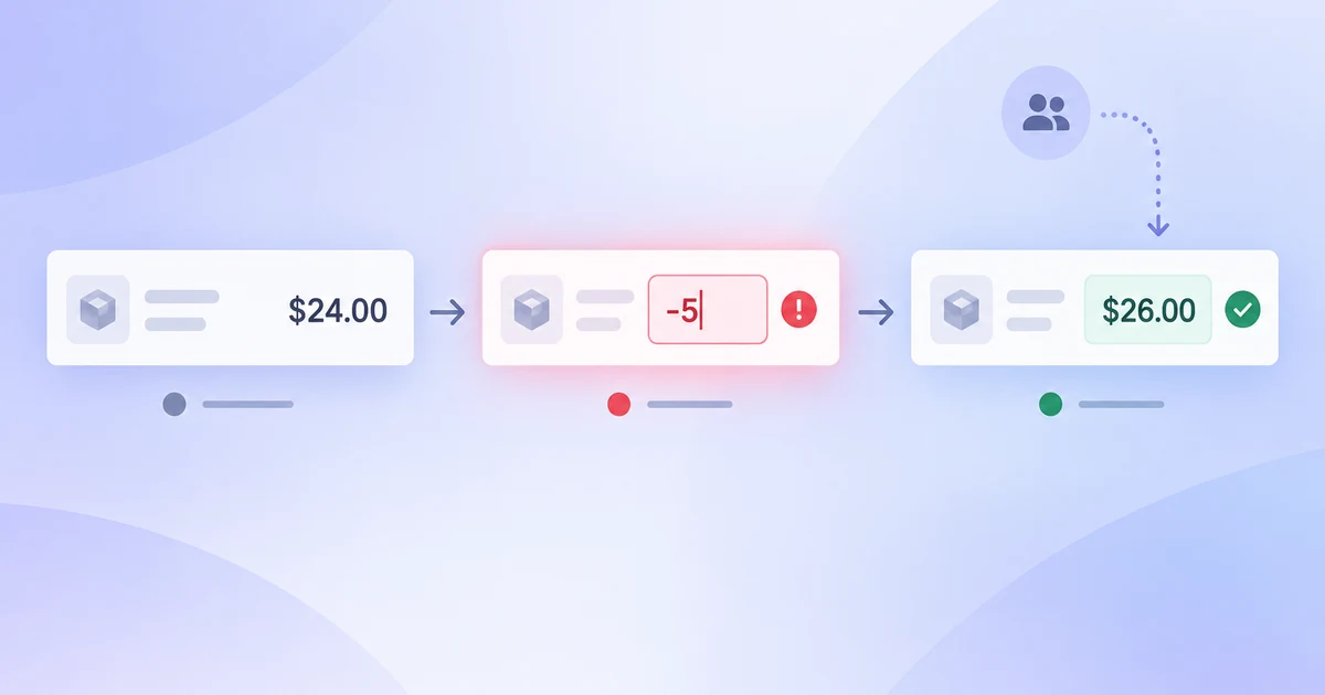
Validate one complete task before adding more screens. After the address form is organised, use an interactive prototyping workflow to connect the valid, invalid, and success states, then ask a reviewer to recover from the invalid postal code without hints.
- Write the expected outcome before linking the screens.
- Connect only the transitions needed for the task; keep unfinished branches visibly separate.
- Record where the reviewer hesitated and fix the copy, state, or transition before expanding the flow.
What this tutorial will help you do
Figma can feel large because one file can contain pages, frames, components, variables, comments, prototypes and exported assets. A beginner does not need to learn every panel before making useful work. This tutorial uses one small delivery-address flow to explain the decisions that recur in real UI projects: how to organise a file, create a frame, make content respond, reuse a component, connect a prototype, collect feedback and hand off the decision.
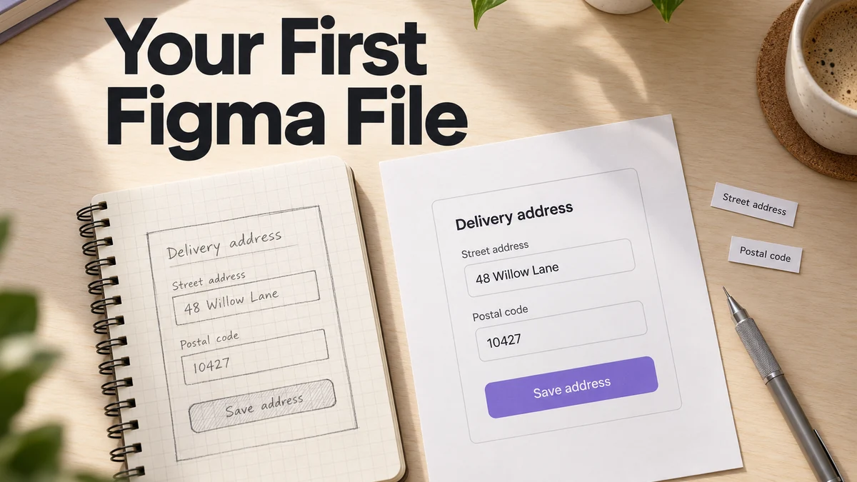
Start with the address form below and keep the official Figma guides handy for the controls you use. Learn each feature while solving a concrete layout or interaction problem, then repeat the task without following the instructions.
Start with a task, not a blank canvas
Write a short brief before opening a new file:
| Item | Example |
|---|---|
| User | A returning customer on a phone |
| Task | Add a delivery address and save it |
| Screens | Address form, invalid postal code, success |
| Constraint | The user may lose network connection |
| Evidence | A reviewer can complete the task and recover from an error |
This brief prevents a common beginner mistake: drawing attractive screens without knowing what they need to prove. Keep the assumptions visible in a note on the first page. If the product team has not decided whether an address is shared with another service, mark it as an open question instead of hiding it in the visual design.
1. Create and organise the file
Create a file with a name that explains its purpose and date. Use a page for the flow, a page for experiments and a page for components or references when the project needs them. Keep a simple naming convention for frames: Address / Form, Address / Error, Address / Success. Names help a reviewer and developer find the same state without a tour.
Use the layers panel as a readable outline. Group elements that belong to one semantic object, such as a form field, instead of grouping solely because they happen to overlap. Keep decorative experiments away from the flow under review. A clean file is not busywork: it reduces the chance that a comment or handoff points to an obsolete layer.
2. Choose a frame and build the hierarchy
Pick a target viewport that matches the first task. Add the page title, short instruction, fields, primary action and a place for status or help. Use real labels and a realistic long address rather than placeholder text. Placeholder text hides wrapping, field height and error placement problems.
The first frame should answer three questions: what is this screen for, what information is required and what can I do next? Do not start with a hero illustration or a perfect shadow. Create the information hierarchy with simple shapes and text, then inspect the result at the intended zoom and on a narrow viewport.
3. Learn the canvas and property panels through a task
The canvas is where you place frames and objects. The layers panel shows the structure; the properties panel lets you edit dimensions, position, typography, color and effects for the selected object. Select a field and record which properties define its visual state. Select the whole form and identify which properties define the container.
When an object looks wrong, inspect its parent before adding another override. A misplaced layer may be inside the wrong frame; a text box that wraps unexpectedly may have a fixed width; a shadow may make a border appear darker than intended. Debugging the hierarchy is faster than covering the symptom with another shape.
4. Make one component respond to content
Start with the Save address button. Add its text label, select the text layer and press Shift + A to wrap it in an auto layout frame. Add a fill to that frame, then set horizontal and vertical padding. Change the label to “Save delivery address”: the frame should grow around the text when its width hugs the content. The official auto layout instructions explain how to add it to selected layers.
Next, build a field from a visible label, an input area and helper text. Stack these inside a vertical auto layout frame. Use a fixed width for the outer practice frame, allow text to wrap inside it, and let the field's height grow with its content. Place two fields and the button in a second vertical frame. Changing the gap here adjusts the space between whole controls; changing a field's padding adjusts space inside that field. Start with one level of nesting, then add another only when the content needs it.
Separate three questions:
- How much space belongs inside this object (padding)?
- How much space separates its children (gap)?
- What happens when the available width changes (resizing)?
The official Auto Layout guide is the source of truth for current controls. A flexible frame does not automatically produce a responsive product; test the surrounding layout, content expansion, localization and implemented CSS as well.
5. Turn repeated UI into a component
If the same field appears on several screens, create a component with named states such as default, focused, error and disabled. Use a realistic value and a long error so the component’s limits are visible. A component is valuable when a change should be made once and understood everywhere; it is not a reason to abstract every one-off decoration.
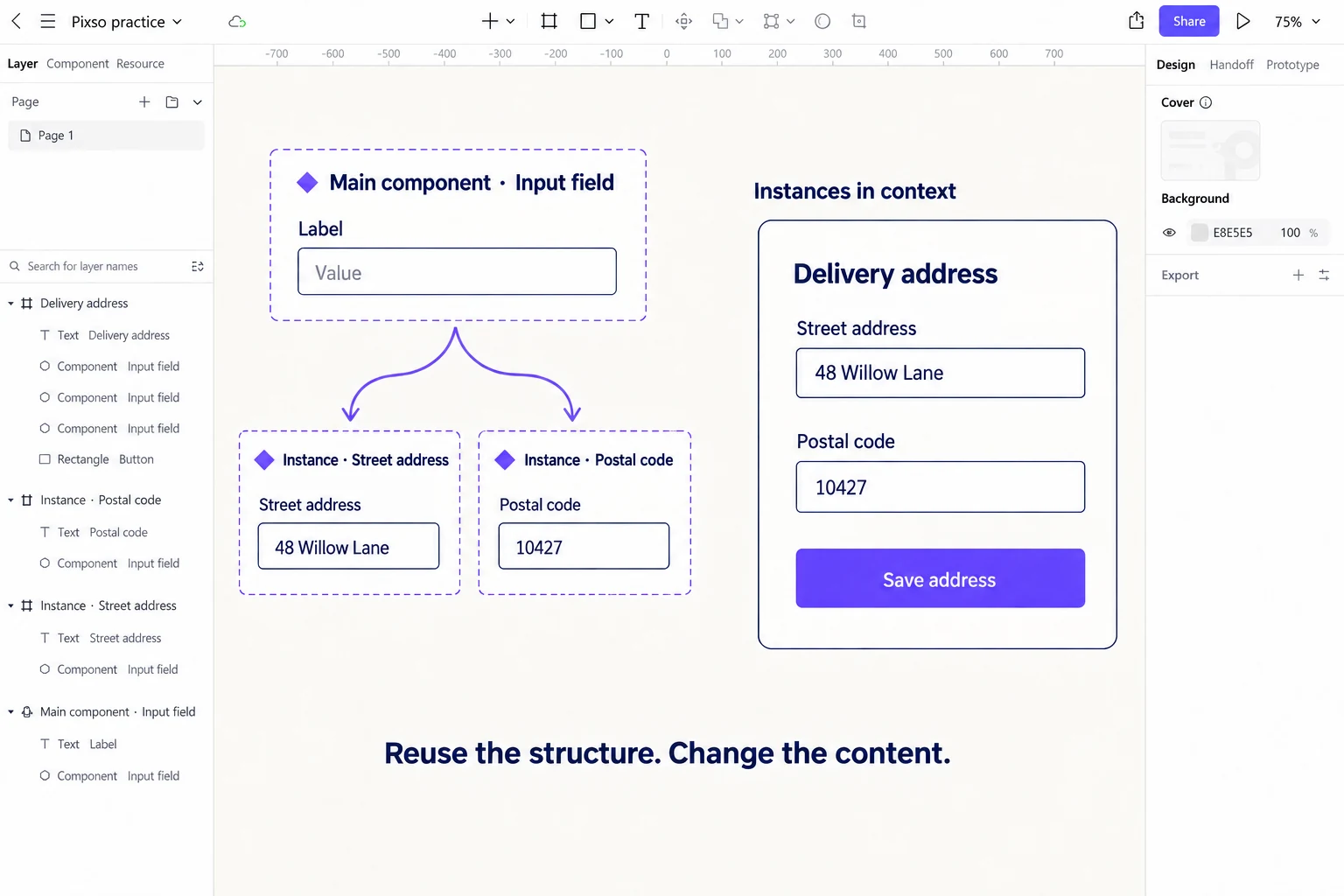
The main component defines the reusable design; an instance is a linked copy placed on a screen. An override changes a supported property on that instance, such as its label, without creating a new main component. Check that an error state preserves the label and points to the exact correction. The component guide should be consulted for current terminology and behavior.
6. Connect the smallest useful prototype
Use three prepared frames for a first prototype. In Address / Form, enter a deliberately incomplete postal code such as “10.” Duplicate the frame as Address / Error, preserve the address, and add “Enter the complete postal code.” In Address / Success, show the corrected address and a clear saved confirmation.
- Select the Save address button in the first frame and open the Prototype tab.
- Add an On click interaction with the Navigate to action, targeting
Address / Error. - For this beginner exercise, add a clearly labeled “Use corrected postal code” action in the error frame, targeting
Address / Success. It represents the correction step; it is not a production form control. - Set the first frame as the flow's starting point and preview it. Follow the error path, then return to the first frame and repeat.
This fixed path teaches connections without pretending that a drawn text field validates typed input. Keep the correction step explicit: an unchanged invalid address should not become a successful save. Figma's prototype connection lesson shows how triggers, actions and destinations fit together.
Preview the flow as a person who has not seen the file. Can they tell whether the address saved? What happens if the postal code is invalid? Does the error remain long enough to read? A prototype reveals selected behavior; it does not prove that a production network request, screen reader or keyboard interaction will work. Keep those implementation checks in the handoff notes.
The official prototyping guide should be checked when triggers, overlays or interaction names change.
7. Share for a useful review
Write a review brief before inviting people. State the task, the question and what kind of feedback is useful: “Can you find the error and recover?” is better than “Thoughts?” Choose view or edit access deliberately and remove confidential data from public links. A comment should identify a frame, state and suggested decision, not become a second design file.
Ask one reviewer to complete the task without a verbal tour. Record where they pause, what they expect next and whether they understand the error. Separate an observed obstacle from a personal preference. If the file has several experiments, label which one is the current candidate so feedback does not land on an abandoned version.
8. Prepare a handoff another person can build
Handoff is not a screenshot export. Share the source file or inspectable link, named frames, component states, content assumptions, assets, behavior notes and unresolved questions. State what happens on loading, timeout, offline, permission and partial success paths. Mention which decisions are still open and who owns them.
For each important control, a developer should be able to answer:
- What is the label and accessible name?
- Which states exist and when does each appear?
- What happens if the action fails?
- Which content can grow or be translated?
- What event or success signal should be measured?
Compare the implemented screen with the intended behavior. A handoff is complete when the developer does not have to reconstruct the interaction from a static image.
Compare tools using the same task
When choosing a tool for a team, compare the work you actually need to do: build a component, review a prototype and pass design details to development. Check the current plan requirements for the people editing and reviewing the file before committing a larger project.
Rebuilding the same small flow in a second tool makes differences in layout controls, components and review easier to judge. For a broader comparison, see the Figma alternative guide.
A complete beginner practice plan
| Session | Deliverable | Review question |
|---|---|---|
| 20 minutes | Brief, page and first frame | Are the task and next action clear? |
| 25 minutes | Form component with states | Does the component survive long content? |
| 20 minutes | Error and success prototype | Can a reviewer recover? |
| 20 minutes | Share link and feedback notes | Are access and review scope clear? |
| 25 minutes | Handoff checklist | Could a developer implement the behavior? |
The objective is not speed for its own sake. It is to practise a loop: make a small decision, inspect it with realistic content and record what needs to change.
Practise the same task in Pixso
To compare tools while the lesson is still fresh, rebuild the same address form in Pixso. Open a browser-based design file, create the default and error screens, and use a repeated component for the form fields. Connect the save action to a confirmation screen, then share the prototype so a teammate can review the labels and transitions. Keeping the task and content the same makes the differences in editing and review easier to notice. Start with this small exercise before moving a larger project. The Figma alternative comparison explains the broader workflow choices when you are ready to evaluate Pixso for your team.
Repeat the form with a longer address
Once the first flow works, duplicate the practice page and replace the street value with “48 Willow Lane, Building B, Floor 3.” Keep the same component structure. The longer content exposes whether a value is clipped, a helper message overlaps the next field or the button sits outside its parent frame.
Then change the main field component's padding and inspect the street-address and postal-code instances. Their structure should remain related while their text stays specific to each field. This second pass is where the distinction between a shared component and a copied group becomes useful. If a change behaves unexpectedly, inspect the instance's overrides and its parent layout before rebuilding it.
Further reading and sources
- Figma Auto Layout
- Figma components
- Figma prototypes
- Pixso’s Auto Layout guide, wireframe vs prototype and design system pages.
Troubleshooting a first file
If a frame grows in the wrong direction, inspect which parent controls its width and whether the text has a fixed or flexible setting. If a component instance does not show a change, check whether the edit was made on the source component or only on one instance. If a prototype opens the wrong screen, inspect the starting point and the connection rather than adding another link. These small diagnostics teach the hierarchy of the file better than a list of shortcuts.
When a reviewer reports that the form “feels confusing,” translate the comment into a task observation. Did they miss the label, misunderstand the error, expect the button to save immediately or lose data after a timeout? Capture the state and content that produced the problem. A beginner learns faster when every adjustment is tied to a user action and a visible result.
Keep a backup or version before a broad reorganisation. Rename frames after the review, not while someone is commenting, and tell collaborators which page is current. A tidy handoff is part of learning the tool: the file should explain itself to the next person.