Scott
The UI design process, from requirement to working interface
The UI design process turns a requirement into screens that people can understand and developers can build. Its seven steps are to clarify the brief, map the flow, structure the screens, define visual rules, prototype the interaction, review the task and hand off the decisions.
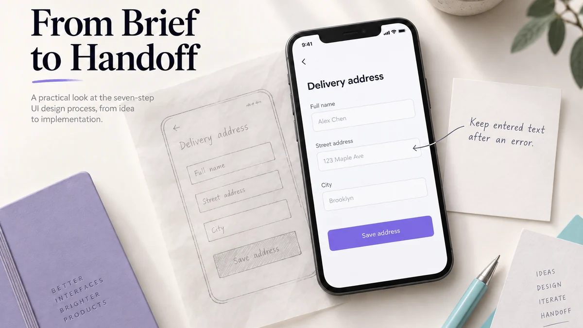
Consider a returning shopper adding a delivery address on a phone. The initial requirement sounds simple: add a form and a save button. The design work is deciding what happens when the postal code is invalid, the keyboard covers the button or the save request takes longer than expected. Following this one task through the seven steps shows what each stage contributes.
Step 1: Clarify the brief
Write the user, task, platform, content, permission, business constraint and success signal in plain language. If the team does not know an answer, mark it as an open question instead of hiding it in the visual design. A brief that says “make a dashboard” is not enough; state who needs to decide what and under which conditions.
Use a one-sentence task and a short acceptance statement:
A returning shopper needs to add a delivery address and know whether it was saved, including after an invalid postal code or a slow connection.
List the assumptions that could change the flow. Who owns the content? Is the user signed in? Which data can be stored locally? What counts as success? Resolve the highest-risk unknown before polishing the first screen.
Step 2: Map the flow and states
Draw the shortest successful path, then add cancellation, back, validation, loading, empty, permission, timeout, offline and error states. A flow that contains only the happy path can look complete in a review while failing in use. Keep state names consistent with the product and implementation plan.
| State | Question to answer |
|---|---|
| Initial | What can the user do and what is required? |
| Editing | What feedback is useful before submission? |
| Loading | Did the request start and can the user wait or leave? |
| Validation | What is wrong and how can it be corrected? |
| Permission | Why is access needed and what is the next step? |
| Partial success | Which part was saved and which part needs action? |
| Complete | What happened and where can the user continue? |
For the address task, map checkout → address form → saving → address saved → payment. Branch from the form to an invalid-postal-code state, and from saving to a connection problem. A validation error keeps the other address fields intact. A successful response shows the saved address before the shopper continues to payment.
A timeout needs its own decision: the server may have saved the address even though the browser received no confirmation. Agree with engineering how the application checks the result before offering another save. A second click should not silently create a duplicate address.
Step 3: Build the information structure
Start with a wireframe or simple blocks. Group information by the user’s decision, choose labels that match their language and keep the primary action visible. Compare alternatives before investing in final imagery or motion. Use realistic content so line wrapping, density and error placement are visible.
For the mobile address form, use a single column so labels and errors remain next to their fields. Keep the order compatible with the countries the checkout supports rather than forcing every address into one regional format. Start with the fields needed for delivery; make an optional apartment field visibly optional.
Compare two wireframes with the same content: one places “Save address” after the fields; the other pins it to the bottom. Open the keyboard and enlarge the text in the implementation review. A pinned action is useful only if it does not cover the last field or its error message. Preserve these two alternatives until the team has checked that behavior.
Step 4: Establish visual rules
Define a small type scale, spacing rhythm, color roles and component states. Keep foundation values separate from semantic roles so the system can evolve. Create a component when the pattern repeats and needs one source of truth; do not abstract a one-off decoration simply to make the layer panel look tidy.
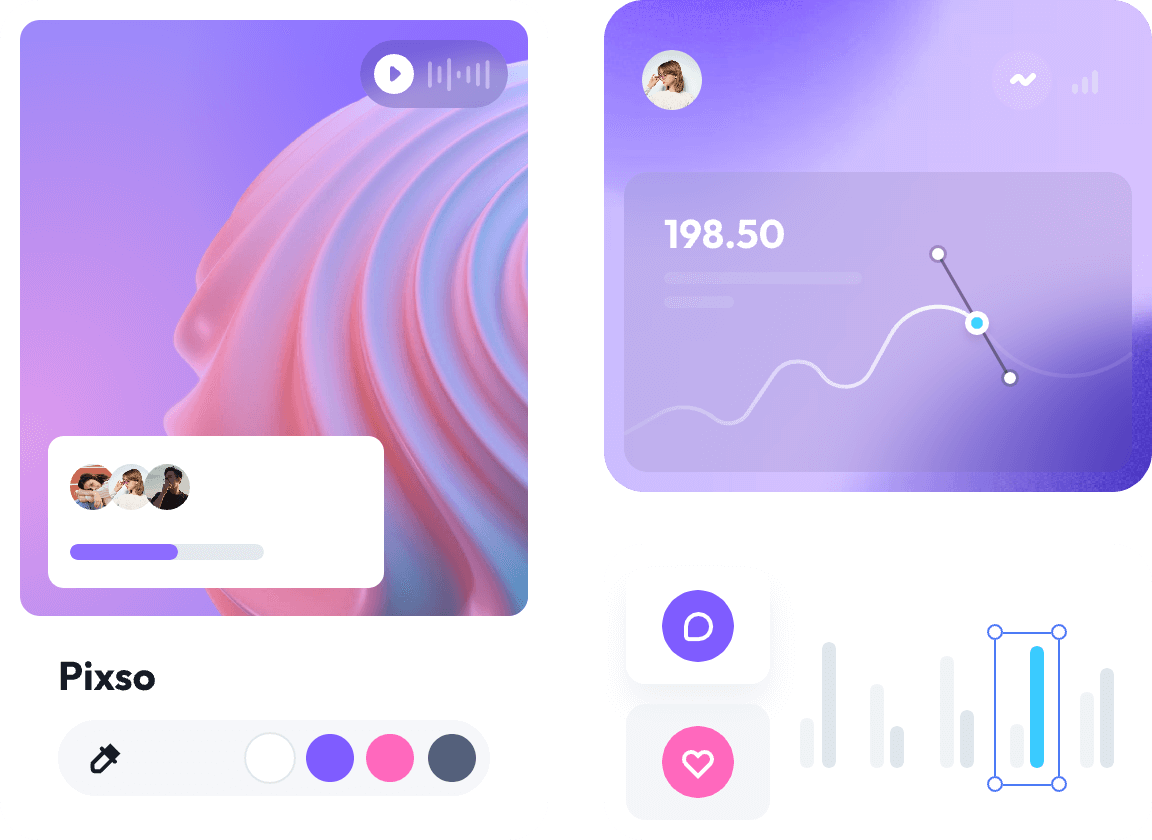
Record focus, hover, pressed, disabled, loading and error states where they affect the task. Check contrast and text enlargement with the implementation baseline in WCAG 2.2. Do not label a palette “accessible” from a screenshot; the final component and content need to be tested.
Typography and localization need an early specimen. Include navigation, a button, a paragraph, a price, an error and the scripts the product supports. Document fallback fonts, font licenses and whether a control wraps, grows or changes hierarchy when text expands.
Step 5: Prototype the task
Connect the screens that matter to the decision. Use the prototype to test timing, focus, feedback and recovery, not only to demonstrate transitions. If the question is whether a user can recover from an invalid postal code, include that state and a route back. Do not prototype every navigation item when a focused flow will answer the question.
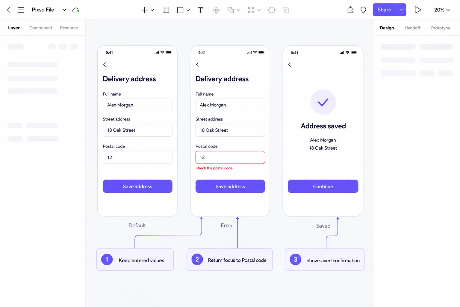
Build the valid path and one deliberate error path first. Give the participant a delivery address with a postal code that the selected country format rejects. After submission, the prototype should show a message beside that field, preserve the other entries and offer a clear route to correction. Then let the participant reach the saved-address confirmation.
A useful review question is: can people correct the postal code and tell whether their address was saved without help? Choose participants who resemble the intended shoppers and expand the review if new problems keep appearing; a fixed count does not establish that the design is validated. Check keyboard behavior, screen-reader announcements and real save failures in an implemented version.
Step 6: Review with evidence
Ask a reviewer to complete the task without a verbal tour. Record where they hesitate, what they expect next, whether the interface explains an error and which labels they misunderstand. Separate observed issues from personal preferences. Check keyboard focus, contrast, text size, touch targets, screen-reader names, narrow widths and reduced motion when those conditions matter.
For the address review, distinguish what you see from the change you want to try. Look for the following recovery problems:
| If you observe this | Likely task problem | Change to review next |
|---|---|---|
| The shopper edits the street after a postal-code error | The message does not identify the field clearly | Name “Postal code” in the message and place the correction instruction beside it |
| The keyboard hides the error and save action | The viewport prevents recovery | Allow the form to scroll and remove the overlapping fixed action |
| The shopper submits again after seeing the confirmation | Completion is ambiguous | Show the saved address with a distinct “Continue to payment” action |
Do not turn a single preference into a universal rule. Record the condition, evidence and owner. If the product serves multiple locales, repeat the task with expanded content and required scripts.
Step 7: Hand off the decisions
Share the source file or inspectable link, prototype, component states, content assumptions, assets and unresolved questions. Name frames and components so a developer can locate the decision. Include loading, empty, error, permission and partial-success behavior. List analytics events and acceptance criteria when the product needs measurement.
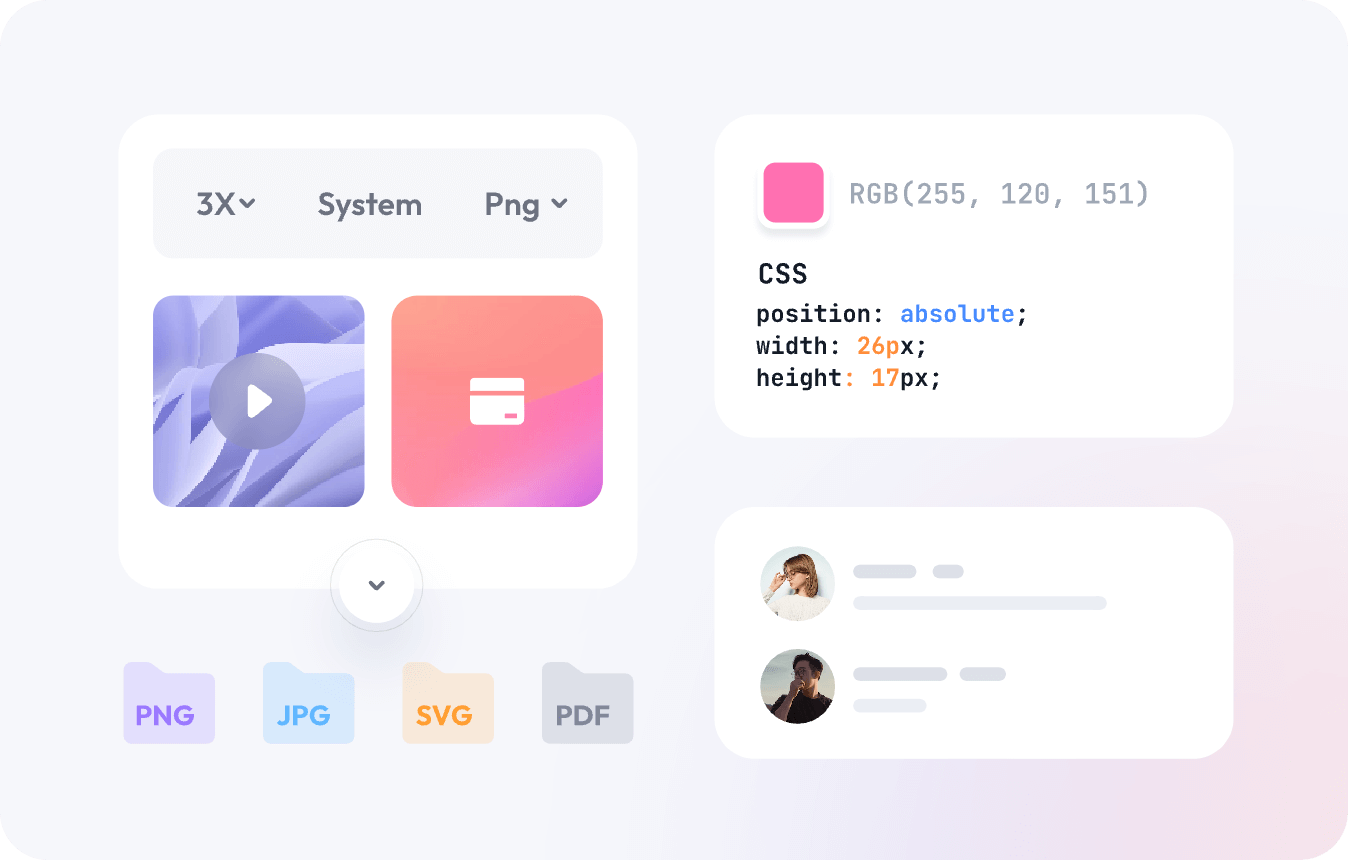
Handoff is complete when another person can implement the intended behavior without reconstructing it from a screenshot. Add the source of truth for pricing, legal, eligibility and dynamic copy. Give each unresolved item an owner and review date. Preserve a stable link to the approved version and remove obsolete test pages before launch.
Worked example: the address-form handoff
The final file should make the error path as easy to build as the successful one. Name the three main frames “Address / Default,” “Address / Postal-code error” and “Address / Saved.” Put the exact validation message beside the error frame, including the required format for the selected country. Avoid a generic “Something went wrong” message when the application knows which entry is invalid.
Attach the error text to its field in the implementation notes. After an unsuccessful submission, define whether focus moves to the first invalid field or to an error summary that links to it. W3C’s form-notification guidance explains these patterns. The choice depends on the form length and how many errors can occur together.
On success, show “Address saved” and the address the shopper just entered. If that message appears without moving focus, its implementation must also expose the update to assistive technology; see WCAG status messages. The next action is “Continue to payment,” not a second save. These few notes connect the brief, visual states, prototype and implementation into one usable handoff.
Roles and collaboration
Clarify who owns the brief, content, interaction, visual system, research, implementation and acceptance. Ownership can overlap, but an unanswered decision should have a named person. Invite engineering early when a behavior depends on data, permission, performance or a platform API. Invite content and localization before text becomes baked into images.
Use a shared file and review note when collaboration spans locations. A comment should identify a frame, state, question and decision. Keep a short change log so a reviewer can see why a pattern changed. Pixso can support shared editing, review and handoff in one browser workflow; the process still needs the team’s ownership and acceptance rules.
Use the address flow to make the handoff concrete. Put the default form, the invalid-postal-code state and the saved confirmation next to each other in Pixso. Keep the entered address visible after an error, then annotate where focus returns and what the confirmation must say. A reviewer can discuss the exact state that needs work, while a developer can trace each behavior note to the screen it affects.
How to choose the right level of detail
Use a low-fidelity flow for navigation and information-order questions, a realistic mockup for hierarchy, typography and content density, a prototype for selected interaction and recovery, and a thin implemented slice for network, performance or accessibility API questions. These artefacts are not mandatory phases. Return to a rough structure when polish makes a structural change expensive.
The wireframe vs mockup vs prototype guide explains the boundary in more detail. Keep the deliverable small enough that the team can change it after evidence arrives.
When a design decision needs another pass
Return to the brief when the team disagrees about what “saved” means. Return to the flow when a timeout can leave the shopper unsure whether to retry. Return to the wireframe when a larger error message covers the action. Adjust a component when the same field error behaves differently across screens.
These changes do not require restarting the whole project. Keep the accepted parts and revisit the smallest decision that caused the problem. For the address form, changing the error placement may require a revised field component and one prototype state, not a new checkout concept.
FAQs
Does the UI design process start with visual design?
Usually the first useful step is clarifying the task and flow. Visual exploration can happen early, but the team should know which question it helps answer. Starting with a polished screen can hide an unclear requirement.
How long does a UI design process take?
There is no reliable fixed duration. Estimate by tasks, states, platforms, reviewers and unresolved constraints. A small flow with known content may need little exploration; a regulated or multilingual product may need substantial review and implementation evidence.
Where does UX fit?
UX work frames the user problem, flow and information structure. UI work gives those decisions a visible, interactive form. In practice the responsibilities overlap; agree on ownership and evidence instead of treating the labels as separate departments.
Further reading and sources
- WCAG 2.2
- WAI-ARIA Authoring Practices
- MDN responsive design
- Pixso’s wireframe vs prototype, typography guide, design system examples and UI collaboration page.
A small process is still a process
For a one-screen change, the seven steps may fit into a short review: clarify the task, list states, adjust structure, check visual rules, prototype the risky behavior, observe the change and hand off the acceptance note. The scale changes; the decisions do not disappear. Keep the record proportional to the risk and preserve the source of truth.