Scott
In website design, selecting the right navigation bar style determines how visitors perceive your digital product. An intuitive navbar helps users find information instantly while reinforcing brand credibility. Designers often wonder: How do you balance aesthetics with usability? What are the most effective navigation bar design patterns? What sets corporate headers apart from ecommerce navigation menus?
In this guide, we break down 8 popular navigation patterns, explain what a navigation bar is, and showcase practical navigation bar examples to inspire your next web project.
1. What is a Navigation Bar?
Before diving into visual layouts, it helps to answer: what is a navigation bar?
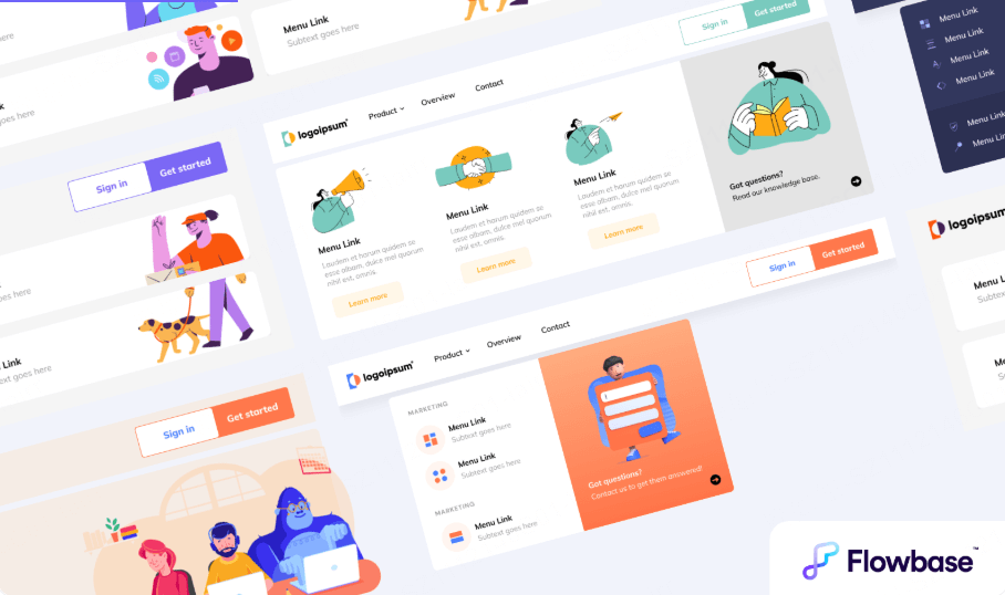
A navigation bar is a designated region on a website or application interface that displays links to primary pages or content categories. It acts as a visual roadmap guiding users across different sections.
Common placements include:
- Top navigation bar (positioned across the upper header)
- Sidebar navigation (aligned along the left or right edge)
- Bottom navigation bar (common in mobile app interfaces)
- Sub navigation (including submenus and breadcrumbs)
The term navigation bar style refers to both visual presentation and interaction behavior. This includes layout structure, visual hierarchy, typography, hover states, and animation effects. It determines how users interact with your site from the moment they land on the page.
2. 8 Common Types of Navigation Bar Styles
Different digital products require tailored navigation bar design choices. Whether you are building an enterprise portal, an ecommerce storefront, or a creative portfolio, choosing the right layout improves usability and content flow. Here are 8 popular types of navigation bar patterns used in modern web design.
(1) Horizontal Top Navigation
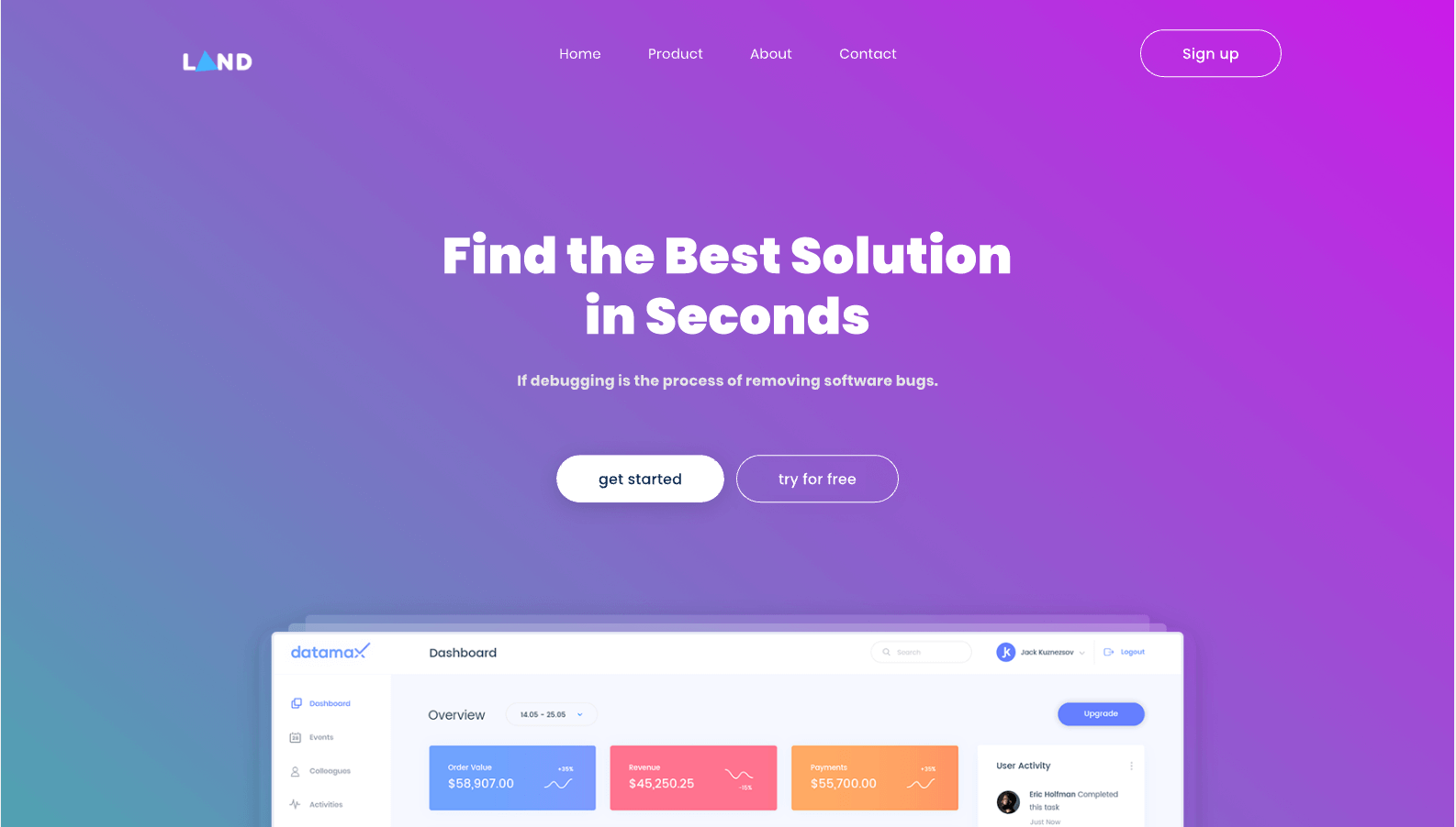
Horizontal top navigation is a classic navigation bar style. Fixed across the header, it presents primary navigation links clearly without requiring user interaction. Users can access core pages from anywhere on the site.
This straightforward layout works well for websites with concise page hierarchies, such as corporate sites, blogs, and marketing landing pages.
(2) Dropdown Menu Navigation
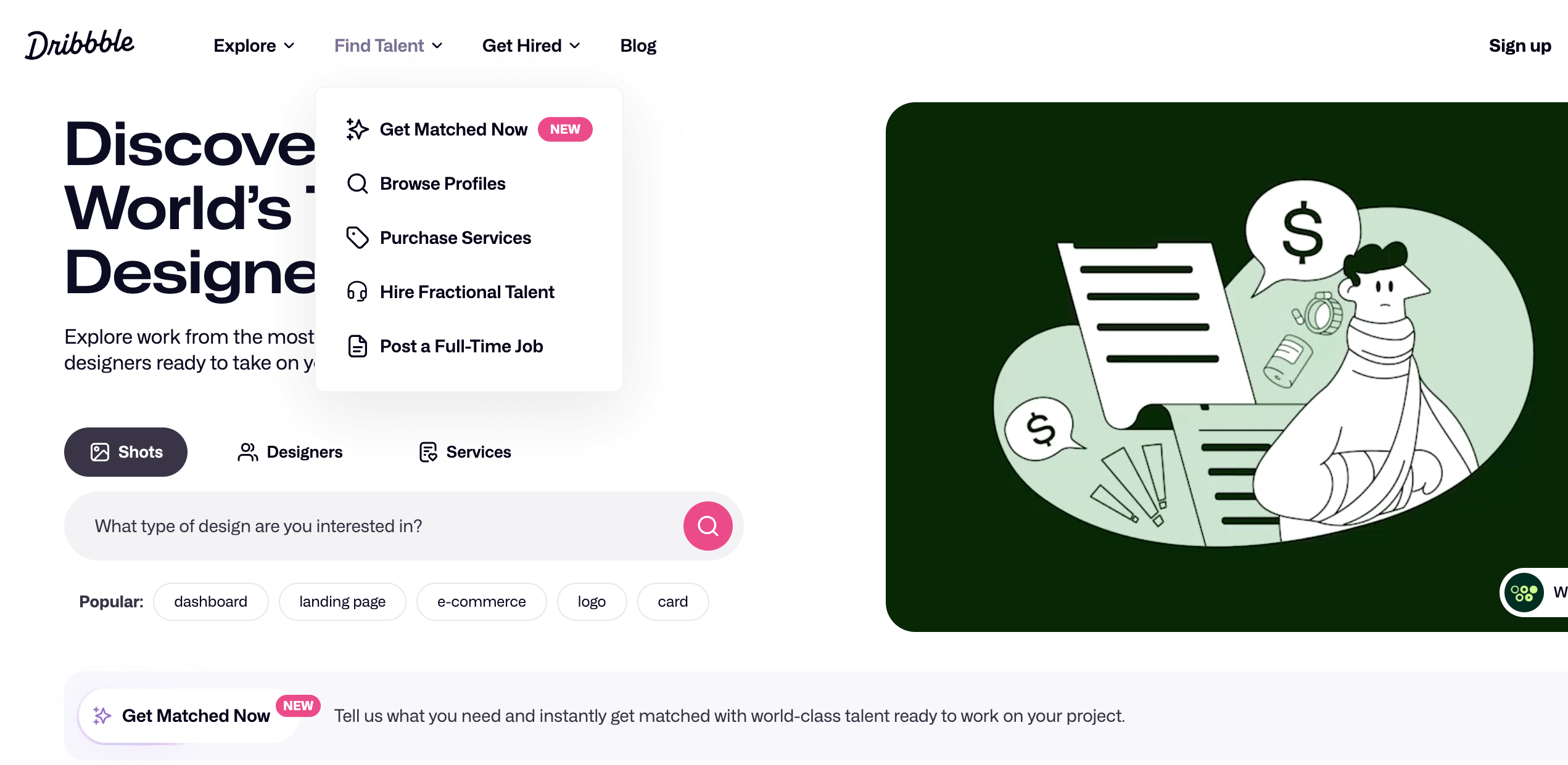
A dropdown menu extends the horizontal top navbar. When users hover over or click a parent category, a vertical menu unfolds to reveal subcategories.
Dropdown menus allow designers to incorporate additional navigation choices while maintaining a clutter free header, making them ideal for medium complexity websites.
(3) Mega Menu Navigation
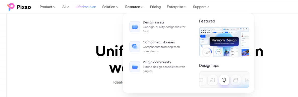
A mega menu is an expanded dropdown panel that displays multi level navigation categories simultaneously. Instead of a single vertical list, mega menus utilize wide panels that organize links into columns, often featuring icons, images, or promotional badges.
Triggered by hover or click interactions, mega menus are among the best navigation bar examples for large content ecosystems, such as ecommerce marketplaces, news portals, and software platforms.
(4) Vertical Sidebar Navigation
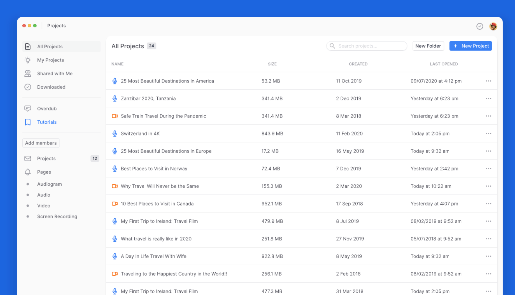
Vertical sidebar navigation resides along the left or right screen edge. When collapsed, it displays compact icons to preserve canvas space. When expanded, it reveals detailed text labels and multi tier lists.
This layout optimizes screen real estate, leaving the central region open for data dense content. It is widely used in complex dashboards, administrative panels, and SaaS tools.
(5) Search Bar Navigation
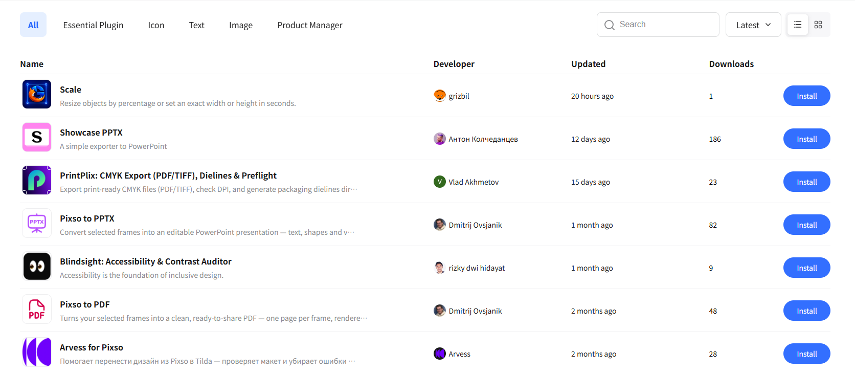
Search bar navigation centers around a prominent search input field. For large documentation hubs, technical blogs, and extensive ecommerce catalogs, a search driven navigation bar helps users jump directly to specific items by typing keywords, drastically reducing navigation friction.
(6) Full Screen Overlay Navigation
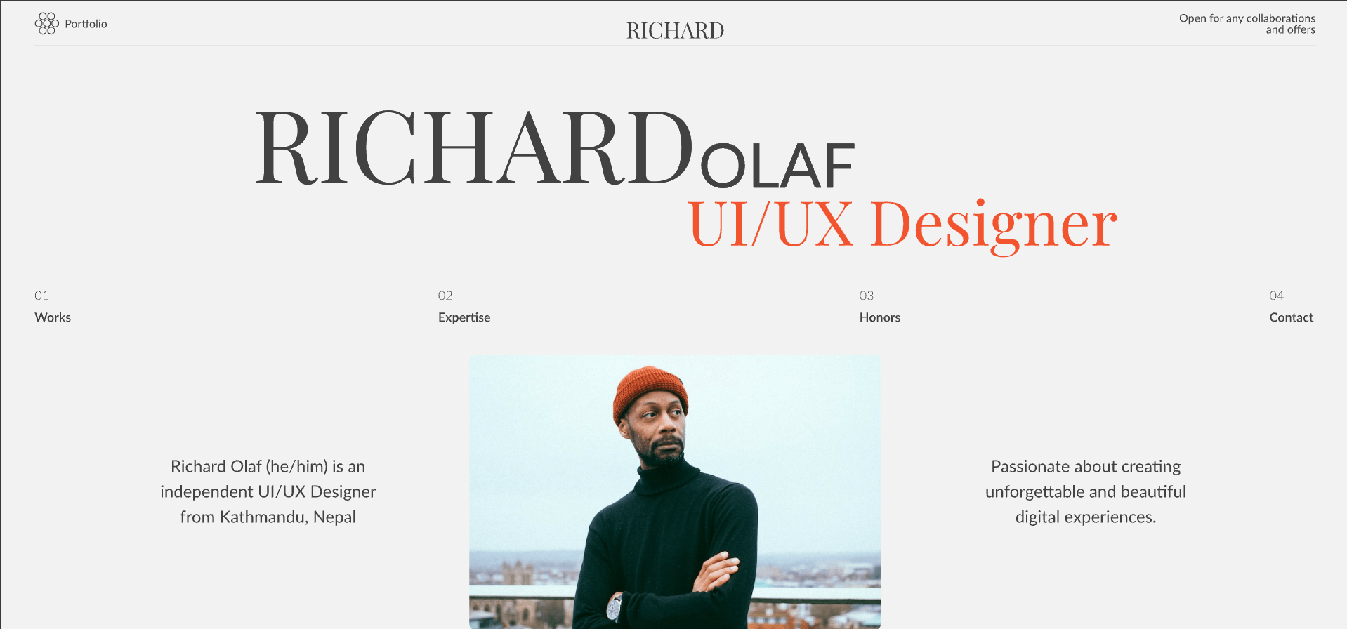
Full screen navigation covers the entire browser viewport when activated by a hamburger menu or trigger button. Main page content is temporarily hidden so users can focus entirely on navigation choices.
This immersive navigation bar style creates strong visual impact and is popular among creative agency sites, interactive portfolios, and luxury brand experiences.
(7) Breadcrumb Navigation
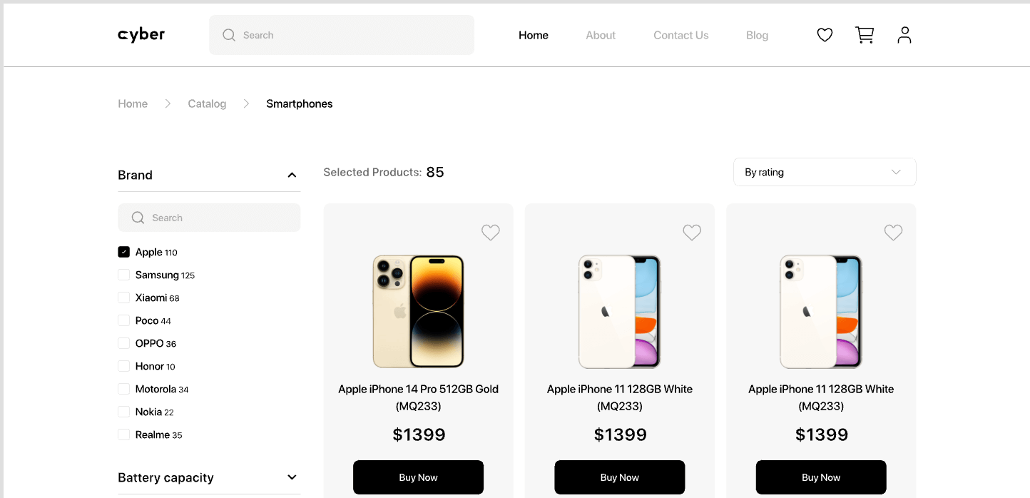
Breadcrumb navigation provides a secondary trail showing users their exact position within a site hierarchy. Typically separated by symbols like > or /, breadcrumbs allow visitors to step backward to parent categories effortlessly.
Breadcrumbs are essential in deep ecommerce structures (such as Home > Electronics > Smartphones), ensuring fluid navigation across multi tier catalogs.
(8) Footer Navigation
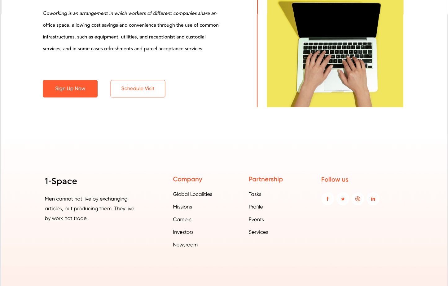
Footer navigation sits at the bottom of the page, accessible across all site views. Unlike top headers, footers offer generous space for secondary links without cluttering the primary viewport.
Designers use footer menus to organize supplementary links such as Privacy Policy, Terms of Service, Contact Info, Careers, and social media channels.
3. Inspiring Navigation Bar Examples and UI Templates
To help you kickstart your next project, here are 4 inspiring UI templates showcasing versatile navigation bar design ideas created in Pixso:
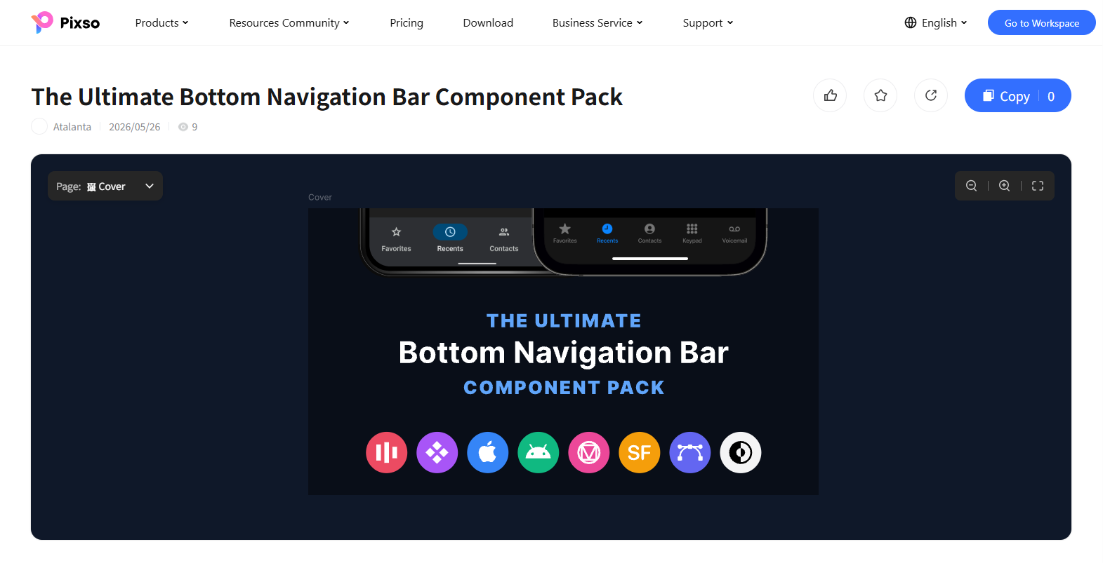
(1) The Ultimate Bottom Navigation Bar Component Pack
A comprehensive collection of mobile bottom navigation bar UI components designed for seamless app navigation. It features a wide variety of tab bar layouts with active and inactive icon states, text labels, and flexible menu configurations. The pack includes pre-designed bars for common application sections such as Favorites, Recents, Contacts, Keypad, and Voicemail. Built in accordance with native iOS and Android UI guidelines, these components adapt effortlessly to both dark and light themes. It is ideal for mobile application UI design, cross-platform prototyping, and mobile design systems.
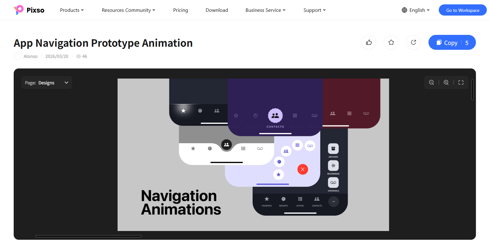
(2) App Navigation Prototype Animation Set
A dynamic collection of interactive mobile navigation animations and transition prototypes designed to elevate app micro-interactions. It features fluid tab bar switching effects, morphing active indicators, glowing selection highlights, and animated floating menu transitions. The set includes expanding radial action buttons (FAB) that pop out quick-access icons, as well as vertical overlay panels for sections like Archived, Recordings, and Voicemails. Designed with multiple dark, light, purple, and maroon color themes, these pre-configured motion presets offer high-fidelity animation references. It is ideal for mobile app interactive prototyping, UX motion design, and high-fidelity UI presentations.
(3) iOS Bottom Navigation Bar UI Design
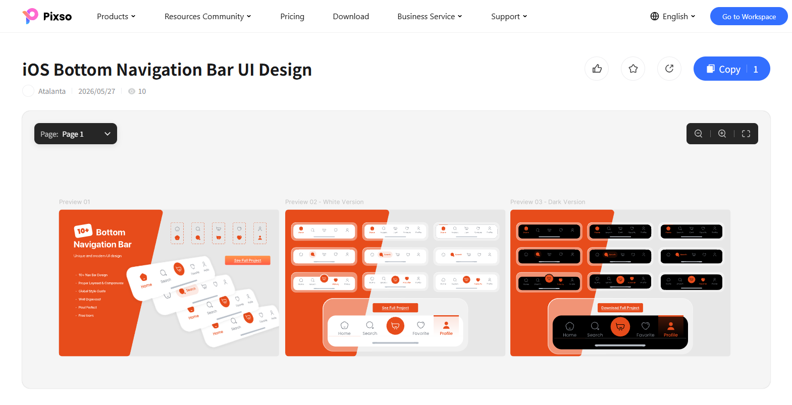
A versatile mobile navigation library featuring over 10 unique and modern iOS bottom navigation bar designs. It includes both Light (White Version) and Dark (Dark Version) theme options, highlighted by a vibrant orange accent color scheme with distinct active indicator states. The set provides flexible layout configurations, ranging from clean 5-tab bars to layouts with a prominent central shopping cart or action button. Every component is pixel-perfect, properly layered, and supported by a global style guide for effortless customization. It is ideal for mobile e-commerce applications, iOS app UI design, and rapid prototyping.
(4) Animated Mobile App Navigation Side Menu Bar UI
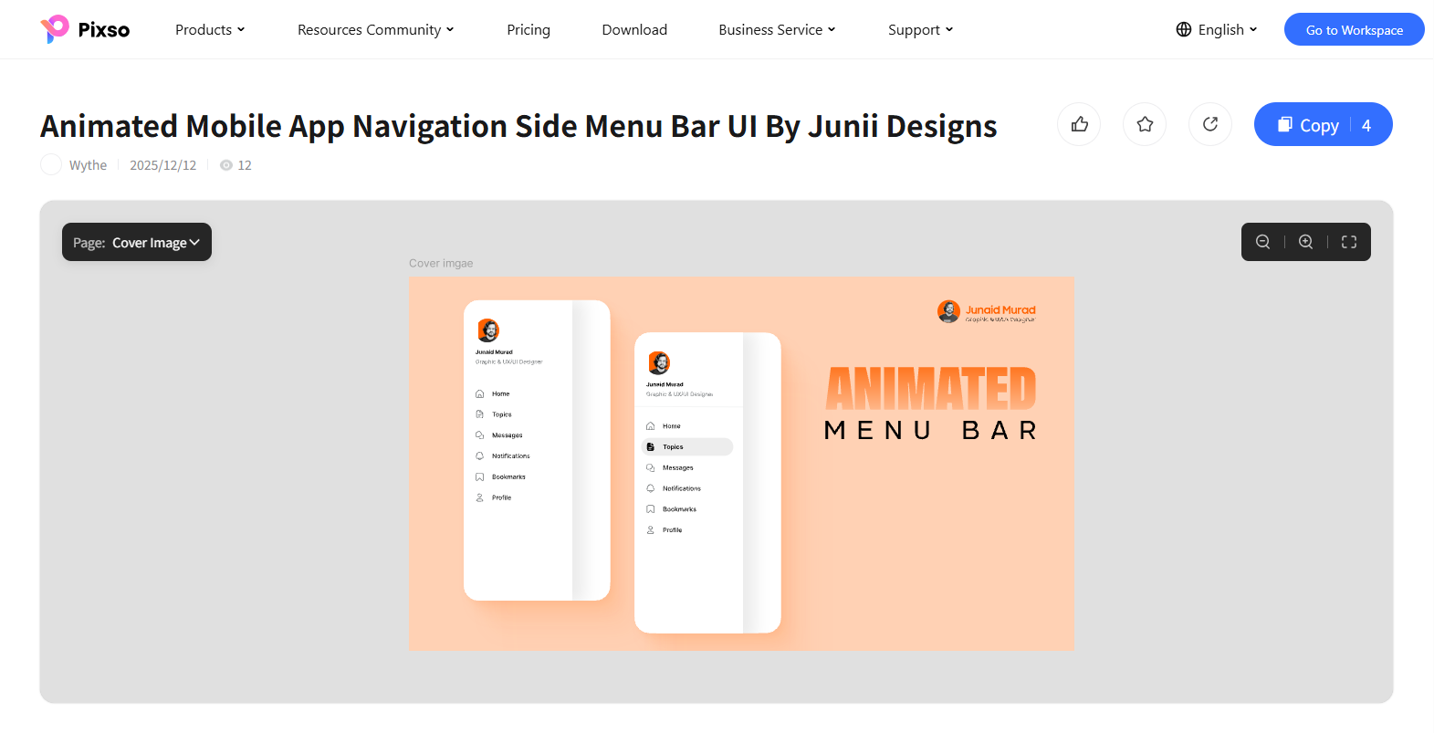
A clean, modern mobile side drawer menu template designed with smooth slide-out animation transitions. Set against a warm peach-toned backdrop, the layout features a personalized user profile header complete with an avatar, display name, and professional title. It neatly organizes essential app categories including Home, Topics, Messages, Notifications, Bookmarks, and Profile. The design highlights interactive navigation states, transitioning seamlessly from clean outline icons to pill-shaped filled active indicators. It is ideal for mobile app drawer menus, social community platforms, content-driven reader apps, and interactive UI prototyping.
FAQ
Q1: Should a top navigation bar be sticky (fixed) or non sticky as users scroll down a page?
Sticky navigation bars remain visible at the top of the browser during scrolling, improving navigation speed for long content pages, documentation hubs, and blogs. However, fixed headers consume vertical screen real estate on smaller screens. A balanced approach uses shrinking fixed headers or scroll aware navigation bars that automatically hide during downward scrolling and reappear when users scroll back up.
Q2: What is the UX difference between a mobile hamburger menu and a bottom tab navigation bar?
Bottom tab navigation bars position top priority destinations directly within the user thumb zone, resulting in higher engagement for core app tasks. In contrast, hamburger menus hide secondary options behind an additional tap. Desktop adapted mobile sites often use hamburger menus for broad page directories, while primary mobile workflows benefit from persistent bottom tab bars.
Q3: How many primary items should be included in a top navigation bar design?
UX research on human cognitive load suggests limiting primary links in a top navigation bar design to between 5 and 7 items. Keeping the top level menu concise reduces visual clutter, speeds up scanning time, and helps users memorize site architecture. Secondary or granular options should be grouped logically into dropdown submenus or mega menu panels.
Conclusion
Selecting the appropriate navigation bar style depends on your content depth, target audience, and product goals. From horizontal top headers to expansive mega menus, each navigation pattern serves a distinct purpose in guiding users.
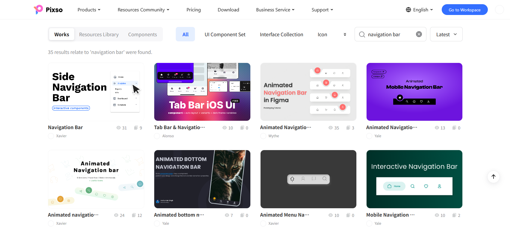
If you want to explore more navigation bar examples and UI design resources, visit the Pixso Resource Community.
Pixso is an advanced collaborative design platform combining vector editing, prototyping, and developer handoff. With AI generative tools, real time team co editing, and interactive canvas previews, Pixso empowers designers to transform creative concepts into high converting digital experiences. Start designing with Pixso today!