Scott
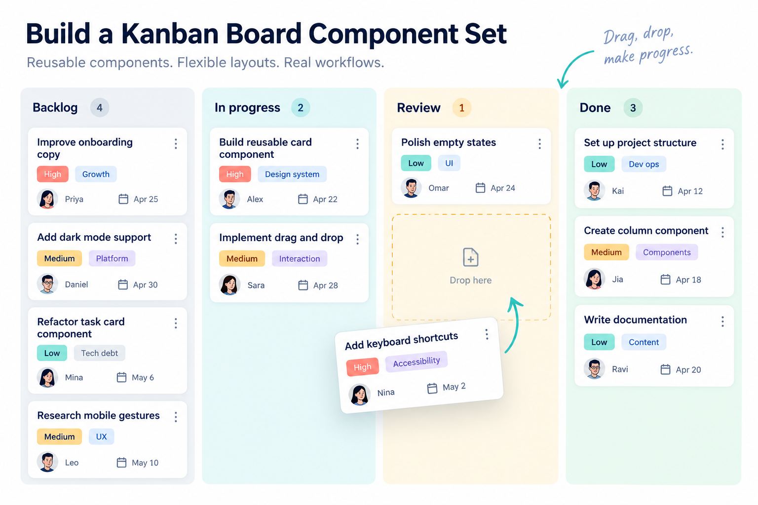
A useful Kanban board UI design is a system of reusable states, not a row of colorful columns. Cards need consistent metadata, columns need explicit limits and empty states, and drag behavior needs a clear before, during, and after condition. This tutorial builds an editable Kanban component set in Pixso for a product team that moves work from Backlog to In Progress, Review, and Done.
Part 1. Define the board model before drawing cards
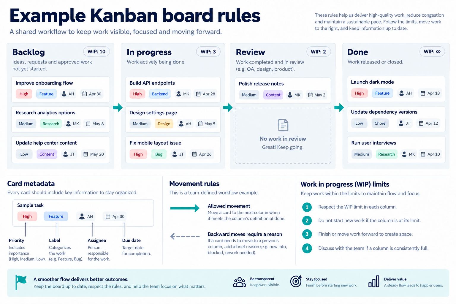
Write the workflow rules first. The example board uses four columns, allows one assignee per task, shows one priority and up to two labels, and limits In Progress to three cards. Moving a card into Review requires an assignee. Done cards show completion date instead of due date.
These are example product rules, not universal Kanban policy. Ask the product owner to confirm:
- Which columns exist and who can move work between them.
- Whether position within a column is manual priority or another sort order.
- Which fields are required for each transition.
- Whether work-in-progress limits block a move or only warn.
- How archived, blocked, overdue, and completed work is represented.
- What happens when another collaborator moves the same card.
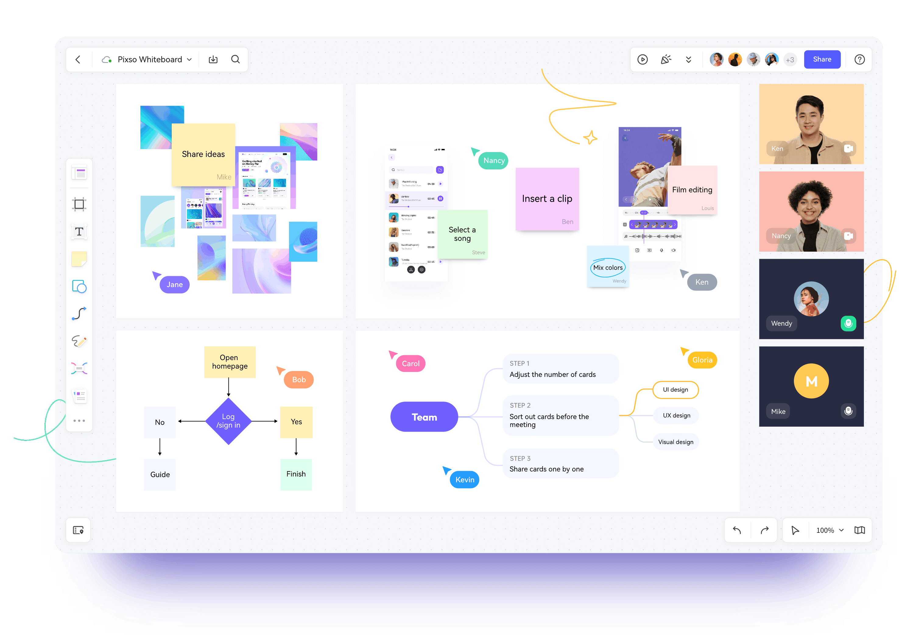
Keep these rules beside the design. Pixso Whiteboard can hold an early workflow map or PRD table, while the design file contains the editable board and component states. The board does not decide policy; it makes policy visible for review.
Part 2. Design the card anatomy
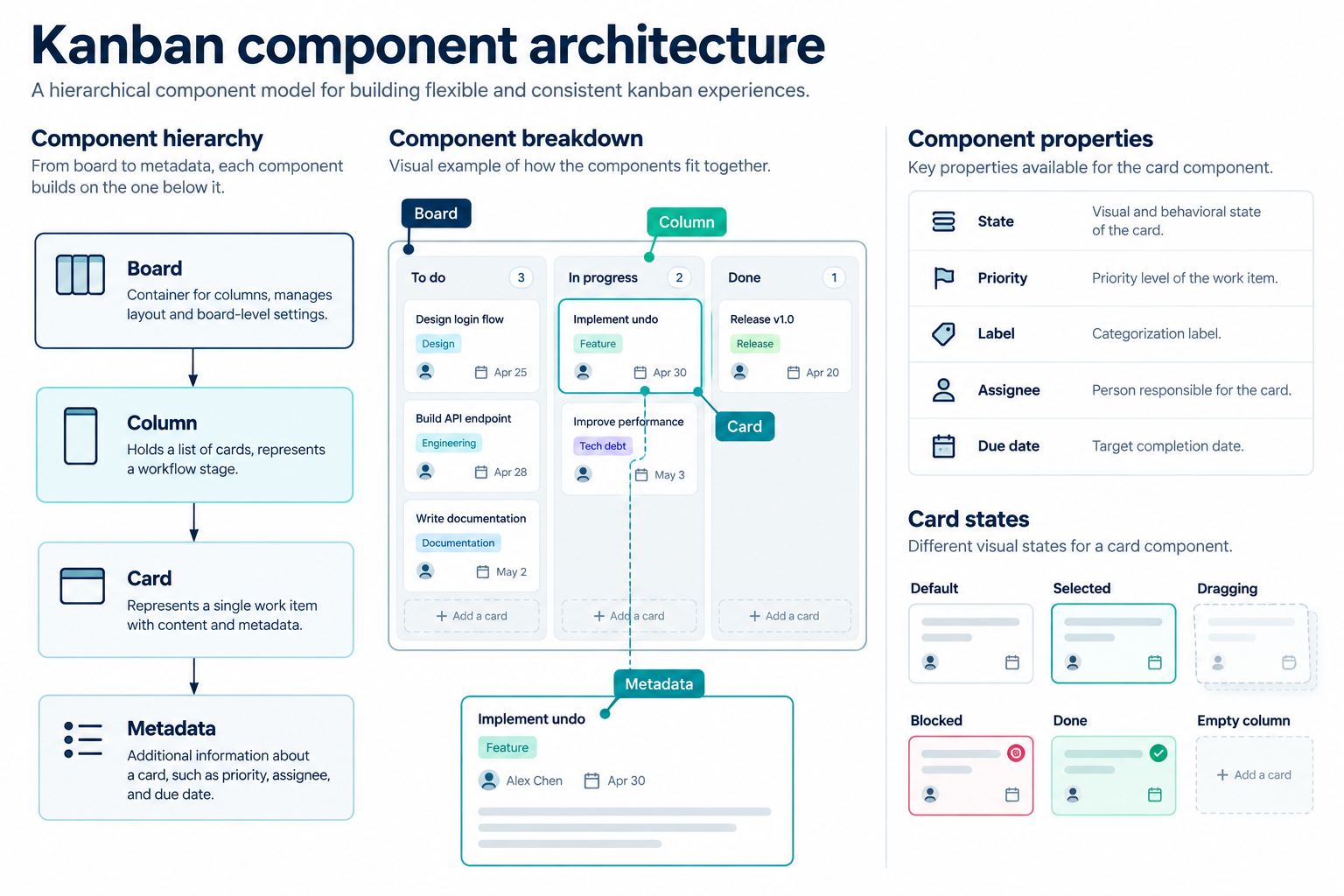
Start with the smallest useful task card. The primary line is a task title. Secondary metadata should help users decide what to do next without opening every item. For the example, include task ID, priority, labels, assignee avatar with name available to assistive technology in implementation, due date, and comment count.
In this Kanban board UI design, every metadata field supports a movement or prioritization decision.
Use a predictable information order:
- Task ID and status signal.
- Task title, allowed to wrap to a defined number of lines.
- Labels that identify product area or work type.
- Priority and due-date warning when action is needed.
- Assignee and supporting counts.
A card is not a miniature detail page. Hide metadata that does not support scanning or movement decisions. If severity, priority, and due-date risk all use strong color, the board becomes visually noisy. Reserve the strongest cue for the most important decision and include text or icon meaning.
Part 3. Build the card component in Pixso
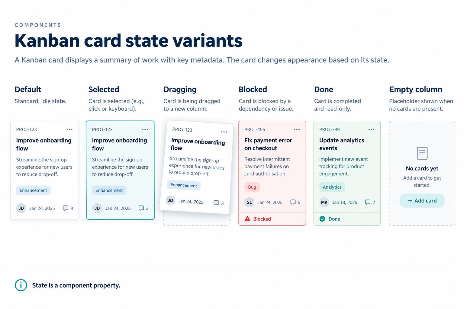
In Pixso, create a page named “Kanban Components” and add a section for source components. Build the card with layout settings so the title, labels, and metadata adapt to real content. Convert the structure into a component and expose the properties your team actually changes.
| Property | Values | Purpose |
|---|---|---|
| State | Default, selected, dragging, blocked, done | Changes emphasis and available metadata |
| Priority | None, low, medium, high | Supports scanning without altering workflow status |
| Labels | Zero, one, or two visible | Tests wrapping and overflow |
| Assignee | Assigned or unassigned | Supports transition requirements |
| Date | None, due, overdue, completed | Shows time-based state clearly |
Keep decorative differences out of the property set. A separate variant for every label color creates an unmanageable library. Use styles or variables where the design system allows them, and define a limited semantic label palette.
Pixso AI smart rename can help replace meaningless layer names with business-oriented names, and smart layout can help restructure selected content. Treat both as editing assistance: review the resulting hierarchy, spacing, and naming before publishing the component to a team library. The Pixso AI documentation provides the current feature overview.
Part 4. Create the column and its states
The column component needs a header, count, optional limit, card list, add action, and empty state. Its width should be stable enough for card scanning while the board controls horizontal overflow. Show the work-in-progress limit as “2/3” rather than only changing color at the limit.
Create column states for populated, empty, loading, limit reached, and permission restricted. Empty does not always mean “Create a task.” In Review, an empty column might say “No tasks are waiting for review.” The next action depends on the column’s purpose and the user’s permission.
If a column fails to load, preserve the rest of the board and explain that this section is unavailable. Do not display an empty state that suggests there is no work when the data is unknown.
Part 5. Assemble the Kanban board UI design
Create a board frame with the four column instances. Add a toolbar only for tasks the board genuinely supports, such as search, assignee filter, label filter, or view settings. Avoid placing every possible management action above the board.
Test the board with a realistic content set:
- A short and a three-line task title.
- An unassigned task that cannot enter Review.
- An overdue high-priority item.
- An In Progress column at its limit.
- An empty Review column.
- A completed task with completion date.
On desktop, horizontal scrolling can preserve usable card width when many columns exist. On narrow screens, consider one focused column with a column switcher rather than squeezing all columns into the viewport. The design must say how users retain context and move between columns.
Part 6. Design drag-and-drop as a state sequence
Drag behavior needs more than a translucent card. Show the picked-up card, its original position, valid destinations, invalid destinations, insertion point, auto-scroll area, and result after drop. Keyboard and touch alternatives must exist in implementation.
- Idle: the card is readable and its drag affordance does not compete with links or menus.
- Picked up: the original location remains understandable and the moving card has clear elevation.
- Over valid target: an insertion marker shows exactly where the card will land.
- Over invalid target: the target explains the rule, such as “Assign an owner before Review.”
- Dropped: the card appears in the new position and the board confirms the status change.
- Failed: the card returns or remains recoverable, with a reason and retry path.
Do not imply that a visual design proves real-time conflict behavior. If another person moves the same task, the product needs a conflict or refresh rule. Design frames can show the intended message, but engineering must test synchronization.
Part 7. Provide a non-drag movement path
Dragging is not equally usable for everyone and can be imprecise on touch devices. Add a “Move to” action in the card menu or detail panel. It should list permitted destination columns, explain blocked transitions, and confirm the selected destination.
For keyboard use, the final product may offer a menu, command, or documented lift-and-drop pattern. Whatever approach is chosen, focus should remain predictable and the new card position should be announced. Test these behaviors in implementation, not only in the design review.
Part 8. Design filtering without hiding board state
Filters change what the user can see, not the underlying workflow. Display active filters and provide a clear reset. Column counts need a defined meaning: total cards or visible cards. If they show visible results, consider “2 of 8” so users do not mistake a filtered board for missing work.
Search results can highlight matching text, but do not remove status cues. A zero-result state should say that no visible cards match and preserve the filters for correction. If the board uses server-side search, add loading and partial-failure states.
Part 9. Review the component set with the team
Publish the approved source components to the team’s reusable library only after reviewing the instances. Use comments on the exact card and column state to capture content, permission, and transition decisions. Pixso supports real-time collaborative editing and contextual comments, which helps product, design, and engineering inspect one editable artifact.
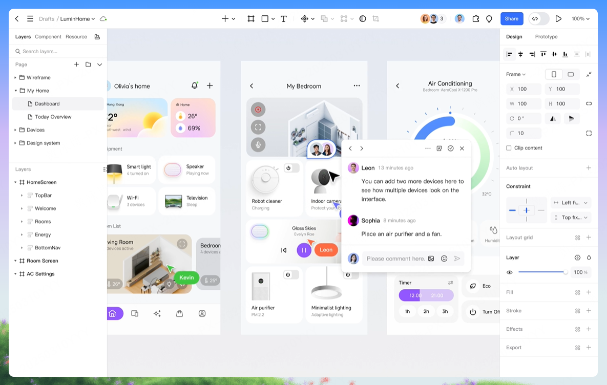
The Kanban board UI design review should cover both the reusable source component and realistic board instances.
Document the pattern in the team’s Pixso design system: card anatomy, property definitions, label limits, column widths, empty states, movement rules, and examples of misuse. Share the file through the Pixso product-design workspace for review. Component publication does not approve product rules; link every transition constraint to its authoritative source.
Part 10. Prepare the board for engineering
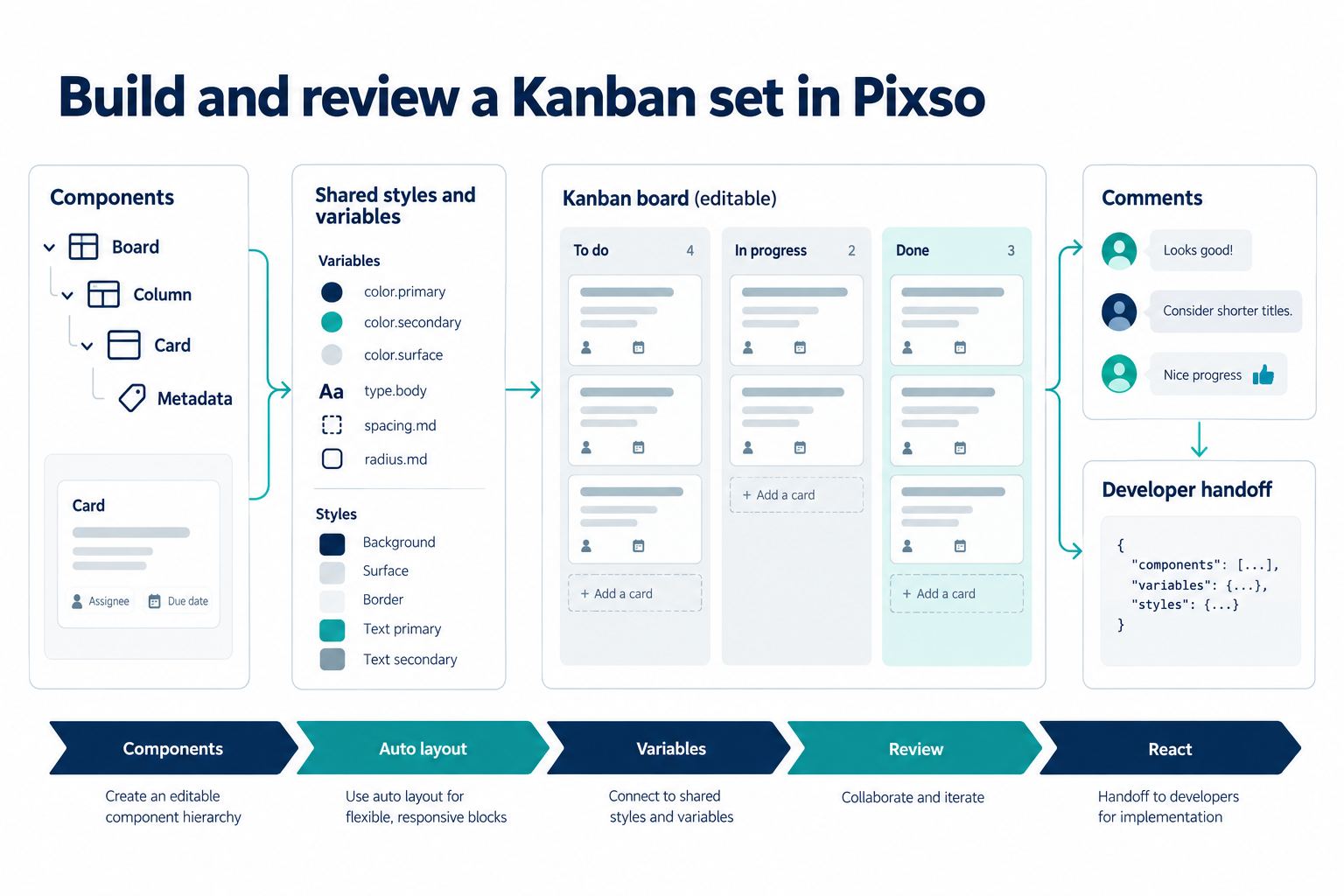
Annotate responsive rules, overflow, spacing, card truncation, status mapping, and all drag states. For each transition, specify trigger, optimistic or confirmed update, failure recovery, and completion evidence. The developer should be able to distinguish a visual property from a workflow rule.
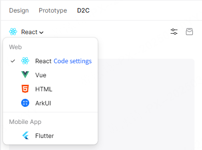
Pixso developer inspection and D2C can support delivery, including code generation paths for React, Vue, HTML, ArkUI, and Flutter. Generated code still requires engineering review for the project’s state model, drag library, semantics, keyboard behavior, performance, data synchronization, and tests. Use the Pixso D2C guide for the current workflow.
Part 11. Kanban board UI design checklist
- Columns, transition rules, permissions, and limits have named owners.
- Card metadata supports scanning without becoming a detail page.
- Default, selected, dragging, blocked, done, and failure states are covered.
- Columns include populated, empty, loading, limit, and unavailable states.
- Insertion position and invalid destinations are clear during drag.
- A non-drag movement path exists.
- Filters expose their effect on counts and zero results.
- Long content, localization, narrow screens, and high zoom are reviewed.
- Real-time conflict, permissions, and keyboard behavior are tested in implementation.
Conclusion
Build the Kanban board UI design from explicit workflow rules, reusable card and column components, and a complete movement sequence. Pixso helps the team maintain editable components, shared standards, review comments, and delivery context. The result is stronger when every visual state points back to real permissions, data behavior, and implementation tests.