Scott
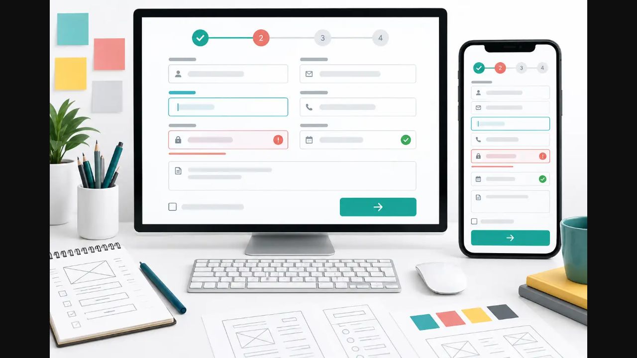
Forms turn intent into product data, so small interface decisions can decide whether a task feels simple or exhausting. This form UI design tutorial builds one concrete example from start to finish: a fictional team-workspace signup form, not Pixso's own signup screen. You will define its fields, design components and validation, wire submission states in a Pixso prototype, test accessibility, and prepare a D2C-assisted handoff. The same example runs through every part, so each principle becomes an action you can reproduce.
Part 1: Define the signup form's job and field contract
The sample form creates a workspace for a new team. Before drawing inputs, define the transaction: collect enough information to create the account, configure a relevant starting experience, and record agreement to the terms. Do not add a field merely because another signup flow has one.
Open a Pixso Whiteboard file and add a requirements table. Pixso Whiteboard provides tables, flowcharts, brainstorming structures, and PRD templates that can keep early decisions visible to product, design, content, security, and engineering. Add one row per field and do not begin high-fidelity design until each required rule has an owner.
| Field | Purpose and control | Rule and example | Owner |
|---|---|---|---|
| Work email | Account identifier; email input | Required; valid email format; alex@studio.com | Identity engineering |
| Password | Account credential; password input | Required; product security policy defines length and prohibited values | Security |
| Team size | Tailor onboarding; single select | Required; 1, 2-10, 11-50, or 51+ | Product |
| Country/region | Regional setup; searchable combobox | Required; choose one supported value | Operations |
| Product interests | Choose relevant tips; checkboxes | Optional; UI design, prototyping, design systems | Growth |
| Terms | Record agreement; checkbox | Required; unchecked by default; link to current terms | Legal |
Keep product rules separate from presentation choices. The contract says that Team size is one value; the interface team decides whether radio buttons or a select present that value best. Password rules must come from security, and the design must communicate them without inventing a policy. This distinction also makes later form validation easier to review. When records arrive in a spreadsheet, use an import mapping and preview step to review column meanings and proposed changes before committing them.
Part 2: Build the information structure and first Pixso draft
Group the sample into three sections: Account details (Work email and Password), Team setup (Team size, Country/region, and Product interests), and Agreement (Terms and the primary action). Use a single column so labels and values follow one vertical scan path. At narrow widths, keep the same order. At desktop widths, resist placing unrelated fields side by side simply to fill space.
For rapid exploration, open the AI panel in Pixso and choose AI Design. Try this prompt:
Create a responsive team-workspace signup form with three groups: Account details, Team setup, and Agreement. Include Work email, Password, Team size, searchable Country/region, optional Product interests, a Terms checkbox, and a Create workspace button. Show desktop and mobile versions plus default, field-error, submitting, server-error, and success frames.
Import the result into Pixso, then compare every field with the Part 1 table. Delete invented fields, correct labels, and add missing states. AI output is a starting point for layout exploration, not an approved data model or accessibility check. The concrete completion test for this step is simple: all six rows in the requirement table have a visible control, and no extra question appears without an owner.
Structure the sample form in Pixso
- Create desktop and mobile frames.
- Add the three named field groups in the same order.
- Place the Create workspace button after the Terms checkbox.
- Add a short status area after the button for submission feedback.
- Create a review note beside the frames that links each field back to its requirement row.
Part 3: Design labels, controls, helper text, and component states
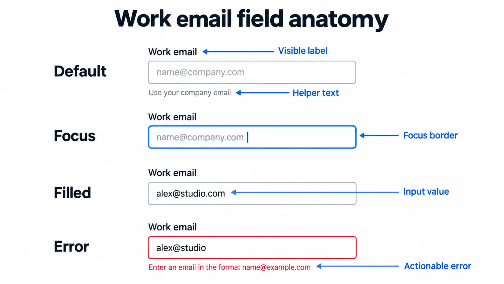
Start with the Work email component. Use the visible label “Work email,” the example placeholder “name@company.com,” and helper text only when it adds information, such as “Use the address you check at work.” The label remains visible after entry. The error variant keeps the value on screen and replaces or supplements the helper with an actionable message: “Enter an email in the format name@example.com.”
Match each control to the task. A native select can suit Team size because the list is short, single-choice, and does not need search. Country/region is a stronger candidate for a searchable combobox because the list is long and users may type to filter it. Product interests are independent choices, so use checkboxes and allow zero or several selections. An operation menu triggers commands such as Duplicate or Delete; it is not the right pattern for choosing a form value. The W3C combobox pattern provides terminology and keyboard behavior for editable and select-only comboboxes.
In Pixso, create an Input/Text component with variants for Default, Focus, Filled, Error, Disabled, and Read-only. Add Success only when a field-level confirmation genuinely helps; a green field does not mean the whole form was submitted. Keep Submitting, Submission failed, and Workspace created as form-level states.
Use Auto Layout so each field component contains a vertical stack: label, control, then helper or error message, with named spacing values and left alignment. Pixso AI Smart Layout can add Auto Layout to a selection, but the official Smart Layout documentation notes that it cannot be applied to a single selected layer or a Section, and it does not change layers that already use Auto Layout. AI Smart Rename can suggest meaningful names for eligible layers without overwriting names you set; instances, nested instance layers, hidden or locked layers, and certain primitive layers are excluded. Review every suggestion against the team's naming convention.
Part 4: Design validation, error recovery, and submission feedback
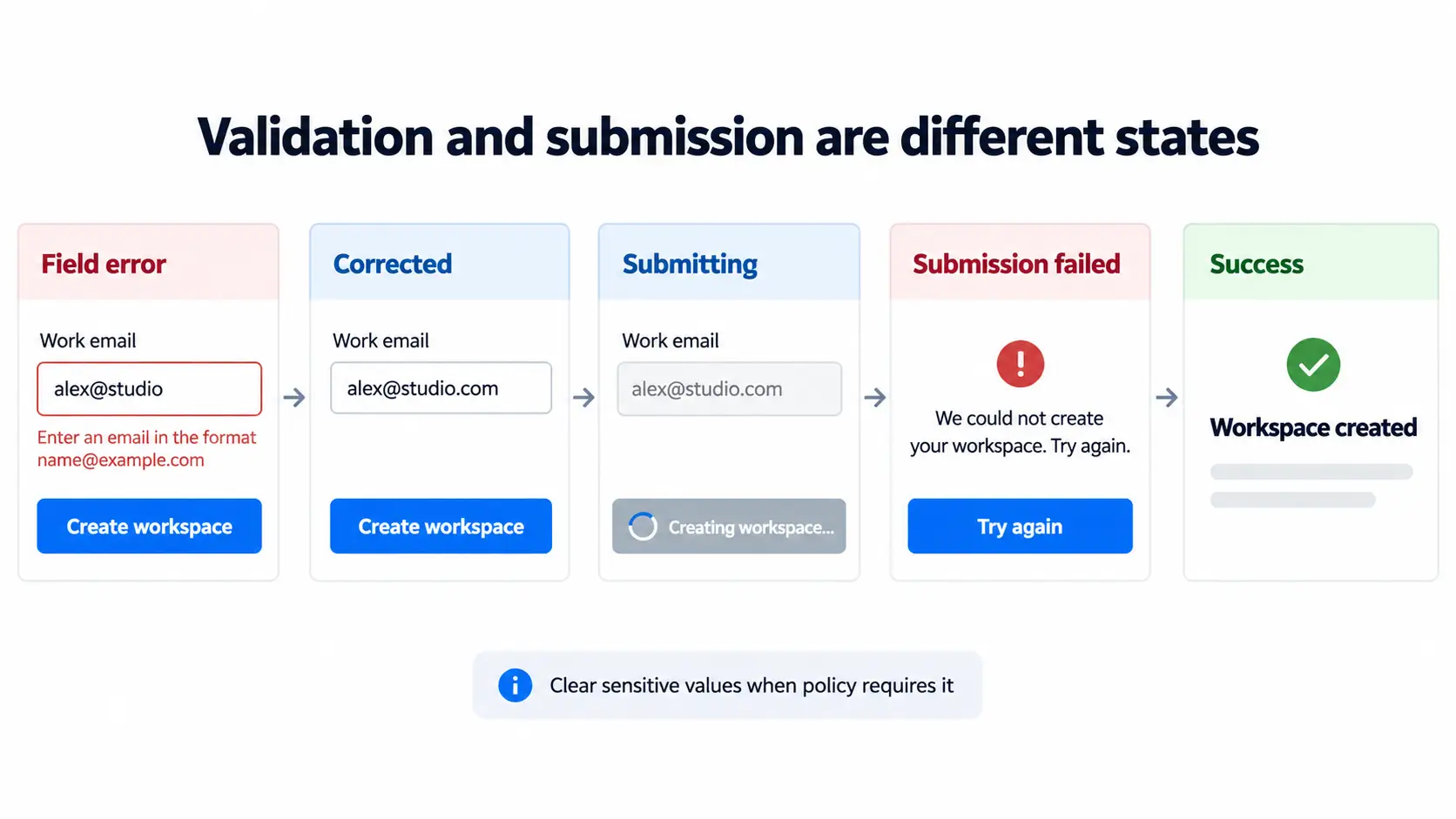
Validation should help people correct a problem without punishing normal entry. For the sample, do not display “Invalid email” while the user is still typing. When they continue or submit with alex@studio, keep that exact input visible, focus the field or error summary according to the implementation pattern, and show “Enter an email in the format name@example.com.” After correction to alex@studio.com, remove the error only when the value has been checked again.
The GOV.UK validation guidance recommends redisplaying the form with the user's entered information so they can understand and fix errors. Preserve useful entered content, including an invalid value that the user needs to edit, rather than preserving only values that already passed validation. Apply a different policy to sensitive fields. A transient client-side error may keep a password only in the current secure interaction, while an expired session or security boundary may require clearing it and explaining why. Never persist a password, payment value, or other sensitive input merely to satisfy a blanket “preserve everything” rule.
Treat validation timing as a design decision with conditions, not a universal best practice. The table below is a review matrix for this signup form.
| Optional timing | Use it when | Avoid or delay it when |
|---|---|---|
| While typing | Updating a password requirement checklist or character count without declaring an unfinished value wrong | The user has not had a reasonable chance to finish |
| On blur | A lightweight check clearly benefits the user and returning to edit will not create noisy or contradictory feedback | The field depends on another value, formatting may still change, or the service validates mainly on Continue/Submit |
| On Continue/Submit | Required fields, cross-field rules, Terms, and the final client-side review | The response is only a generic message that does not identify affected fields |
| Server response | Email uniqueness, permission, policy, or other authoritative checks | The UI exposes internal codes, erases correctable input, or implies success before the server confirms it |
Now add three form-level frames in Pixso. Submitting keeps the entered non-sensitive values visible, changes the button label to “Creating workspace…,” shows a progress indicator, and prevents duplicate activation. Submission failed explains what happened in plain language and offers “Try again”; it does not display a green check beside every field. Workspace created appears only after the server response confirms the transaction and provides the next destination. The W3C form notification guidance explains how errors and success feedback should be available to assistive technology as well as visible users.
Part 5: Configure complex and conditional controls
Implement the Country/region combobox as a real selection pattern, not a menu dressed like an input. Its popup lists values, text entry filters them, arrow keys move through available options, Enter chooses one, and Escape closes the popup. Document empty results, the clear action, and what happens when typed text does not match a supported value. If search is unnecessary or the list is short, prefer a native select.
For Team size, reveal an optional “Company name” field only when the user chooses 51+. Place it immediately after Team size and announce the change in implementation. If the user changes back to 2-10, keep the company name in the current session unless product policy requires clearing it. When clearing is required, explain the consequence before removing the value.
Use component properties to model label, message, icon, state, and optional-field visibility instead of duplicating the entire form. When the Input/Text component changes, update its instances, then inspect the signup frames for message wrapping, spacing, alignment, and unintended overrides. The update target is the component and its instances; propagation does not remove the need for review. Pixso AI Smart Search can help locate team or community assets, but each reused component still needs an interaction and accessibility check.
Part 6: Make the example accessible and responsive
Document the intended semantic structure beside the frames. Work email and Password need programmatic labels. Helper and error messages should be associated with their controls. Team size needs one accessible name and one selected value. Product interests need a group label. The Terms checkbox must expose its label and link without making the entire sentence difficult to operate. Keyboard focus must remain visible in every state.
Submission feedback also needs an announcement strategy. A field error should be connected to that field, while the form-level status area communicates “Creating workspace…,” the retryable failure, or the confirmed success. Do not move focus for every small update. After a failed submit, focus an error summary only if it helps users reach multiple problems; after success, move focus to the confirmation heading or navigate to the confirmed destination according to the implemented flow.
For the mobile frame, keep the same field order and use appropriate virtual keyboard types. Do not let a fixed action bar cover the Terms control or an error message. At desktop width, set a sensible maximum form width instead of stretching short fields across the canvas. Test 200% zoom, longer translations, long email addresses, right-to-left layout where supported, and regional differences in country names. Pixso AI Smart Text can assist with exploratory translation, but language, legal, and product owners must review the final copy.
Part 7: Walk through and validate the full submission flow in Pixso’s Prototype Presentation
Create six named frames sequentially on the canvas: 01 Default, 02 Email error, 03 Ready to submit, 04 Submitting, 05 Server error, and 06 Workspace created. Use realistic sample values across all states to construct a clear visual storyboard of the entire submission lifecycle, from initial validation to asynchronous handling and success confirmation.
To review the flow, launch Pixso’s Prototype Presentation Mode. Pixso supports an offline presentation mode, allowing you and your team to deliver smooth, uninterrupted walkthroughs even in low-bandwidth or offline environments, making it dependable for on-site reviews and client pitches. Step through the frames to demonstrate how the interface responds: show how correcting alex@studio transitions the UI from 02 Email error to 03 Ready to submit, verify the clarity of the progress feedback in 04 Submitting, and showcase the recovery path when 05 Server error directs the user to retry without losing non-sensitive inputs.
Pixso’s presentation environment is designed for real-time, multi-user collaboration. Reviewers and stakeholders can join the presentation simultaneously, inspect each form state, and drop contextual comments and optimization feedback directly onto specific screens. Ask reviewers to evaluate each stage asynchronously or in a live sync: confirm whether error recovery steps are intuitive, ensure the submitting indicator properly communicates wait time, and gather actionable feedback right where it happens.
Part 8: Test, document, and hand off through D2C
Run a state matrix before handoff: empty required fields, unfinished email, corrected email, password checklist, unsupported Country/region text, Team size 51+ with the conditional field, unchecked Terms, Submitting, duplicate click while pending, retryable server failure, expired-session handling, and confirmed success. Test both desktop and mobile. Confirm that messages wrap without moving the next target unexpectedly and that every entered value can be reviewed and corrected under the agreed security policy.
Document field names, component sources, formats, validation timing, exact messages, dependencies, responsive rules, focus expectations, live-region behavior, and data-preservation rules. Link each frame to the requirement that causes it. Pixso link sharing and comments can keep review decisions close to the design.
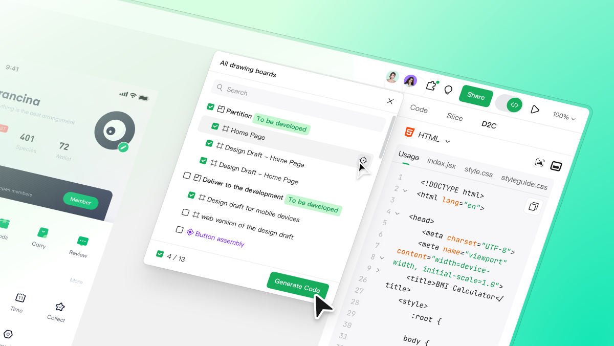
Use Pixso's Design to Code feature for the code-oriented portion of handoff. The official Pixso D2C guide explains that D2C is available in Design Mode and Dev Mode. Choose React, Vue, HTML, ArkUI, or Flutter; review the framework-specific settings; select the target frames or layers; generate the code; inspect the project structure and assets; then download the code package. Design Mode also exposes design optimization, while Dev Mode focuses on viewing, generation, and export.
D2C output is an implementation accelerator, not finished form behavior. Engineers must still use semantic controls, connect accessible names and messages, implement secure credential handling, call the real service, prevent duplicate requests, announce results, protect server validation, add analytics, and test with keyboards and assistive technology. Compare the built form with all six prototype frames rather than judging only the default screen.
Final form UI design checklist
- All six sample fields have a documented purpose, rule, and owner.
- Every control has a visible label and pre-error formatting guidance where needed.
- Team size uses a single-select control; Country/region uses a searchable combobox only because search helps.
- The Work email error keeps alex@studio visible so the user can correct it.
- Sensitive values follow an explicit security policy rather than a blanket preservation rule.
- Submitting disables duplicate activation and provides perceivable progress.
- Submission failed offers a retry without pretending that field validity equals transaction success.
- Workspace created appears only after a confirmed response.
- The Pixso prototype connects default, error, submitting, retry, and success frames.
- D2C handoff is followed by semantic, security, server, and accessibility implementation work.
Conclusion
Effective form UI design reduces uncertainty about what to enter, how to recover, and whether the transaction finished. In this tutorial, one workspace signup form moved from a field contract to components, conditional controls, validation, submission states, a Pixso prototype, and D2C-assisted handoff. Reuse the sequence for your own product, but replace every sample rule with an approved requirement. Pixso can keep planning, design, review, prototyping, and code-oriented delivery connected; accountable product, security, accessibility, and engineering review remains essential.